comparison.のTwitterイラスト検索結果。 38ページ目


@AutumnTheKazoo @ZestyLemonss can't rlly do this for a sona since they all stayed consistent in their respective designs but the furthest growth a oc has had is a like. 2015 vs 2019 comparison.
And then a recent doodle of her from 2 weeks ago.
i love her


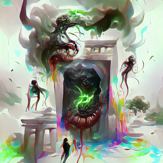
same prompt, different models. a comparison.
spot the one that is faceshq.
#VQGAN #vqganclip #aiart #generativeart


Looking up tiny ass sharks for the merman AU fic and I found the best comparison. Tiny ass salmon shark vs. great white.


I noticed @kakauk00 shared Yuka's Kioh Gyoku Portrait recently, & it reminded me of how that Portrait has a weird Glitch where the Pixels along a Certain Stretch are horizontally flipped.
I took the Time to flip them back where Appropriate. The Second Image is the Comparison.


A quick Danganronpa: SINGLEFILE update: I finished Hoyt and a few expressions, put next to his brother, Skip, for comparison. Going to be honest! Not sure I'm 100% on the way he came out compared to others, but it's something I can improve down the road.


OC : art style challenge, i attempted to paint my OCs Orochi and Byakko in the Valorant Artstyle. My normal artstyle at the back for comparison.
#oc #originalcharacter #artstyle #styletest #digitalart #digitalpainting


I wanted to do the my version of y/n and height comparison.
#YourBoyfriendGame #YourBoyfriendfanart #YourBoyfriend #YourBoyfriendYN


Left is from the promo, right is her canon design in next to the same character for comparison. How and why did they let this happen?


Here's a couple earlier pieces for comparison. https://t.co/81x43Ff4Pj


gahhh- I havent been able to make anything so have a sketch to final comparison.


Height comparison.
Diferencia de estaturas.
#art #illustration #artistlife #womenofillustration #diarydrawing #manga #mangastyle
#mangastyleart #digitalart #digitalartist #digitaldrawing #clipstudiopaint #sketching #doodle #outfitdesign #originalcharac… https://t.co/LON2bROFBn


Sasha the tiger size comparison. This was very fun to do, getting the hang of drawing her now.
Sheet made by:
@AdamBryceThomas


I redrew my orc OC because the last drawing was pretty crunchy in comparison... I've come a long way in these past 2 months damn


Rework of Quetzlcoatus from last week for patreon, old version shown for comparison. #dinosaur


My sketch and colored versions of my first sexy Spice drawing, it's a repost but a comparison.


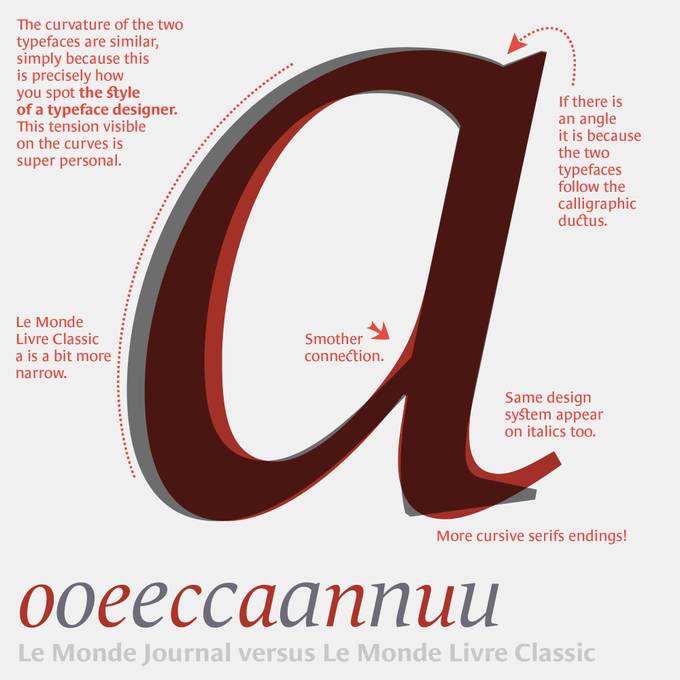

You know these two typefaces, but less in a finer comparison. The challenge of a super family is to establish common principles and structure, while looking for the difference: those nuances that will help the contrast. Le Monde Journal, intended for small sizes, is the base… 1/




Tonight's color-contrast pairing is Aru/Yukiteru (Yukise) from Mirai Nikki! ❤️🤍/💙🖤
Akise is an important person to Yuki. He is also canonically attracted to him. Many prefer them over Yukiteru/Yuno due their relationship being healthier in comparison.


