moreのTwitterイラスト検索結果。 1,572,054 件中 372ページ目


changed the hand position for a bit, now it looks even more grabbable 👀


"D, do you like this?"
I will undress her more if you guys want me to~
#FGO


New Concord redesign.
I decided to make Lark( I guess it's the name) a bit more oriental/ psychic way than the original counterpart. And the head is based on a certain tokusatsu.


@Sasouraaaa GRAAAHHHHHHHHHH i'll be sure to deliver more. tysm for this delectable dish


New comic finished!
Yogurt will be teaching more this semester!
"Miss Breene will also be your teacher!" - Short Comic - Class Example
https://t.co/lOKQEb5lnC

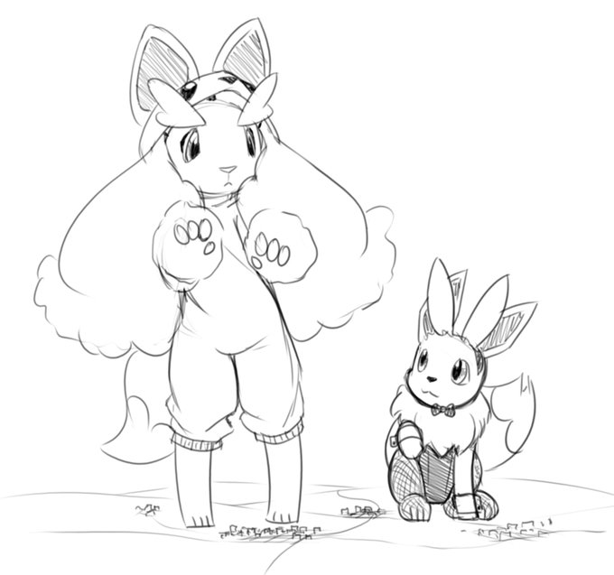


I feel like I keep drawing him more breedable every time


Sketched this Crack yabbit, so i can do something even though i should be resting Could of done more but im at my limit for the day


They're starting to look great together! just one more left for this set T-T
#ガンダ娘 https://t.co/aWHlgK1TzQ


@Cyberlord1109 Like Osborn Iron patriot vs MCU Iron patriot. I like the color scheme in the comics way more. The other one is too blue.


Artist Feature: @palsonart! She draws amazing LoL illustrations and more 😄
You can find her commission info on her Linktree, and prints on her Inprnt!
https://t.co/H6ErelY2hj


The color impression is different on the LCD screen of a computer and an OLED smartphone. I use an iPhone 12. On that screen, the picture is more vivid and the magenta is strongly expressed than the computer screen
←original / retouched→


I wanted to draw more Omega Strikers characters after drawing Nao




also at 1999, they made an adaptation of an FPS game, which in their website they said behind the scenes, it was a mess (staff dispute etc etc from the western side)
I think their works appealed more to westerners than JP, sadly enough