ContrastのTwitterイラスト検索結果。 10,505 件中 373ページ目


@adorablimp Contrast this with Muffet, designed by Michelle Czajkowski. The OC was a freshly designed one, therefore, it had no sort of gross history behind it whatsoever
3. While it's true that you can find those characters having big tiddies in Google image search, Sam's art is much worse


... just one random tiefling designs of my own - cause esthetic and stuff (maybe I will play him later) - really like this certain contrast between dark brown and gold - what do you think? ... design by me #DnD #DnDcharacter


Roishat, Pokémon serenata. Creo que al final me quedó un contraste decente entre starters para haber sido creados en un día cada uno 😂
Escucho ideas espeluznantes para mañana 👀👻
#regionexpreschallenge #fakemon


eu acho simplesmente perfeito o estilo dos irmãos de suna. ao mesmo tempo que eles são super diferentes um do outro, eles tem o mesmo estilo, isso faz eles serem ainda mais lindos. tem um contraste entre eles, sei lá??
neste perfil nós amamos temari, gaara e kankuro ok




A tune I've been working on for a while to contrast Lucille's expression against Merlin's theme🎶
Though, I wouldn't call it a theme tune, but its definitely about her. Far less dramatic, all hoarse whispers and smug smiles.

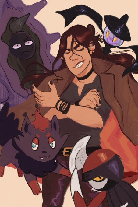
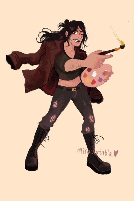


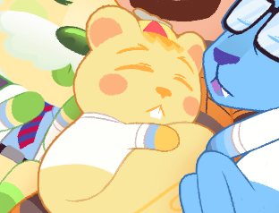
tbh my main concept around tommy was to have him be as round & cuddly as possible so that he can then be a contrast to gman who is more pointy & foreboding, which we will talk abt later
also bc listen. he is 36 but he is also Baby. the range of this man

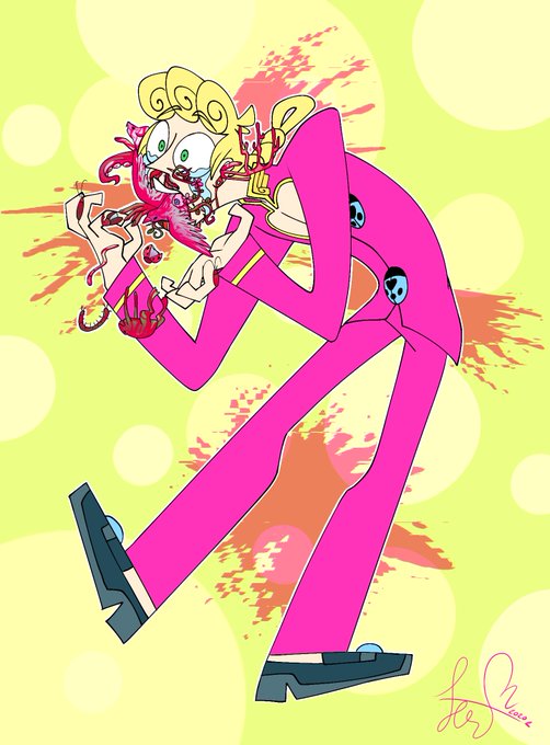


riquet⭐️
little cute boots for the little cute priest. i simply think these are the cutest ones so far. its a funky contrast for the rest of his clothes but ya know, strength comes in sturdy shoes. they also look so big on him... maybe the church didnt know his shoe size
8.3/10

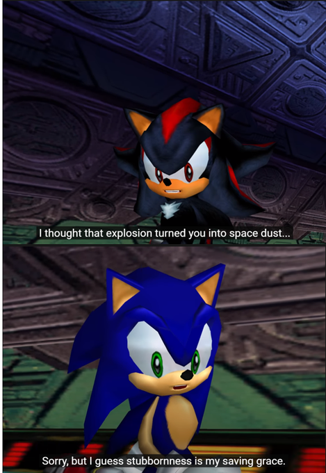

Resumiendo: Ambos dúos presentan una dinámica muy parecida entre el Héroe "natural", energético, simple e Influenciador junto con el héroe "artificial", serio, complejo y con un desarrollo de su visión de la justicia, dejando un notorio contraste entre ambos.


@pavlvsjp I’m Em and I love horror and surreal art! Meshing organic beings and creatures with plants and contrasting objects are my favourite! Thank you for reading and congratulations 😚🥂


Name's Zawa, I'm usually drawing images with dark and bright lumis contrasts.
Hope you'll like my art and will enjoy it.
#BOOSTALONG

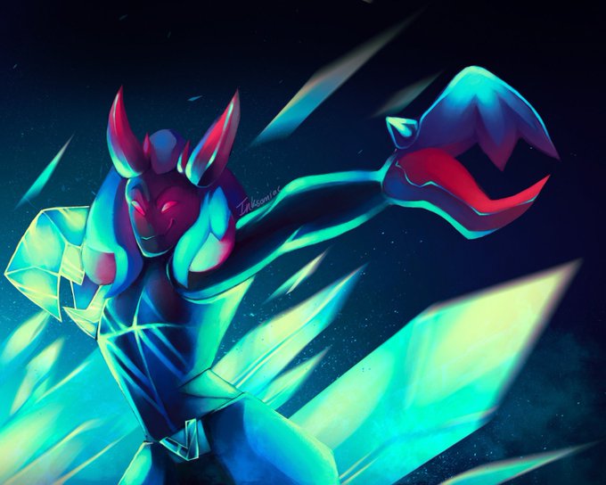


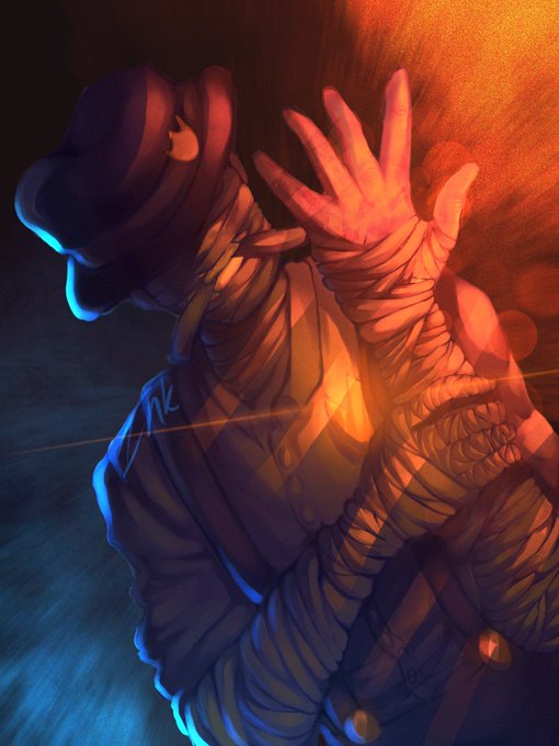
hello #BOOSTALONGMINI!! i’m ink, a 15yr old artist that just., really loves bright colors and contrast lmao
#BOOSTALONGSMALL
#BOOSTALONGBIG


@brookworm_ @elysaesia Congratulations ❤
I think the mesmerizing palette Arlen has would contrast my gal pretty beautifully!
She's still new and her body is up for interpretation depending on how Arlen would like to see her ❤

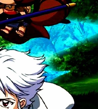


So I went to trace over the face in the blue energy on the yashahime poster and theres another face. I traced over both. The contrast is upped to make it easier to see btw.


Looking at GYS. Missed the first 2...Hoping I can do all 3 before it closes. (eBay store??) I really like how @JonMalin handles contrast. There's a good delineation between light & shadow. It's deceptively simple. I feel he has surpassed his mentor. No diss to Rob. #ComicsGate


An earlier version of Berry Lemonade that I posted the other day. I liked the contrast in the final, but I still like this pink version too.
#digitalpainting #illustration #イラスト


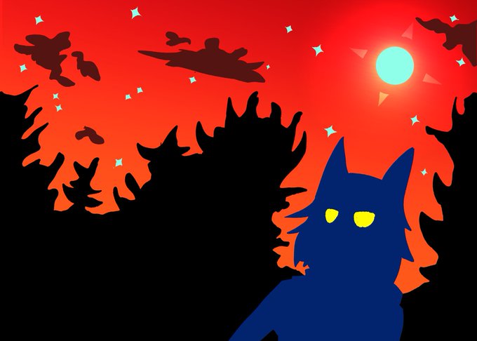
@FeedYourGames Thanks! Color is probably one of my favorite parts of art. I like bright contrasts and stuff. (Also made a 10page original comic recently, though tragically not in color)
Tagging: @Mr_Mansand @septi_art