CONTRASTのTwitterイラスト検索結果。 374ページ目


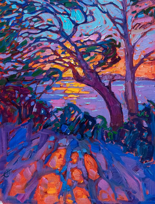
Sherbet Rays
2020
by Erin Hanson
SOLD
Abstract shapes of trees, shadows, and light interplay among contrasting hues of orange and blue. The painting captures the dramatic last rays of sunlight over a distant coastline.
https://t.co/iErETYPTH9
#PetitePainting #ErinHanson


So it was revealed in a recent QnA that in early drafts of the SU movie there was going to be more Connie to have a healthy friendship contrast Spinels unhealthy attachment and it just had me like-- 👁️👄👁️ I had to draw some things. #StevenUniversetheMovie #StevenUniverse


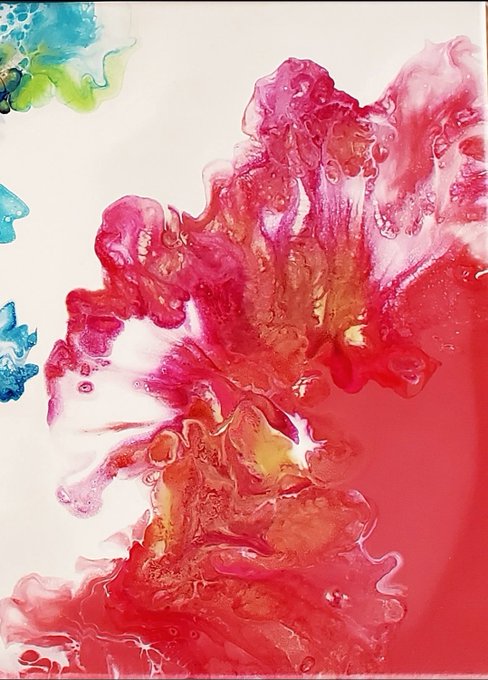
"Worlds Apart."
#fluidart #acrylicpainting
Also some closeups of each side so you can see the wispy petals are SO close they could touch BUT a world, "apart," hence the title! 😇 CHECK IT OUT!
I know I needed more contrast on my coral side but I'm hoping it dries darker.


💀Only a real artist knows the anatomy of the terrible or the physiology of fear—the exact sort of lines & proportions that connect up with hereditary memories of fright & the colour contrasts & lighting effects to stir the dormant sense of strangeness🎨Adrian Smith💀#Lovecraft


reupload because i didn't know what contrast are, sorry botan i have failed you(3).
#ホロライブ


Wanted to draw a first contrast layer to color the water blue but now I am not sure if it looks like blood or jello




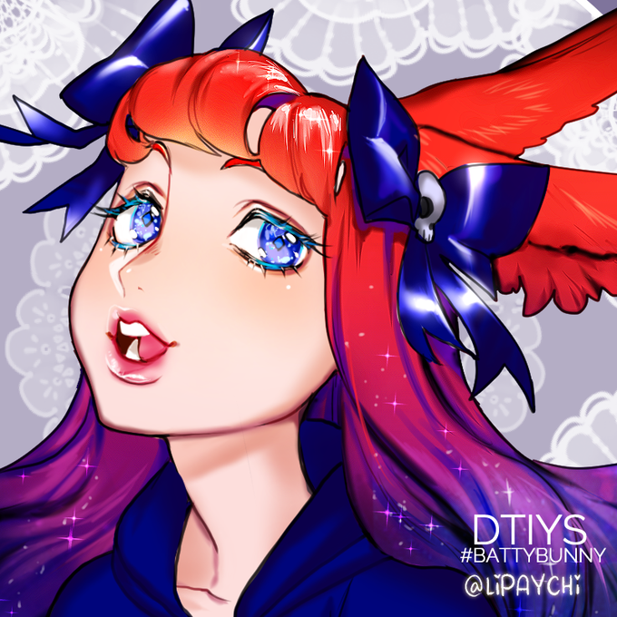

🐰Here's my take on @BattyDraws #dtiys ! This was fun to draw and color! I really enjoyed the contrast between the reds and blues =w= AND HER EYES! THEY WERE FUN TO COLOR AND S P A R K L E
#DigitalArt #drawthisinyourstyle #NobodyArtistClub #ArtistonTwitter #artph #battybunny

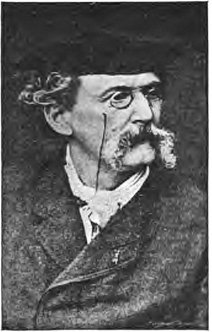
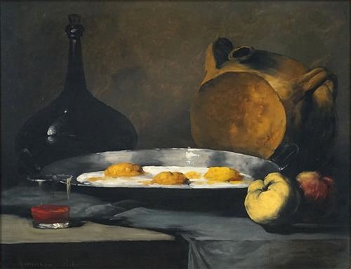


Born #onthisday1823 Théodule-Augustin Ribot French #Realist #artist & #printmaker #painted #stilllife #portraits religious scenes #genreworks Preferred working direct from nature playing with contrast light & dark Salon debut 1861 enjoyed favourable response from critics & public


artstyle bend challenge on ig!! my art is usually neat, has harsh contrast, and usually of link, so here is a soft sketchy zelda with some silent princesses
#art #drawing #illustration #digitalart #botw #breathofthewild #loz #tloz #zelda #link #塞爾達傳說 #曠野之息 #firealpaca


ARTIST SPOTLIGHT ▷ @SPIIIINE
Spine works brilliantly with colors and contrast to set the mood and make their art pop. We're curious to know what comic ideas they have hidden away!


And some color! These might change towards the end, probably add more contrast, but I’m digging this palette for now while it’s in-progress. #wip #kidlitart https://t.co/TXEVDTSf40


[8/7/2020]
~August Seven~
Gold and White that grew dusty.
Messy draw for a... >> << >> ... Special day!
#OC #original #originalcharacter #ColorContrast #gold #white

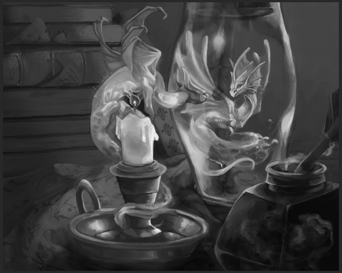
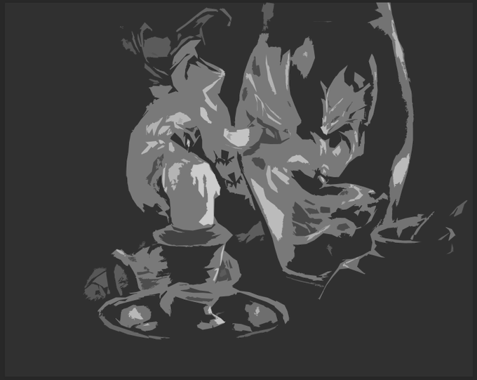
Just to follow up with the values which are one of my main focuses for improvement rn. Could probably manage the foreground/background relationship a little better, but I'm happy with how the contrast is staying centralized onto the focus of the work.


The new banner is here! It's clearer and have more contrast than the previous one. What do you think about it?
[ #thursdaymorning | #ThursdayThoughts
| #indiegame | #gamedev | #indiedev | #pixelart ]

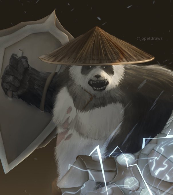


Dnd comm!
It’s always nice to look at your work in b&w to see if the values/contrast offer a readable piece the way you intend to!


Watercolor #painting of the dramatic #storm sky, titled "Sky No. 6'" (30 x 40,8 cm, 2017). I just love those contrasting colors!
You can find the original watercolor and signed art prints of it here:
https://t.co/BO4WBzUoE0
https://t.co/cSVqObweKm


Me encontré esta ilustración de "Alien 9" del 2008, y lo que más me sorprendió es que es del autor de "Denki-gai". Vaya contrastes.