CONTRASTのTwitterイラスト検索結果。 377ページ目


A birthday gift for my friend Contrast ! He likes Hat in Time just a little bit .
He streams sometimes , check him out at https://t.co/v8FjuyK7tp

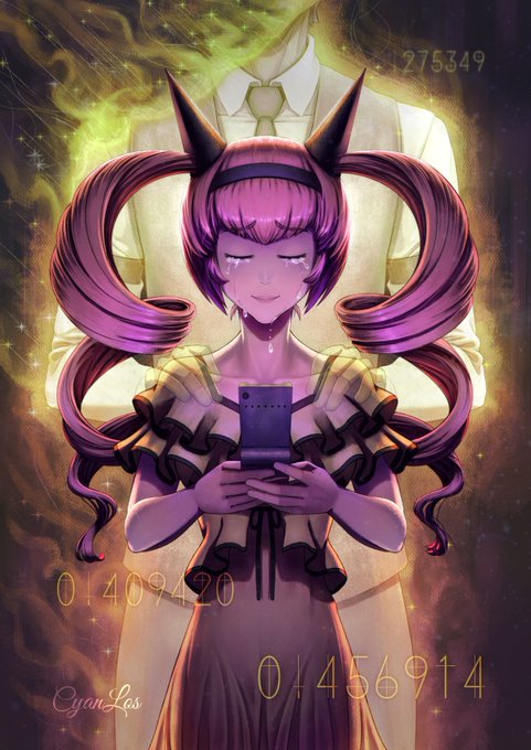
Looking back at my earlier art, "Rumiho's Sacrifice", I feel it was too dark for my tastes. So here's the same after an auto-contrast.
While I can't change the file on Pixiv, the submission on ArtStation has been updated.
#Krita #SteinsGate #DigitalPainting


THE RULE OF ONE was the name of a Sith doctrine developed by Darth Krayt and followed by the One Sith. Darth Krayt's doctrine detailed, in stark contrast to the tenets of the old Sith, obedience rather than conflict and, with many Sith following one leader and purpose.


@1800dogmom i dont know 😭 i have been doing the first layer in pink because it blends nicely with my markers, but if i only use pink it muddies and loses contrast so i do a less intense second layer of black afterwards so it stays crisp 😭 im just crazy!! heres an example of the two layers

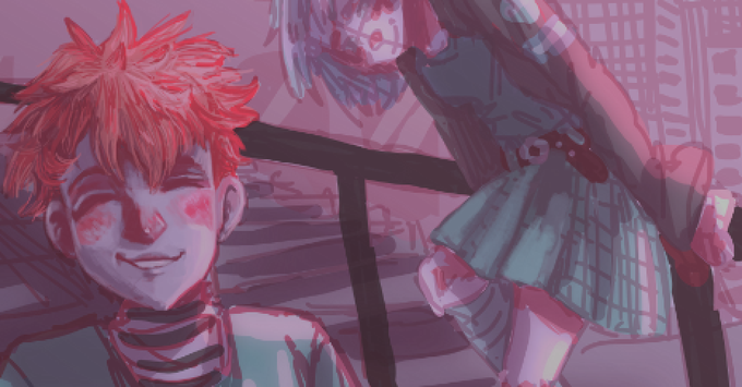

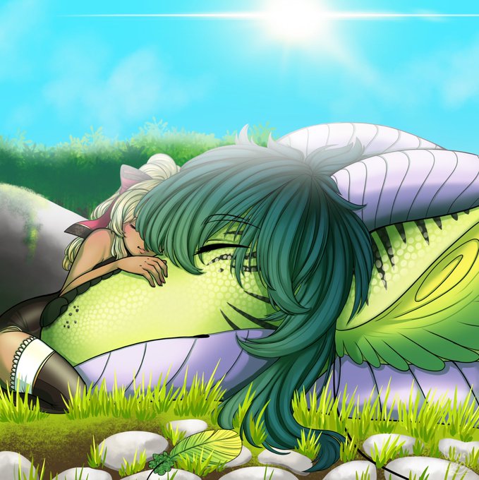
So today I have something wholesome in contrast to previous work :3 Break time!
#dragon #dragonart #dragonoc #originalcharacter #originalart #digitalart #Illustration #art #artwork #elf #Procreate


Some #originalcharacters exploration of an old #vampire OC of mine, before she became cold and jaded and mean. I really needed to draw what she felt at the turning point in her story, to show what she used to be in contrast to what she's become~
Do not repost/trace/edit my work.


@prologhe Thanks so much for this opportunity! My name is Emily and I‘m an illustrator/designer from Germany with a love for high contrasted work ✨


@FreiresArt @dannyuko Great !, I am going through a similar process too, in my case I am just starting to increase the contrast when drawing, (very slowly, they are a year and a half apart, haha) the next step would be to increase the saturation

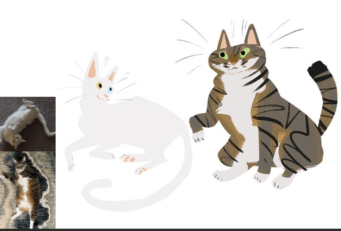
I enjoy the contrast on these 2 lovely kitties owned by @TheMakCave

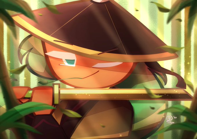


hi #ArtistsofSEA !💛
i’m yoomgie from indonesia🇲🇨, and i like to draw characters with a soft/contrast color palette (i mostly draw fanart!)

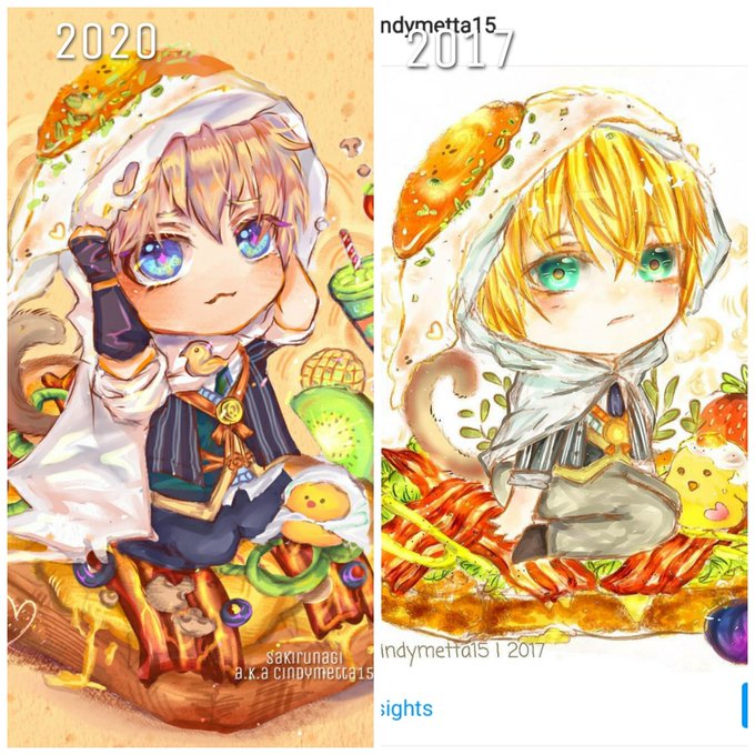
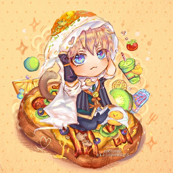
My art improvement from 2017-2020✨
just realize my art had super contrast colours back then and it's makes my eyes hurt :"v
Tools used : @MediBangPaint
Thank you for accompanying my art journey 😭💞💞 https://t.co/brTe5gnK2Q

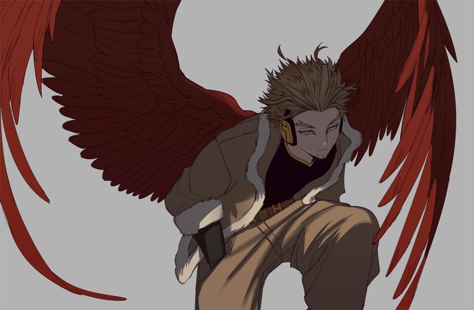

left was the original version i was working with but it lacked the contrast i really wanted....really turned that frown upside down


DO NOT RT!!!!!
The contrast is really fucking weird and I just. wow.


♡ atla girls as aesthetics ( 2 / 3 ) ♡
which girl is your favourite ? i think the contrast between ty lee & azula/mai is so funny (。・‧̫・。)
|
#avatarthelastairbender #atlafanart #azula #tylee #mai


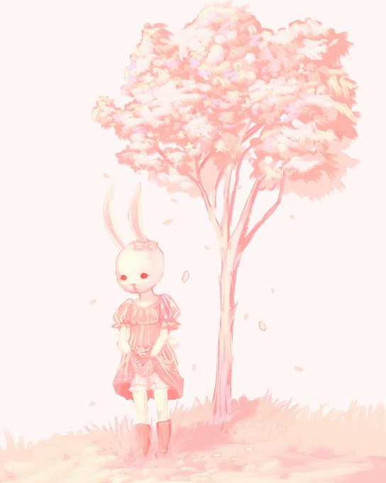

@rin_meraki I just opened commissions today I am an art student and I really like cold colors or just make several contrasts with only two colors
thanks for opening this space c:


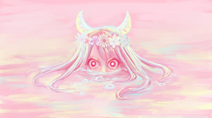

@_Mintisau_ Congratulations on reaching 400 this is my job, i just opened commissions today I am an art student and I really like cold colors or just make several contrasts with only two colors


I adjusted the contrast. This is the one currently on my pixiv and prolly gonna be my final revision. Twitter please add an edit post feature.