ContrastのTwitterイラスト検索結果。 10,505 件中 377ページ目


Essa capa do Dragon Quest VI é bonita pra cacete. Eu amo como evoca muito bem essa ideia de se aventurar num mundo tão maravilhoso quanto perigoso, com uma party bem diversificada e expressiva. O contraste de tons amarelos com o azul do vilão no fundo é 10/10


Me and my boyfriend both decided to make one of these and the ACCURATE, contrasting energies hurts https://t.co/waiCDzpr8Y


7/2/20
Second entry
#spidersona
This is the time I attempt a landscape drawing in contrast to all of my portaits


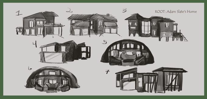
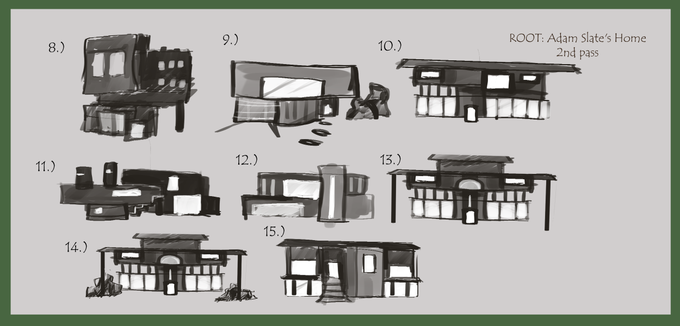

More location ideas for the antagonist's house! Proff suggested looking at brutalism for the 2nd pass and i decided to go for a symmetrical feel to amplify the contrast between the protag house in the earlier post :)


Day 3 of #OutfitAugust ... MESSY! Decided to keep Fancy in there cus I loved the contrast...


Je sketch Hades de Lore Olympus mais j'ai un doute sur l'éclairage et les contrastes, vous préférez lequel? 🙄

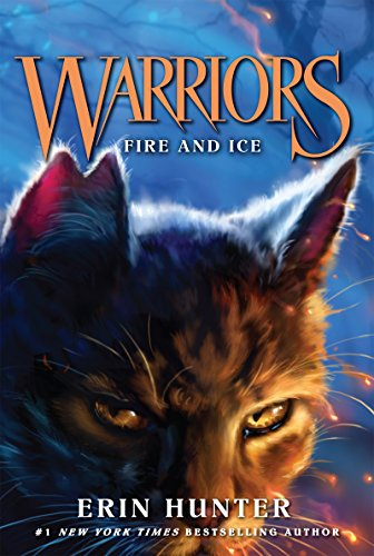
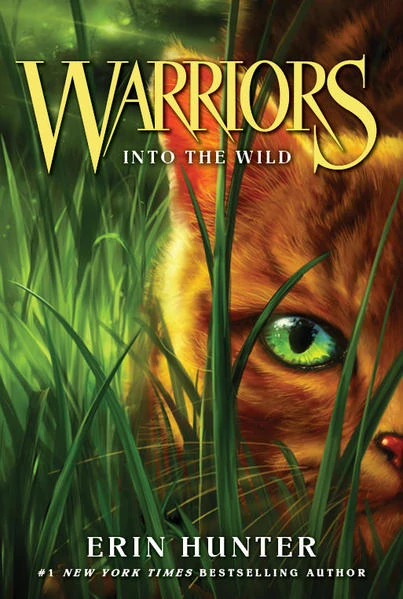
15. Hmmm... I'd say Fire and Ice as I love the contrasting colors that complement the title, and into the wild as it gives me that cozy, warm feeling of the beginning of a new adventure:


Hello #faceyourart
it seems I love only one angle and high contrast? hahahaha


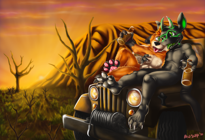


Fyodor, this time in the official masquerade outfit!
#digitalart #myart #illustration #fanart #bungoustraydogs #bsd #fyodordostoyevsky #fedya #dazai #crimeandpunishment #animeboy #anime #manga #contrast #19thcentury #russianliterature #gothic #ouji #vampire #masquarade
#halloween


I do love pushing the contrast up with Batman. See if the shadows are enough to show the form on their own.
It gives me confidence that I’m heading in the right direction. 😊


Mhmmm my personally take on human Nonnon HjnJnB I feel he needed Lolita clothing GINKNH Didn’t draw but Nonnon is kinda...known to be headstrong so he’d probably have muscle under as contrast to his looks
#AFTERL1FE #애프터라이프


a couple of shading practices ft. my version of raibaru!
i'm thinking of changing the bows to blue to give her and osana a blue/red contrast
#yanderesimulator #yansim


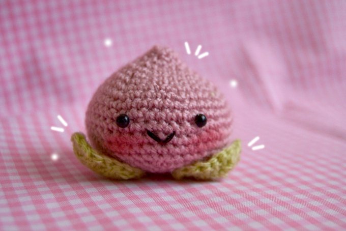

@Artpricott Your style is beyond adorable ♡ simple and light! Love the pastel hues and the contrast between your lineless style and our lined style !!! Your craft work is also wonderful! Check out @Artpricott for more cute art!!!


The finished picture. I tried working with a higher contrast when coloring.

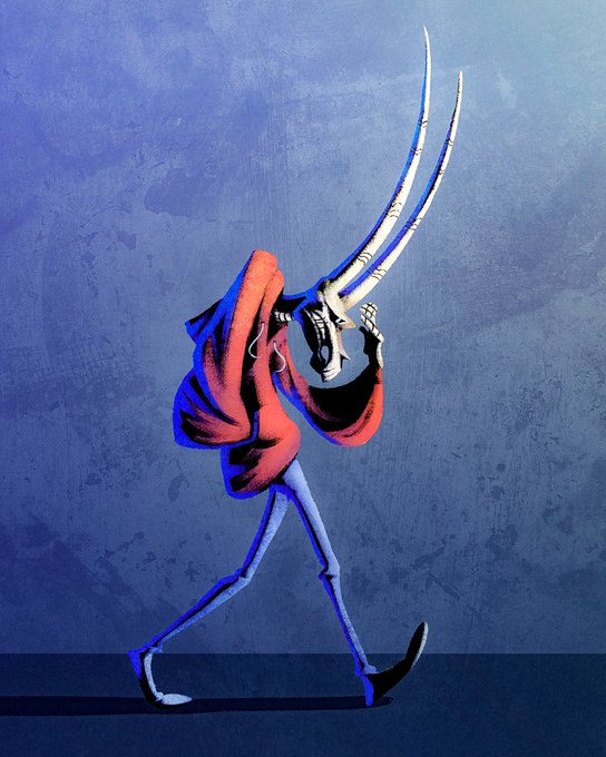


AUGUST ART RAFFLE
Win a high-contrast commission of your OC!
To participate:
🔹Follow
🔹RT
🔹 Comment with a pic of your oc and tag a friend!
I'll pick a random winner on august 15! If I get to 600 followers I'll choose a 2nd winner!
(OCs by @ZimtHandmade and @ScribblerRigby)


A birthday gift for my friend Contrast ! He likes Hat in Time just a little bit .
He streams sometimes , check him out at https://t.co/v8FjuyK7tp

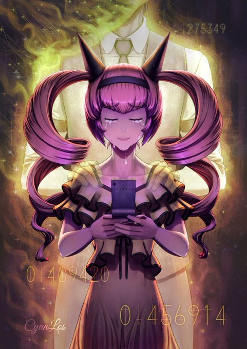
Looking back at my earlier art, "Rumiho's Sacrifice", I feel it was too dark for my tastes. So here's the same after an auto-contrast.
While I can't change the file on Pixiv, the submission on ArtStation has been updated.
#Krita #SteinsGate #DigitalPainting


