comparisonのTwitterイラスト検索結果。 22,161 件中 377ページ目


comparison shot if you wanna see how they completely overhauled rosaria and mona without changing tabs https://t.co/XKi6aOowKN


comparison teaser for some steven art i redrew! i'll post the full thing tomorrow along with the speedpaint (´▽`)


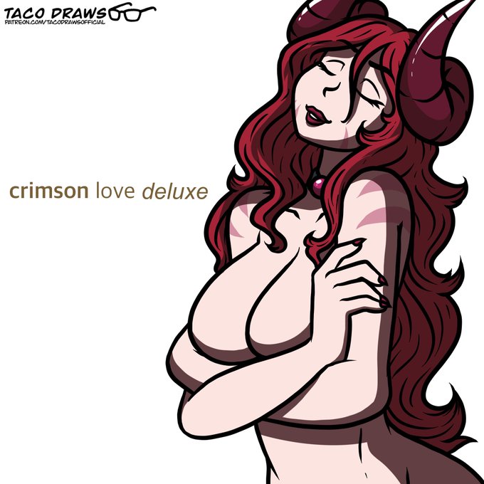
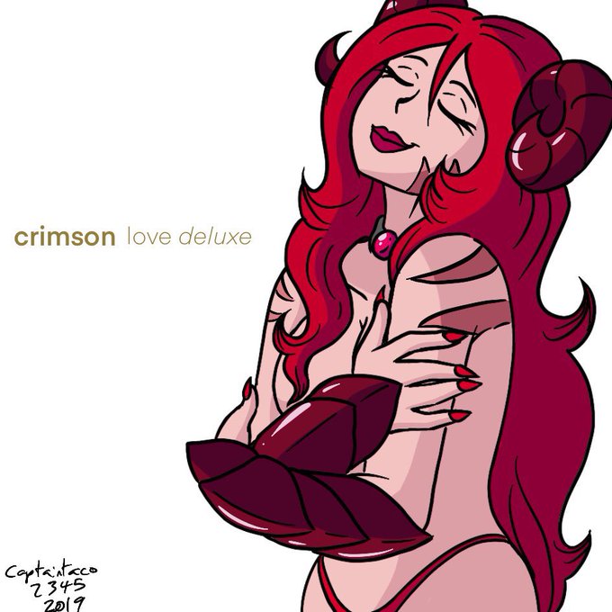
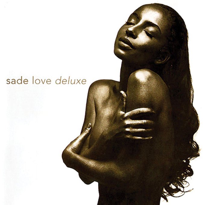
Redraw of my "Love Deluxe" album artwork redraw with Crimson! Plus the old version from 2019 and the original album for comparison


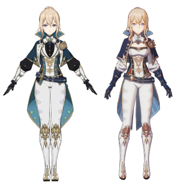


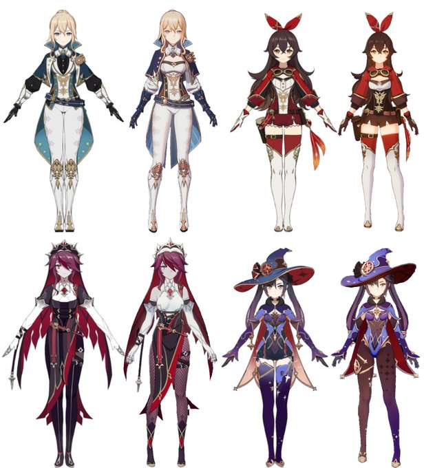
New #genshinimpact skins side by side comparisons
I really like the new designs!!!!!


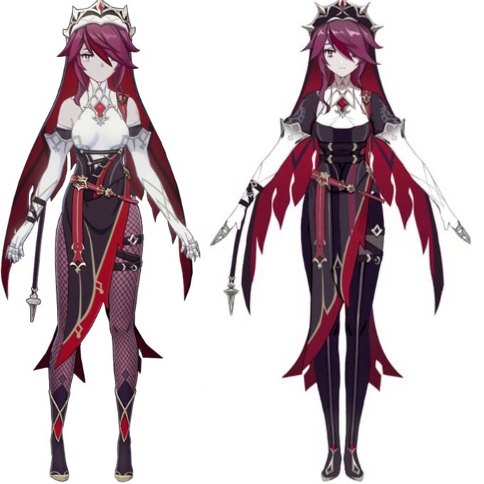

@GenshinImpact Comparison photos for people like me who could barely tell the difference


@TBSkyen I feel like in this particular case the comparison is. Very Bad? You're taking an HD illustration of a group of characters posed in a specific way and the most 240p lineup of cropped live2d sprites and asking ppl to compare the two. Be willing to be more fair with this, come on.


@Mikey_Wolfblade I was thinking more of B3 Boyfriend due to green hair
but I can see this comparison too


Had to give the new Ref Sheet YCH a test run, and decided to revamp Mimi's ref sheet.
Here's the comparison with her 2020 ref sheet!
Super happy with the proportions and feeling more confident for doing ref sheet commissions again!


A comparison of how a Shuckmeister community post and a random PNG of Diego Brando use CG:


The instructions are simple.
1. Appreciate that money you received for Christmas
2. Go buy a copy of Hexen here https://t.co/aFKk6Luv02
3. Lower the chances of being randomly shrunk or transformed
#sizetwitter #sizecomparison #TFTuesday #witches


Slightly adjusted the colors on Thelasa's Mournhold outfit. The old colors didn't have enough contrast from each other and were hard to see against the dark line art, so I hope this is easier to see. I also provided a comparison of the palettes.
HD: https://t.co/SR6BvEqj1g