ContrastのTwitterイラスト検索結果。 10,505 件中 380ページ目


i can't believe we finally figured out The Deal with this mario render and it's just that the most widely-used version had the contrast bumped up way too high and that's what caused him to be shrouded in darkness


"Trabajo en lo cotidiano, trato de encontrar poesía, magia en la vida. En principio, elijo trabajar en el espacio, me gusta trabajar con cuerpos en el espacio, contrastes. Pintar un tema muy actual pero de forma barroca, como Caravaggio.”
Magí Puig


Pushed the contrast a little further with this panel, made it pop a little better.

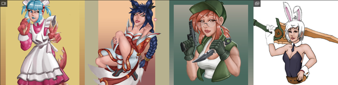


not to keep sassing frank miller but I'm gonna keep sassing frank miller
I understand the decision to let him do the cover art for these volumes, but……… oh man it was not a good idea to contrast his chunky-ass linework with the beautiful flowing style of the actual comic
-R


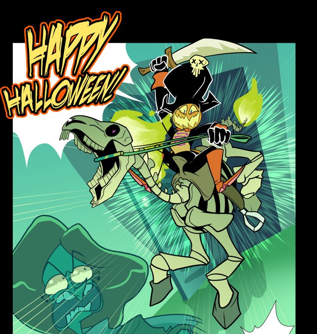
@BroadfootLenny I have a horror webcomic that plays with contrasting cute and spooky themes about Halloween night getting gradually more and more weird with trick or treaters having to fight off vampires.
https://t.co/8a5zQb0w0M
https://t.co/dHqRAbKZBm

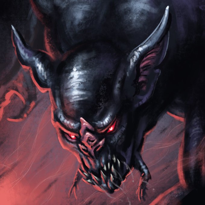
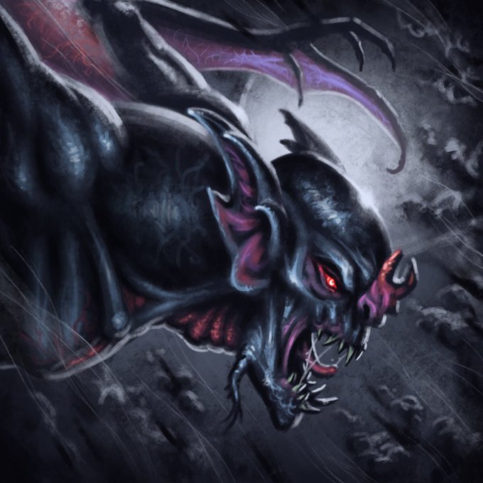
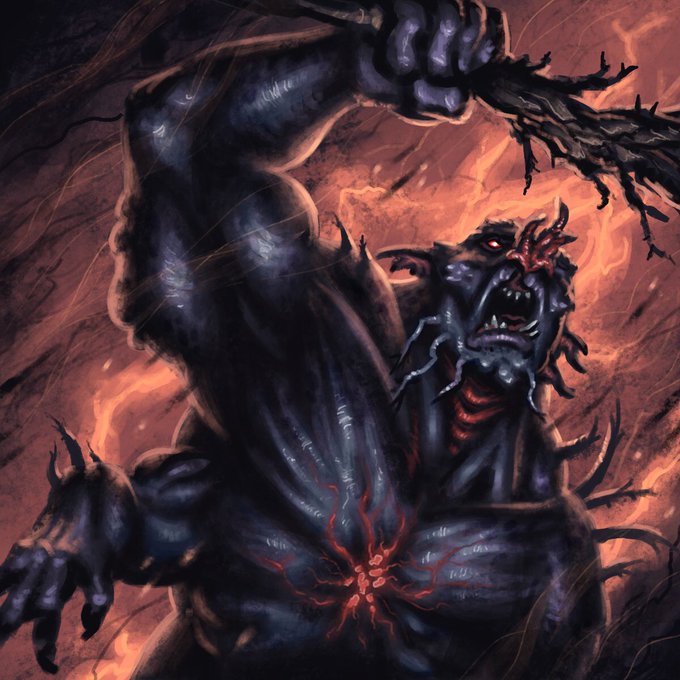
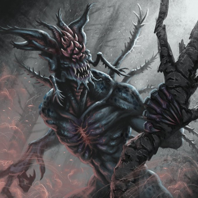
Some monster tokens I did for my current #DnD campaign. These were a lot of fun to paint, and a good lesson in both properly using contrast and space in a limited frame!
#art #digitalartwork #fantasy #creaturedesign


@AzuLewd Sigil can't really hold his liquor, but he still tries to force himself to drink whenever the guys are hanging together. He's also extremely needy and cuddly when drunk as a contrast to his usual withdrawn tsundere personality.

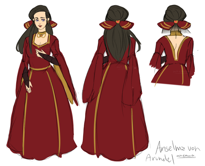
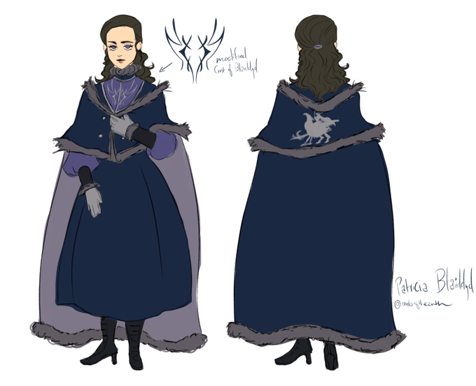
Quick reference sheets for Anselma/Patricia✨
I wanted Anselma to have a typical noblewoman's look since she's just a consort. In contrast, Patricia is the queen so she's a bit fancier. I ended up combining both Dimitri's child design and Edelgard's War Phase silhouette together


#lain_rewatch
Lain's voice has this distant, echo-y quality through the whole scene which contrasts so brutally against the clarity of Other Lain's mocking tone


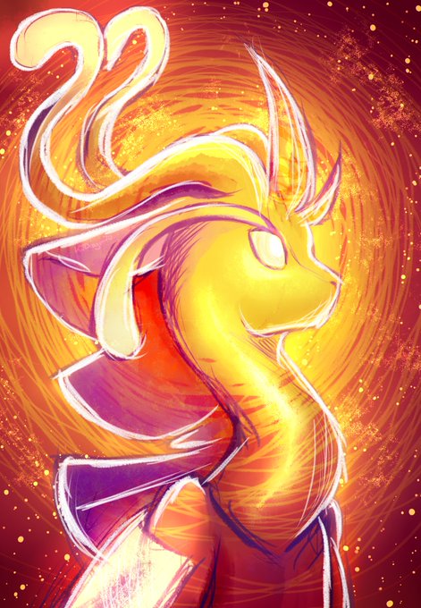
For my first time ever, I've tried using this artstyle for bright and colourful scenery rather than dark tones and high contrast...and I'm REALLY damn happy with this! uwu
Also,, showing love to characters I haven't drawn publicly before hehehehehehe! >=3


The contrast between Psylocke’s preposterously effeminate puffy pink costume and her warrior’s spirit can be explained through the concept of “the feminine masquerade” a theory that posits the subversive power of over-the-top portrayals of femininity. #xmen 1/8 @LetsTalkBetsy


-Dedsecks
Aquí el diseño del prota solo puede resaltar entrando en contraste con los diseños de otros personajes. Los cuales desconozco por la versión gratis..
En cuanto cabe a su disfraz, siento que no es funcional en cuanto a contar quién es, qué busca-

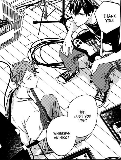
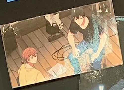
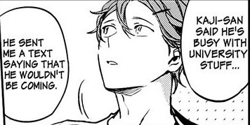


Today's Extra Eisner goes to Matteo Scalera for BEST COVER ARTIST, as chosen for our list by @kirixin.
Kirin writes, 'Attractively angular character designs come out to play with rich contrast and compelling perspectives...'
https://t.co/mwJBSU0kpB


@Slumberyote When I was originally making her I had recently learned about complimentary colors! I wanted to go with a mostly red-orange + green-blue combo. As time went on i made her colors less neon and harmonize a little better, while still trying to preserve that contrast/pop of color.