compareのTwitterイラスト検索結果。 380ページ目

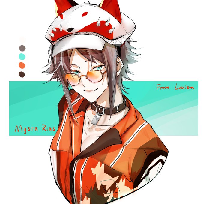
#MystArt
就是顺便把很久之前画的发发(本来还想修修不动了!!!
Compared with my previous works it’s really doesn’t look like the same person


[#oc]
I’m surprise how much Springter’s design changed so much over the years👀👀 Heres all of his old design compare to him now🤯💖💖


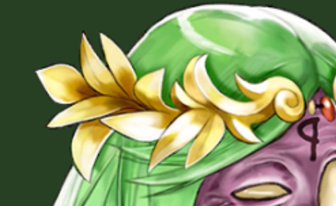
Fun useless kid Icarus fact!
Palutena’s laurel crown looks different in Uprising compared to her appearance in Super Smash Bros. Ultimate.

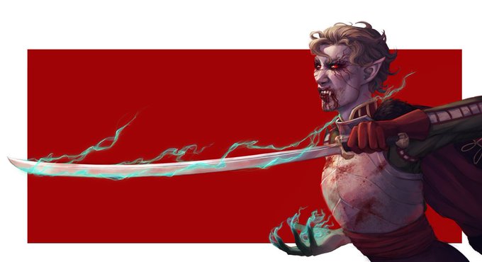
Bloodragers gonna bloodrage.
Here's Ilka, my Wrath of the Righteous protagonist. Dhampir, Bloodrider, Demon (into Legend), former hussar and also a sweetheart, especially when compared to my other characters.
#wrath_of_art #pathfinderwrathoftherighteous #dhampir #pathfinder


🍄 Myco T-Shirt Designs 🍄
Based on combining decentralized technology and naturalist systems, Myco compares a mushroom growth cycle to a cycle of building a healthy community, so it's been quite fun and challenging turning that idea into these visuals! 👁
Thanks @mycodotspace

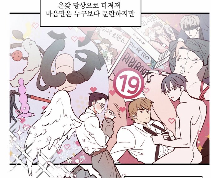
Seonwoo talking about how his mind is so dirty compared to his innocent outward appearance ….and guess what he reads THE NEW RECRUIT (spot the cover in the panel) and RIDIBOOKS. 😂 😂 😂 😂
펀치 드렁크 러브 / Punch Drunk Love: https://t.co/8jWQWfstyd


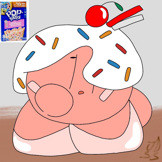


pony sci-twi!! i rly love seeing designs with twilight that give her super dark purples/indigos with white and gold so. i wanted to do one!! im gonna do a regular twilight design to compare them


Baby Yuri hadn't gained much love compared to the manga scan on Twitter, but she got a handful of attention on Deviantart.

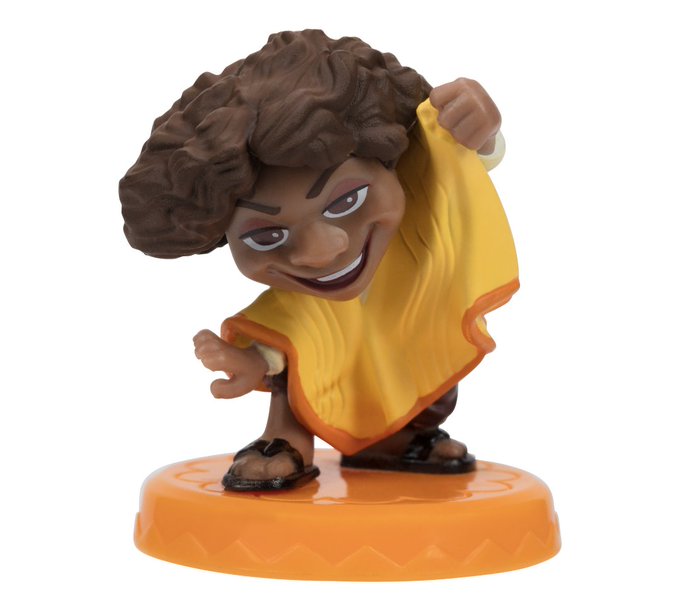


And the official toys have an entirely different color too. In the 3rd pic (also has brown eyes instead?) compared to the 4th, he is a bit darker, but in the dinner photo he looks bit lighter and more pink 😭😭

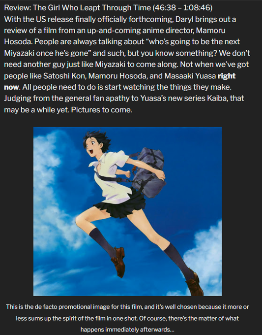
Comparably freaking yikes: I did my AWO review of The Girl Who Leapt Through Time in 2008, before the official US release was out. (This along with nobody else having seen it is why it's so short compared to how I go these days.) My 14-year-old show notes: https://t.co/TOM7XSQ8O3 https://t.co/BpNSX5KJFO


@MegumitheGreat I think it's because that's how Iwamoto shaded her nose in her character art, but when the shading looks flat in her anime artwork it looks more like lineart, and also pushes her mouth down and makes her face longer.
(just a compare with original vs. an edit to Iwamoto's art)


Wererabbit
Beastmen type monsters found in meadows. Compared to other beastmen, they are docile, friendly, and rather curious. They're also very restless and rarely ever stop moving and bouncing around.
#MonsterGirls #monstergirlencyclopedia #魔物娘図鑑 #魔物娘図鑑二次


i've decided to compare the earliest Haruka art that I could find in my archive with the lastest and man
I still have long way to go but i am glad that I am improving!


I think these are better to compare though, theyre drawn on the same tablet/screen. ffnkdkfkckd august 2020 vs october 2021

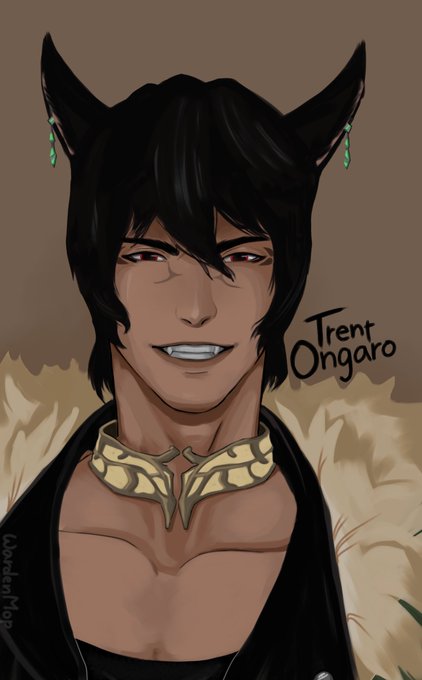

bruh that old drawing is kinda hard to look at in retrospect 😭 (not the most recent but i wanted to compare cat to cat)
<- January 2020 | November 2021 -> https://t.co/hKonaJCDg5


@dollanities @M0DELMUSE The joke was that they were fashionable, hip, sterotypical teens as compared to extremely serious and mature superheros. Sort of à la Kimpossible not wanting to work. You mention the time fashion of the time period and cite the point of the joke as "racy" whilst missing the joke.


the way me n my oomf got into a fight for calling this out lmaooo but yeah ik her whole shtick is that her hubby is the most handsome guy in the verse but????? ur saying this is ugly compared to that basic helmet-kun???? IK YOU LYING 😭😭😭😭 https://t.co/ZvNV4yO83n