ContrasのTwitterイラスト検索結果。 10,824 件中 39ページ目


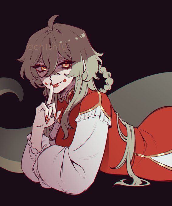
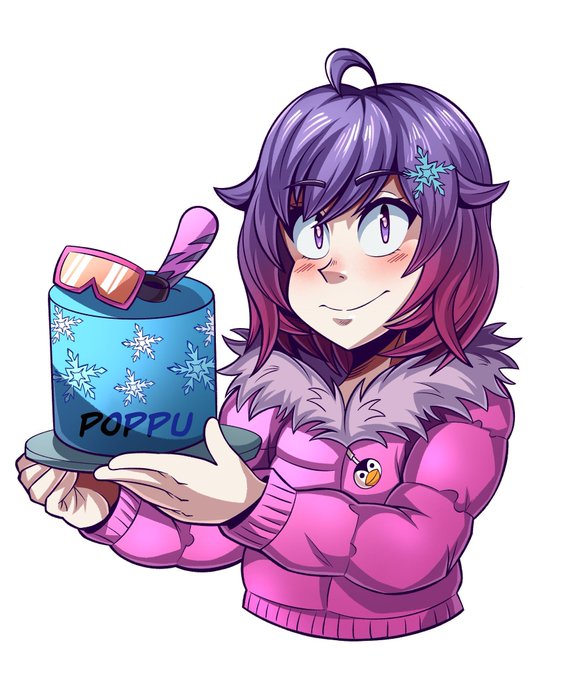
Maybe its just me but i genuinely do like the villain design. i think it contrast well with her daydream design https://t.co/Lf3rhslflQ


1/x Male Peasant
- I like the hat, so I try to choose a cloth that match the hat.
- I choose a darker background to have some contrast.

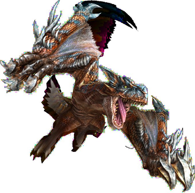

@AlatreonBestBoy If I ever had to choose actual redesigns I really don't like from Frontier it would be these two and they both do the same thing that I hate - they don't expand the designs and instead slap some sharp contrasting as hell edges on top of the sleek body of the OG monster.

🌸Vtuber vs IRL🌸
Perdón quise unirme a esto que he estado viendo por twitter jeje
Obviamente el contraste si es muy grande (╥ω╥)
Link https://t.co/XRgzXtQ6Ck
#Picrew #遊び屋さんちゃん


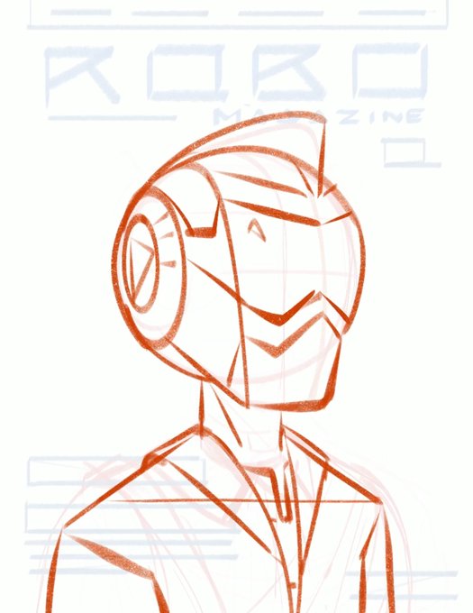

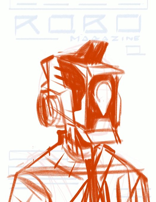

2. Design character
The character should fit the world and story you're creating.
In this case, I wanted the robot to feel more robotic/mechanical, less human to contrast the human outfit.
Tip: Design options to extremes to find out what you actually want/fits the story


@AzurLane_EN Looks like we're getting another skin pair bois.
Slightly similar to her sister's clothing, this outfit of hers instead highlights her butt and bust in contrast to her sister's thighs.
Not only does this skin show Chao Ho's behind but also her sister's; a brilliant addition!


@AliceCirilla And btw, the contrast between the black mask and his blue eyes >>>>


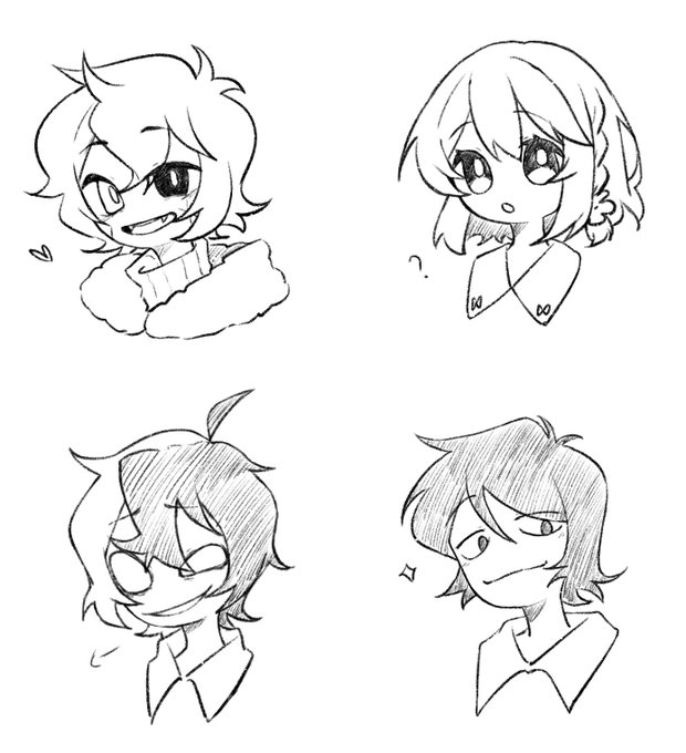
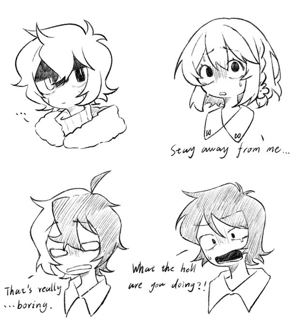

Sorry to bother you... I drew some contrast,just a personal exercise.💦
The last drawing is my oc.🥺
#MyDearHatchetMan
#MyDearHatchetManFanart
#MyDearHatchetManOC


"Beautiful day." 🌸
-
I was thinking what color should i put for her dress that I almost forgot the essence of her name- Gailey Periwinkle.
Quite contrast to the background tho, but i like it. 😁
#oc
#art
#gaileyperiwinkle
#artph
#illustration
#digitalillustration


Another @PlaySpellbreak retrospective featuring the poison character we eventually pivoted to Blackthorn!
She was supposed to be more whimsical in contrast to her element, so we had some really funky ideas for her!


Added a nice contrasting boarder to this piece.
Again, i prefer the boardered versions because it looks like it belongs on a sticker sheet!
But i hope you enjoy one or both versions! <3 <3
#applejack #mlpfim #digitalart #DigitalArtist


Floral Aipes is our #themethursday this week! Definitely some of these get looked over when they’re amazing! Love the blurry body as contrast to the details above! https://t.co/q9Z4K0r0Tp https://t.co/rHHnCDsdN0


Making a new print, but torn on the background color
Blue for that nice contrast, or pink to make everything a whole?
(poll in reply, disclaimer: result might not be the full decider)
#PokemonScarletViolet Tatsugiri


Hi! I’m Eva, a Mexican illustrator and Designer. 💜
I like high contrasts, vivid colors and cute things! I’m available for work!
#PortfolioDay
💻: https://t.co/5KA2VYqzN6
📸: https://t.co/9QZYMcDn5p
✉️:evazgar.anim@gmail.com


I want to know someone who drawn this. This gives not only sexyness but also beautyness of spring,simply beauty of her,contrast of her white skin like silk and her hair like black diamond

