CONTRASTのTwitterイラスト検索結果。 381ページ目

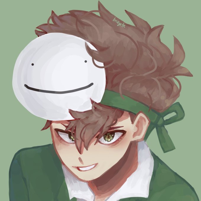
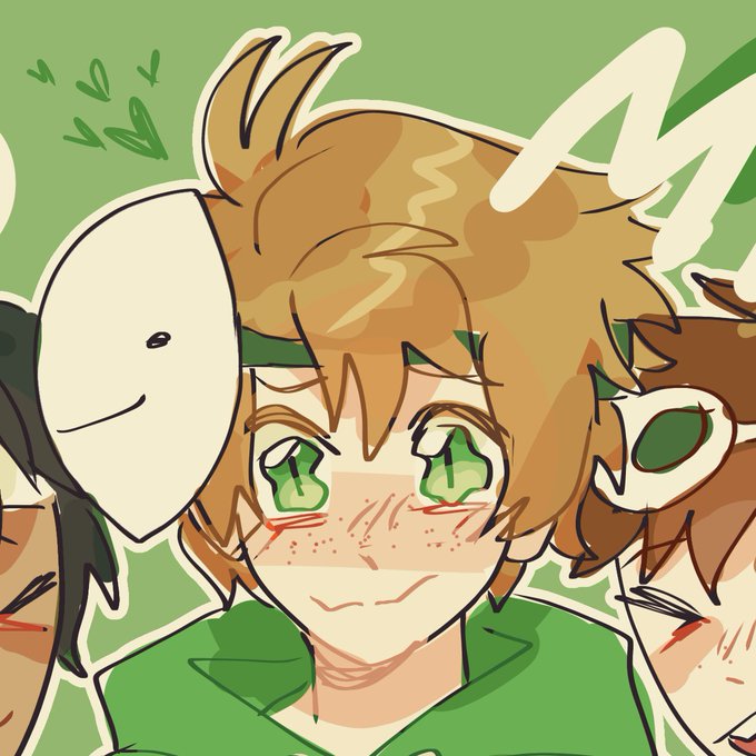


En fin, si llegaste hasta acá, ehh, ¡Felicidades! 🎉 ¡Te encontraste con un Matt hecho una papa! 🥔 Un raro espécimen que te dará suerte y paz mental por el resto de la semana 😌 (y no se preocupen, ya volveré a la normalidad, siempre lo hago, pero gracias por leerme uwu ✨)

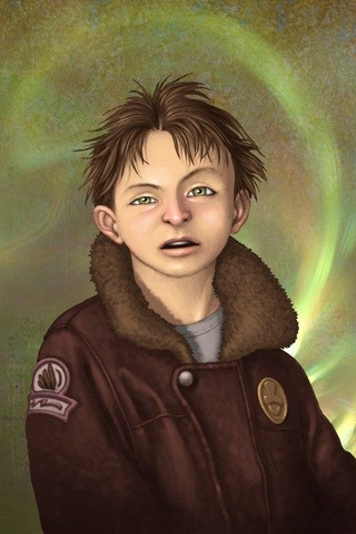
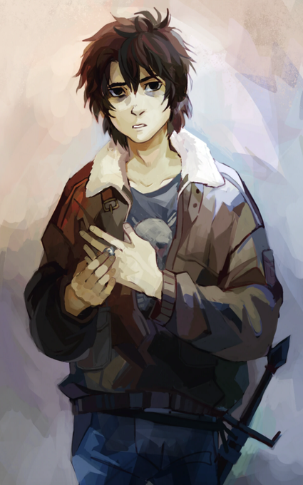
the contrast between the old and new official art of nico di angelo haunts me every day literally who ALLOWED that first one


The 2 latest characters in my African Fantasy series, this time royal courtier dudes. I worked a lot on the shape and personality contrast between these 2 and getting their personalities to come across in the drawing. Hopefully, I succeeded #digitalart #POC


If you're been around Target Rich for a while, it's obvious who her brother is. So, while she's virtually a direct contrast to him personality-wise, a certain look of madness runs in their family.


New artist alert 💫 @amber_does_art balances shape, and contrast to create simple, yet distinct, portraits! #commissionsopen 💜 check out more of her work here! https://t.co/FmUSoYa1PE


my good old flat mate Em is making me play kh so I drew these aimed at her/my experience with kh2 and I mean wow what a contrast

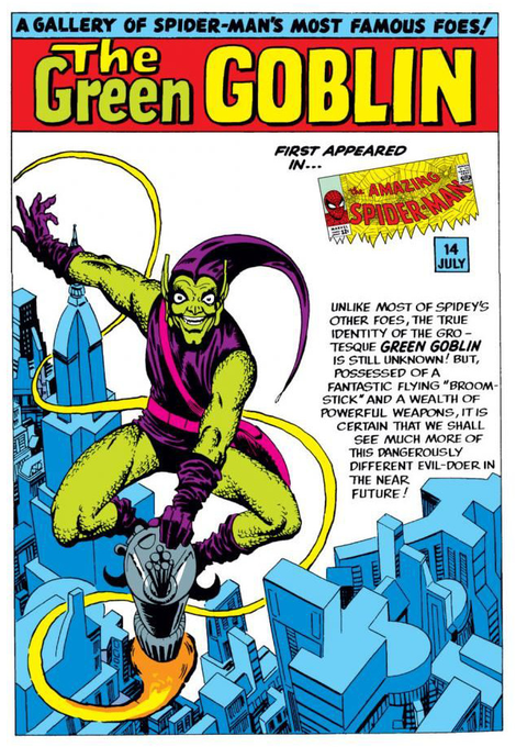

@SGuglie Sure was a running theme. I think it's due to it not only contrasting with the red and blue of Spidey but also that green is a sickly color, so green = disgust.

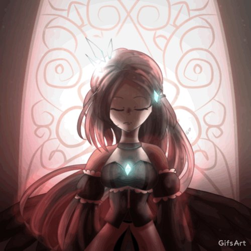

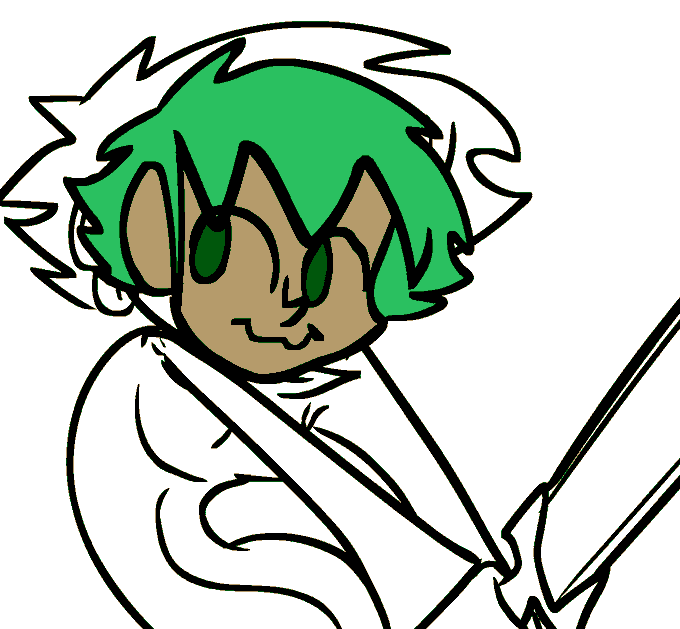
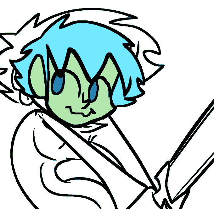


Nathalie Marino, also known as "Natso", creates energetic work of art using a bold palette with gestural brushstrokes, contrasting tones and lush textures. She is influenced by Abstract Expressionism and Action Painting. https://t.co/3gPXpgQyxl



A formal introduction to Johnny. He/him. Sad boy. Wears blues and greys to contrast his hair. Head is actually an apple.
.
#originalcharacter #oc


@Pudge_Ruffian @nyonn24 I really love the way they handle colors. There's an absurd amount of contrasting elements but none of it is especially harsh on the eyes

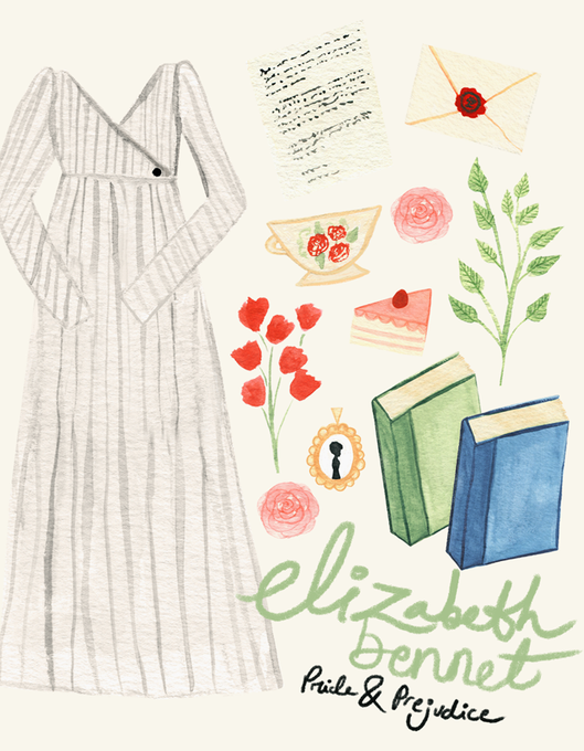
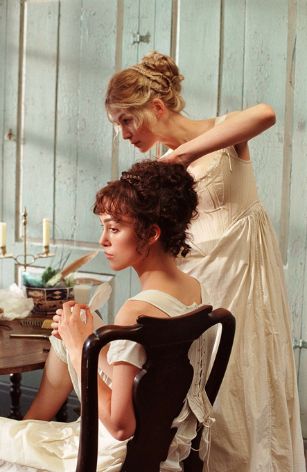
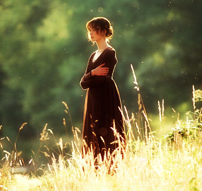
In Pride & Prejudice (2005), Elizabeth Bennet's wardrobe feels lived in with muddy hems and boots that contrast her swan-like cream & earth toned dresses. Designer Durran saying Joe Wright wanted Lizzie to be more "interested [...] in nature & the things around her" than fashion.


Heywood is a neighborhood of contrast—from modern skyscrapers and parks in the north, to dangerous, inhospitable slums in the south. It's “the biggest bedroom in Night City”, where gangs like Valentinos and 6th Street get down to business—legal and illegal alike. #ConceptArt


Glasgow artist Kayleigh McCallum (@kayleigh_mcc) is exhibiting a new abstract collection of work, created over lockdown, focusing on bold colour and contrasting textures!
https://t.co/lIOFnjF4Jr


@EmirichuYT After base coloring, I usually decide on the light first. If the light is yellowish, I make the shadow purple-ish, that way it creates nice contrast. Another way to color is to decide on the mood first, then make a color palette afterwards.