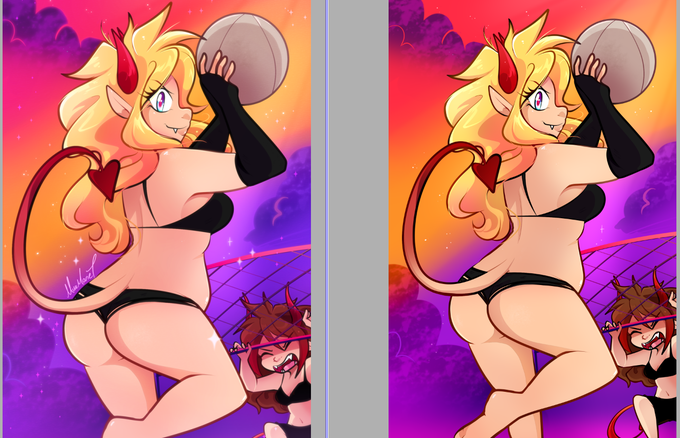
CONTRASTのTwitterイラスト検索結果。 382ページ目


Don't you just adore the gentle contrast in @DoryWhynot's second half of their diptych "Echo"?
.
.
.
#beautifulbizarre #artmagazine #newcontemporaryart #echo #watercolour #painting #portrait #art



I'm dying at the contrast of Johnny Depp rocking Tom Ford suits all week and then when the weekend comes:


google your name plus "anime" plus "aesthetic"
los contrastes entre sid y yo son evidentes https://t.co/iswe9gV5CX




"Beyond Ordinary Limits" is an expressive gestural abstract painting by Linda O'Neill. An animated range of contrasting colors, lines and forms bring a power and depth to the work. Her aim to to bring "transparency to raw, authentic emotion". https://t.co/CLSt7oeo6I


@Fumimi_art I’d probably ship Yoru with my character Piko!! The contrast in colors and probably personality would be really good!!


Finished version of this drawing 🌸
I couldn’t decide what color I wanted the gas to be initially, but I ended up picking yellow for the contrast
#ICantBreathe #protest2020 #ACAB #furryart #Teargas #BLM #BLMprotest #BlackLivesmatter #DefundThePolice #PoliceBrutality


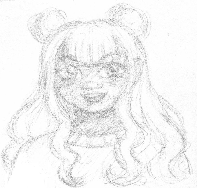
You might recognize this one as Shanna, she was actually gonna be my orange sherbet O.C. but I liked how the mint green contrasted with her skin tone so I decided to make her mint ice cream! I renamed her Megan last night, I think it fits better now. ^-^


After i listened to @HazbinHotel s new song ‘ADDICT’ (love it btw) i got thinking.... what about heaven? What is heaven like if hell is like in the show?
My take, its controlling. In contrast to hell as wild and free, heaven is controlled with an iron fist.


One of the final illustrations from my character design class. The goal was to get out of your comfort zone and to learn something new. I paid a lot of attention to light/darkness contrast. This gives an illustration more depth.
#characterdesign #illustration #digitalart


@jtabartefacts hey there! thanks for the thread! 🤗 My name is Emily and I‘m digitally and traditionally painting and drawing for 10+ years now. I love high contrast work!


Making progress! It's hard to create contrast with yellow and white as the main colors T-T, but i'll give my best! 🏝️
#WIP

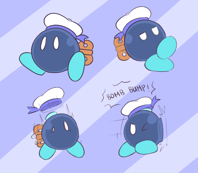
tried to spruce up bobby. made him a lighter blue to contrast the autumn area he's in, and gave him a kiddie sailor hat cause this dude is a chill yet clumsy guy #PaperMario

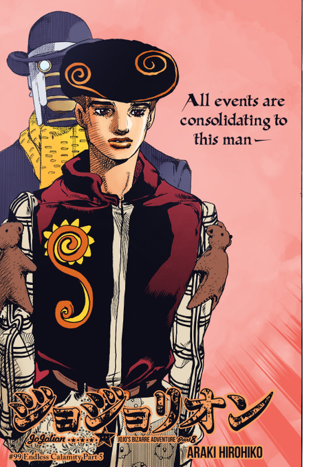
Colored the new chapter cover, wanted to give Tooru and Wonder of U contrasting tones
#JoJolion #JoJolion99


Alexandre Calame was a Swiss painter of the 19th century. Most of his paintings depict Swiss mountain landscapes. His work masterfully contrasts the calm with the brutal side of nature.


The name of this mysterious creature is Replid. He is a hybrid of various creatures, an artificial being that cannot exist in nature. Although it is a contrast to the symbol of nature, Gionatura, he seems to set out on a journey with him to discover the secret of his birth.


customer didn't like the contrasting light so I had to remove it
tbh I still like my previous version
#art #commission