ContrasのTwitterイラスト検索結果。 10,816 件中 384ページ目


#DustManContestN2 #dustmanadventure luego de recobrar mi contraseña y decir vamos hazlo si bien tarde y mi diseño quedo muy a medias la verdad es que el concepto es muy viable espero que si bien mi diseño no es elegido el concepto de warshipman se utilizado


I blocked in "colors" as shades of grey to figure out values/contrast, threw a Difference layer effect over it, and left it at that wrt colors. The last attached pic is the beginnings of a pass at colors (that fucking blue again!!), but it didn't get any further than that.


9th colour scheme #icon set! <3
Characters: Aurilija, Dax, Raphael the Robin, Aster
I love the simplicity and contrast on Raphael. One of my new favs for sure!


Idk about painting but I learn a lot making this piece 😭 i still don’t have the courage to make contrasting shadows but here’s soft-painted kenma fanart ❤️😣🔥


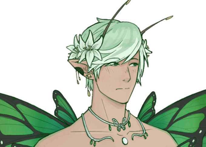
I like how she looks a bit goth because of her colors lol I really like the contrast. Didn't want anything fancy, just something cute she'd wear when not adventuring. I have 0 fashion skills. #paleelf #pillarsofeternity

i’ve never done something this high contrast but it slaps (still working on it)

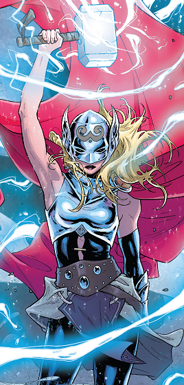

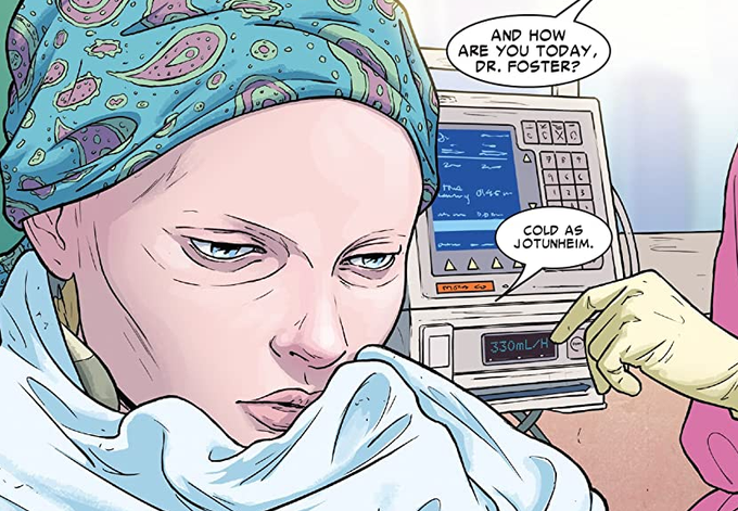
they are all on sale here https://t.co/nUT641PPmS. the art team bring a truly mighty representation of the many different realms, while still bringing an emotional and heartfelt dynamic to Jane's scenes. it's a great contrast that contributes to making Jane the MIGHTIER THOR.


And the color! I love how vibrant Tokyo Babylon is... it's a really fun contrast to look at so much of the art (less so the 3rd since that one isn't so bright pose-wise) and think yay! Happy trio! And to then actually read what's going on... Man. I'm bummed I lost my 1st omnibus.


Also she normally isn't that color-- her skin turned porcelain white as one of the 8 curses she immediately felt the effects of (regular radioactive Neut pictured for contrast)


@Mikesdarkroom I would love to see it.
Here is something that failed to meet my own personal standards of quality.
The contrasting color in the animated GIF wasn't strong enough to pass the squint test.
I never intended to post this online.
These are only drawings. I can make more.

This seraphim design reminds me of a falling star, but I’ve also been told it looks like a fish. I like that it’s not symmetrical, so it contrasts with the other seraphim designs.

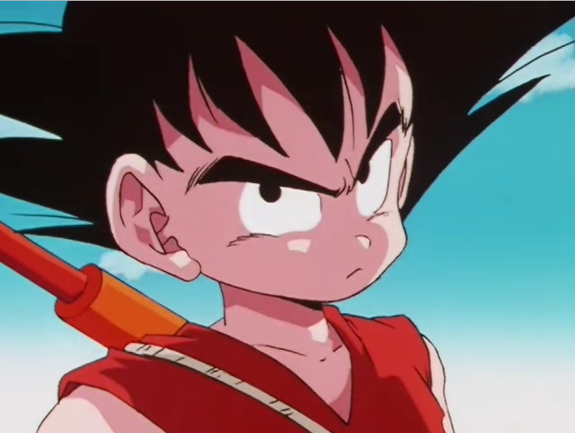
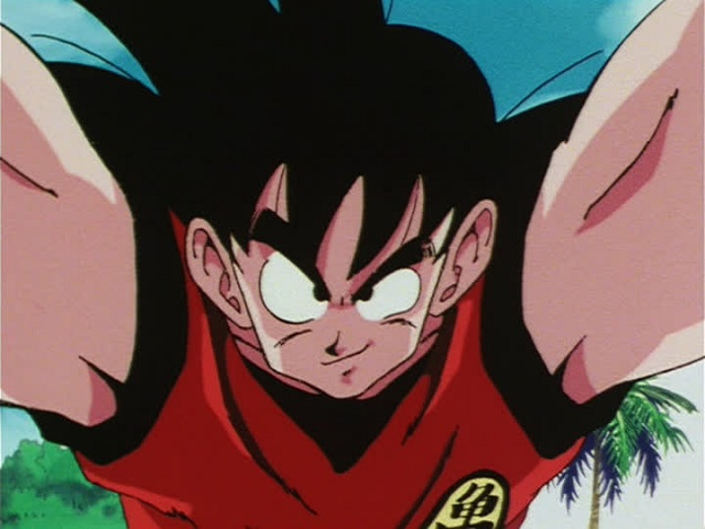


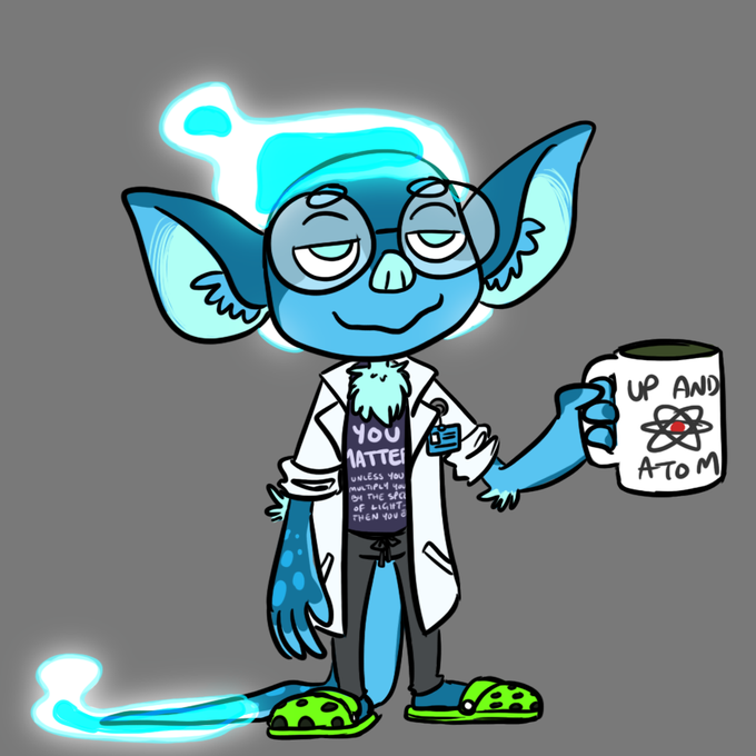
but also serious/focused goku is such a good contrast for those situations that call for it


I uhhh... I can do more pala from watercolor to this HAHAHAHAHAHA
Iz my oc tho!!! Luna's contrast, she's haru, a bright and wild girl, and I'm feelin like she has a boyish attitude.


Raffle prize for @sobu_hasy’s raffle, for the winner @kanan_fox! I really really enjoyed doing this one, I’m weak for good contrasting colours and that turquoise is so pretty! 😍😭


@adorablimp Contrast this with Muffet, designed by Michelle Czajkowski. The OC was a freshly designed one, therefore, it had no sort of gross history behind it whatsoever
3. While it's true that you can find those characters having big tiddies in Google image search, Sam's art is much worse


... just one random tiefling designs of my own - cause esthetic and stuff (maybe I will play him later) - really like this certain contrast between dark brown and gold - what do you think? ... design by me #DnD #DnDcharacter


Roishat, Pokémon serenata. Creo que al final me quedó un contraste decente entre starters para haber sido creados en un día cada uno 😂
Escucho ideas espeluznantes para mañana 👀👻
#regionexpreschallenge #fakemon


eu acho simplesmente perfeito o estilo dos irmãos de suna. ao mesmo tempo que eles são super diferentes um do outro, eles tem o mesmo estilo, isso faz eles serem ainda mais lindos. tem um contraste entre eles, sei lá??
neste perfil nós amamos temari, gaara e kankuro ok