ContrastのTwitterイラスト検索結果。 10,505 件中 389ページ目


Coloquei um filtro de cor, diminui o contraste e a resolução


the contrast between raik when i first made him and raik rn is so fucking funny


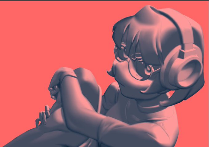
Tried something different with this, I took the pencil sketch and set contrast to max, then cleaned up the artefacts and such
Quicker and less painful than tracing it manually
(also yeah it's Evil Scarle)
#digitalart #originalcharacter #ArtistOnTwitter


She married in 1924 & graduated a year later & moved to Havana. She was influenced by ideas of equality & was a member of the Cuban avant-garde. Contrasts (1927), Requiem (1928), Degenerate Madonna (1930) & Ethel Ashton (1930)



I'm just repeatedly going over Emet-Selch's shadows to increase the contrast to an acceptable level. Think I might need to add more pigment to his lips again....and figure out how pomegranates work, UGH.
If you want to catch me streaming him, follow https://t.co/2tJZqfHq6p !


8. Adjustments
I like to adjust the color balance setting to make the shadows blue. And then on top make a layer of solid red-ish color then set it to multiply. This'll make a nice contrast of cooler tones on the shadows and warmer tones on the lights.


By contrast, this is Powerglide, a flying autobot who is modelled after late 20th century pilots, and is therefore, an immense dipshit




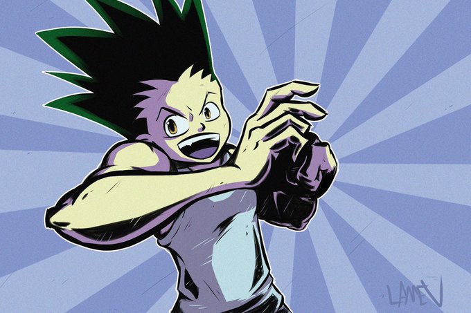
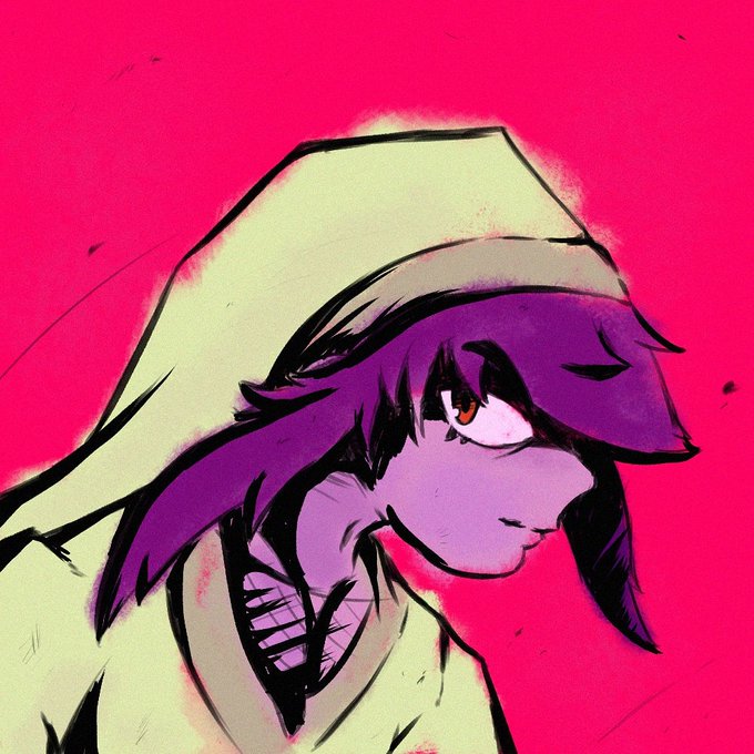
@riressam My name is Cris, I do mostly fanart and I like dark contrast on flat simple colors. I enjoy interacting with the community and am glad to see other's amazing art!




The Beauty and the Beast
There is something incredibly poetic about the contrast in human x beastman pairings, I hope to draw more of them soon.
#Sdorica


So I’ve made two versions of my new ballerina drawing, which one do you think looks better? I really like them both but there seems to be better contrast in the second one #illustration #procreate

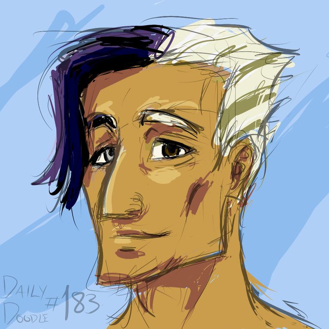
Testing color for the moon man. For his skin tone, I was thinking about contrast, how it would fit with environment color (he would probably appear mostly at night,) and probably should consider ethnicity (he is probably a mix of arctic people)
#doodle #dailydoodle


Took awhile, but I love Ram's new design and I wanted to test out using colored lineart, but darker lines and higher contrast shading really fits her better. #GUILTYGEAR #GuiltyGearStrive #Ramlethal


Me apetecía practicar los contrastes de mis dibujos pero no me veía capaz de empezar nada nuevo así que me he puesto a retocar mi icon


~13min w/quick build technique (layered previous pieces) in #procreate. This is a WIP, posted w/the contrast bumped to highlight the process. #horror #horrorart #rpgart #art #digitalart #digitalartist #darkart #warhammer #40k #warhammer40k #fantasyart #dungeonsanddragons #undead


So I know its a variant of the Locus but why the Zebra stripes? Like its such an odd pattern, especially in contrast to the typical Banished color scheme