imoのTwitterイラスト検索結果。 389ページ目

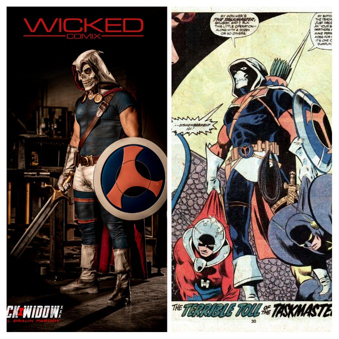

The Adult Indusrty or Marvel.
Which one does it better? (it's no contest imo)

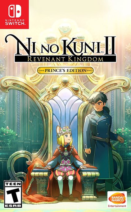
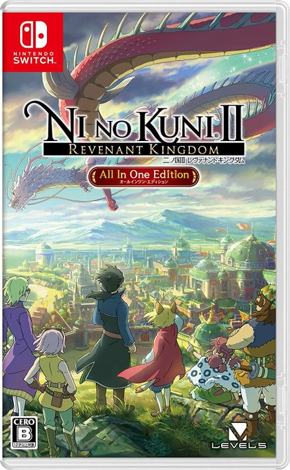
U.S.' Ni no Kuni II: Revenant Kingdom Prince's Edition vs. JPN's Ni no Kuni II Revenant Kingdom All In Edition cover art.
Which one do you prefer?
IMO, that JPN cover art is gorgeous!

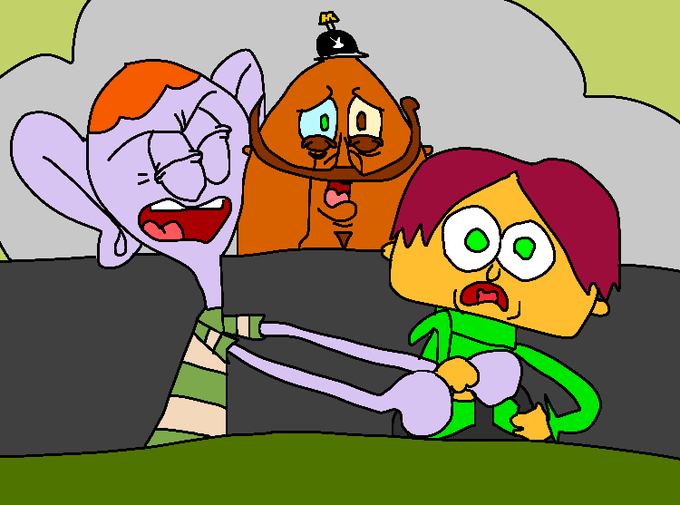
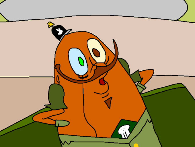
Benny: "Razputin!!! Give me that wheel!!!"
Raz: "I got it!"
*The two argue and break the steering wheel of the tank*
Benny: "Just let go of it!"
Oleander: "Oohooho..."
Based on Spongebob Season 6 Episode Boating Buddies.
(This is an overhated episode imo)

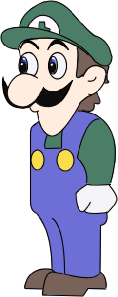

Uncannily drawn video game characters like Weegee is a trope that should come back imo

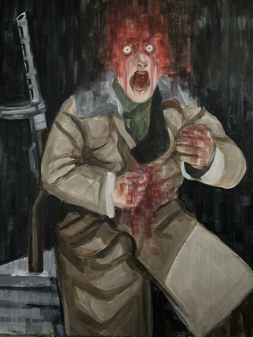


This looks like zombie color,but i think it give more scarier look than before imo https://t.co/ONTvKSPuus


dis. the arms are too bright imo. I was picking colors from a reference I drew a while ago. but all the other colors I made darker/ more saturated except the arms


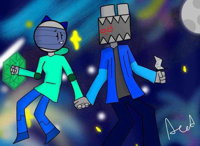
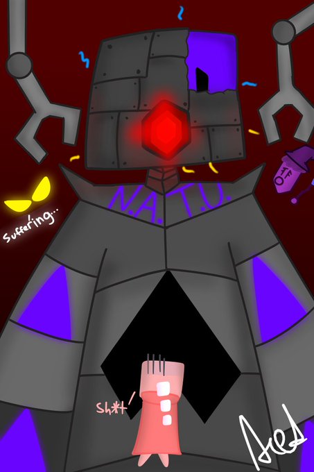

@finnaboo #ProjectArrhythmia characters and ocs of my own.
Not that good imo


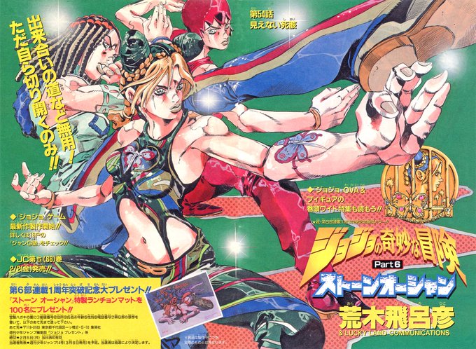


@neon_ufo @Pt6Confirmation Araki helps pick the colors for the anime from what I know, and he seems to chose them on the colors he likes the most which is why giorno was pink! He depicted Jolyne a lot as yellow in official colorings and he also mostly draws FF red so that seems most likely imo


So I made this art as a redraw for a drawing I did back in 7th grade, imo I think I did a really good job, I changed squirtle's name cuz I didn't like it



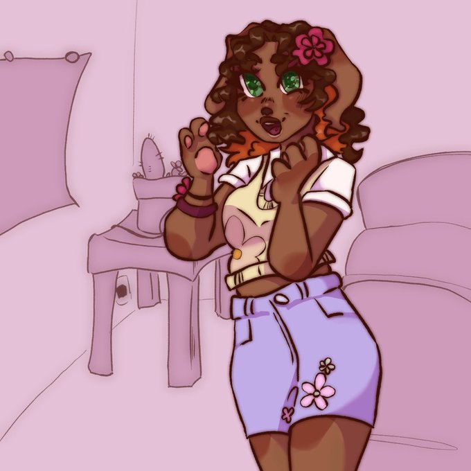
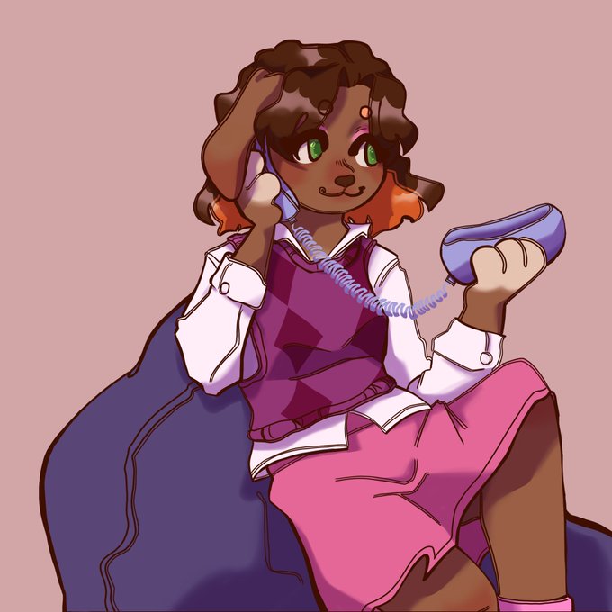
i’m not a savvy fan but! her design is super cute and she is imo the best dachshund lps #lpspopular #lps

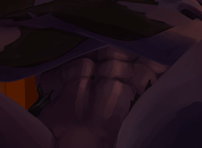
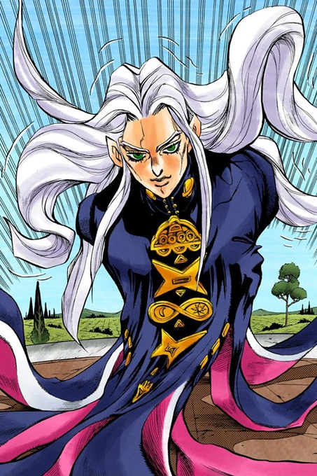
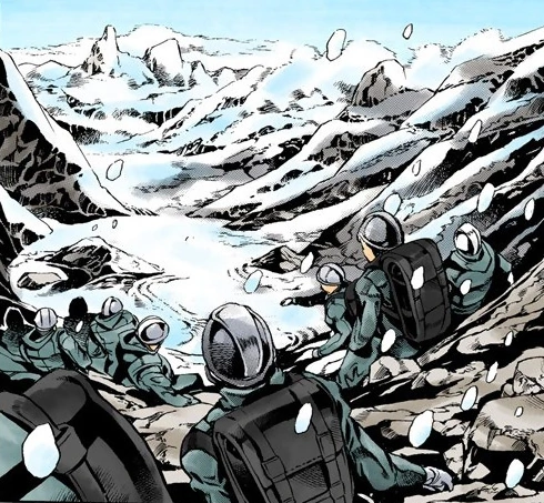
i think because of the fact that the stand arrows originated from a meteorite's metal, Mikitaka really might just be an alien its not too far off imo? Not to mention he just seems really honest and straightforward.

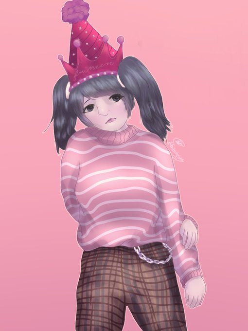
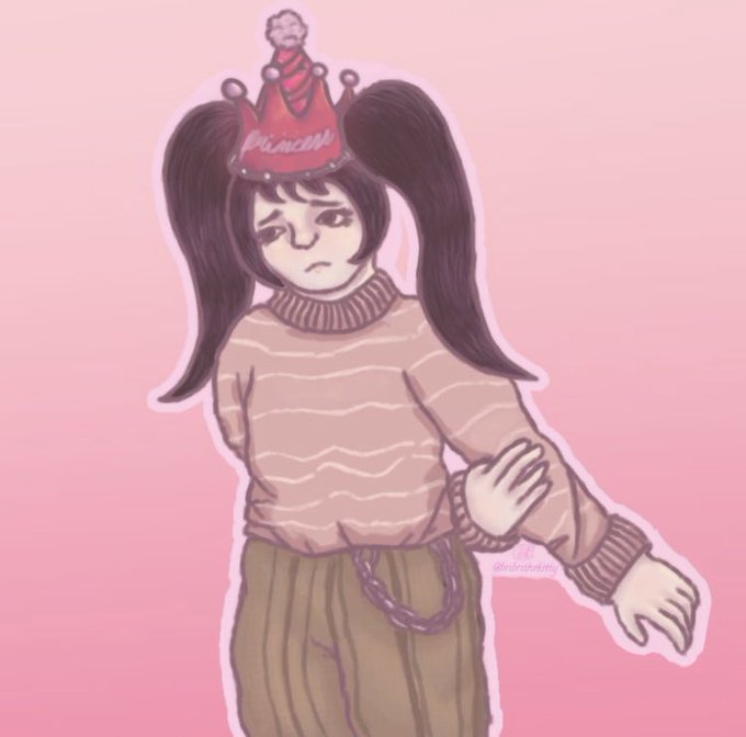
So, I redrew my first twitter commission for @EggressiveE! (I’m a little disappointed in how it turned out lol. The old one is a little better imo)