ContrasのTwitterイラスト検索結果。 10,816 件中 391ページ目


-Not official colors-
I had FUN coloring this! I've been playing too safe and too low contrast for the last 7 years, lol. Here's my first remedy of that in a @DrewStruzan study/homage coloring I did over a @JScottCampbell Comic-Con sketch he drew last year.

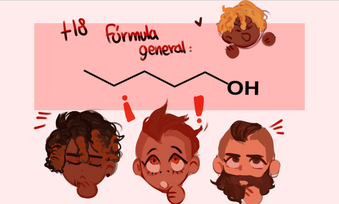
Hola buenaaas <33 les traido el privatter con química que prometí, partimos con algo fácil <3
💕💕 https://t.co/PlXrEvHLYa💕💕
Contraseña: La fórmula Molecular del siguiente elemento
ugu <33


Here's the various versions of Honey Lemon they made for the film in contrast to how she looked in the original comics. I have to remember that people don't realize that Big Hero Six was a Marvel property prior to the film and it's been changed a lot.


Artist: Jon Juarez (@@harriorrihar)
Stunning use of contrast and sparse pops of color to draw attention!
Source: https://t.co/UJ3xvICfdN
Support FBF: https://t.co/4X2iMVNrRD
#agorastudio #animation #framebyframe #illustration #art #drawing #ink #color #drawinganalysis


@AngelusLorelei sometimes I miss when her hair was dyed purple but I just can't vibe with it in her human form. possibly because the contrast with her skin isn't great enough or something


versão com fundo branco porque o contraste tá melhor 💛🌿
#avatarstarterpack

i love the contrast of "this one only happened due to comic licenses aligning" and " these are owned by the same company so they could've done this whenever lol" https://t.co/y2MsZ2CqeD


Variant Cover Of The Day – #RedSonja Age Of Chaos No.5 by @erikburnham & @DynamiteComics
Art by @alanquah & #KomikakiStudio
Just love the contrast between the pale-looking Red Sonja and the demonic green glow of Evil Ernie and Smiley. Great composition and colour work, imho.


updated one of my tieflings for better contrast recently. one of my absolute favorites from the set


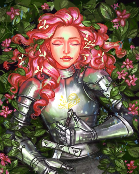

@thatmivy 🖤 Hi everyone! I go online by Hyanide and I paint a lot of colorful and high contrasting characters ✨
🖤 Here are a few of my recent works, hope you guys like them!


@Smuggiess Thank you for this thread! 💖💖
Hi! I'm Byu, I'm 21 and I like to draw people and stuff. I like circles colour dodge lol 🌺🌺 also my colour schemes are all over the place but orange is definately one of my favouride colours to use! I also really like the blue-yellow contrast.


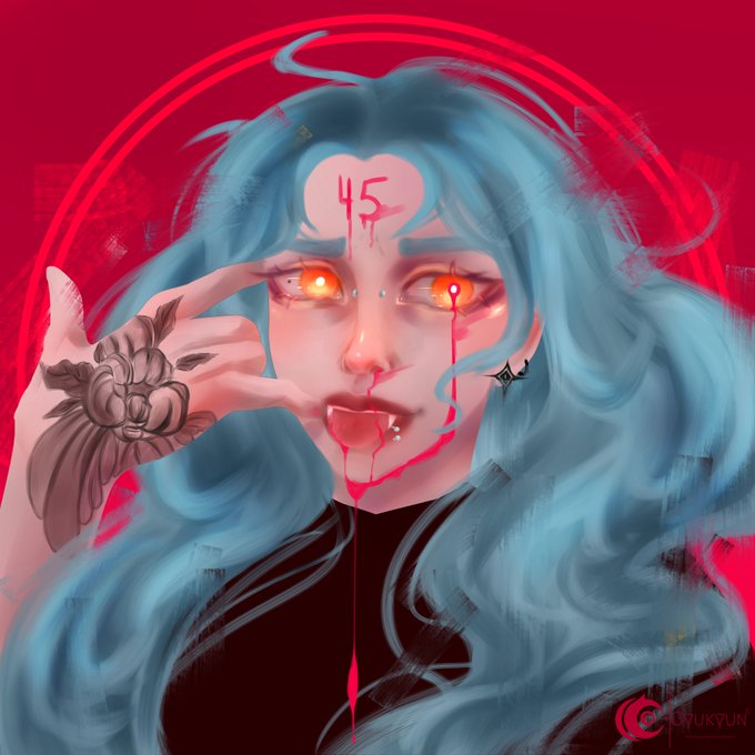
Sometimes I go overboard with colors😁 Especially, when I am listening to fake 80s new wave in the background XD
My sad cookie Werner and his two touchstones: Kayley - a kid he helped raise and Leslie, his exwife. What can I say I love contrasts 🥰#vtm #clannosferatu #vamily


Seductive and mysterious, Jang Koal’s use of soft #feminine shapes contrasted with a bold colour palette, explores the curious beauty of the modern woman.
Check out Jang Koal’s work at the upcoming exhibition #HouseofTheRisingLight!


@NFrog6 @AnsgarTOdinson This isn't about it being a woman, this is about poor construction within the parameters defined by the syle existing purely to facilitate the presence of a thigh gap.
Here's the original contrasted with a quick edit that keeps it from breaking into the uncanny valley.


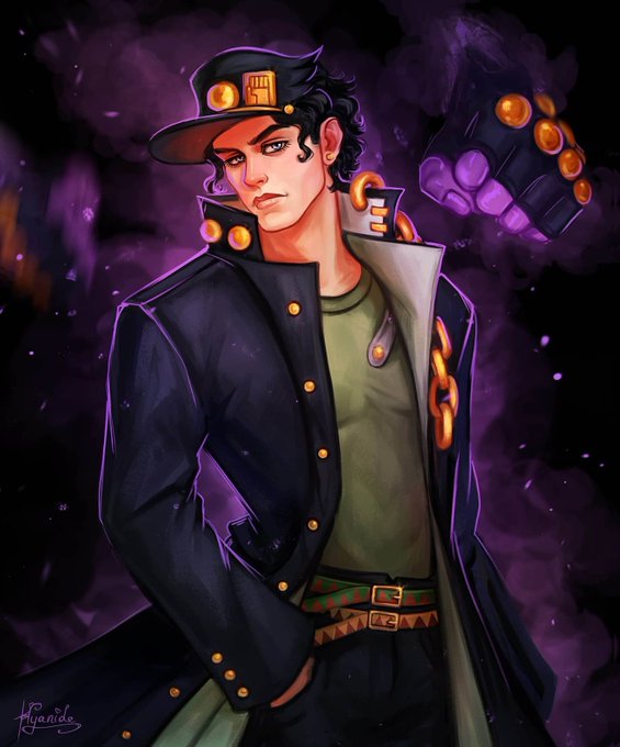
Alright alright- final final improvements, the ribbon earlier detracted from the piece, and I think it just needed a bit more contrast for the lower arm, and a clearer hamon with the wakazashi -3-


Trying to do more environments. I'm still getting used to the lighting of my Huion tablet. I think I might bump up the contrast a bit.

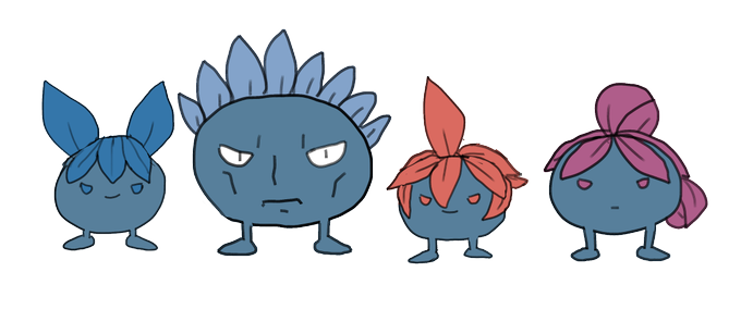
as a contrast to that team galactic drawing here's what tim requested, which was Team Galactic as Oddishes


tiny lil sketch of my OC
obviously the contrast between values, texturing, general details, and the perspective cane be improved but i just drew this because y'KNOW WHAT?? I FELT LIKE IT. I FELT LIKE IT SO I DID IT.
#art #digitalart #comic #OC


i just like round boy lionel cause he used to not be and anyway i think him being soft works better anyway as some contrast to raphael who's like. all sharp points