ComparisonのTwitterイラスト検索結果。 22,229 件中 398ページ目


i saw someone on tiktok post about this and undoubtedly someone on here has drawn this comparison but its sending me to A Place


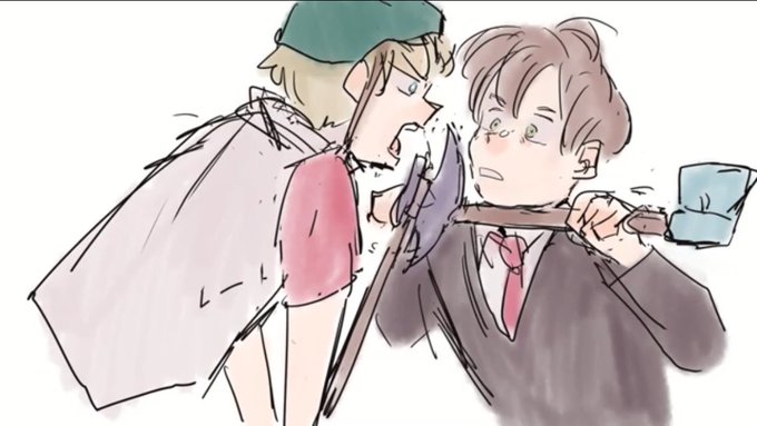
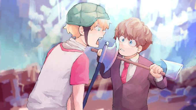
Behold! The comparison of the face that draws and the art itself!
#artvartist2021


@vidrar_sky was reading our TO2S comics when they got to the semi-finals and made this comparison


Back on my bullshit:
Made this one last night at a rush of inspiration and ended up making V2 a gunslinger instead. V1 on the side for comparison


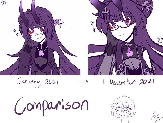
Christmas account decoration is complete. Drawing snow on Gen's SF Alpha 2 stage just for the banner was a bit of an overdoing, but i'm glad i managed to pull it off. Here's a quick comparison \o/


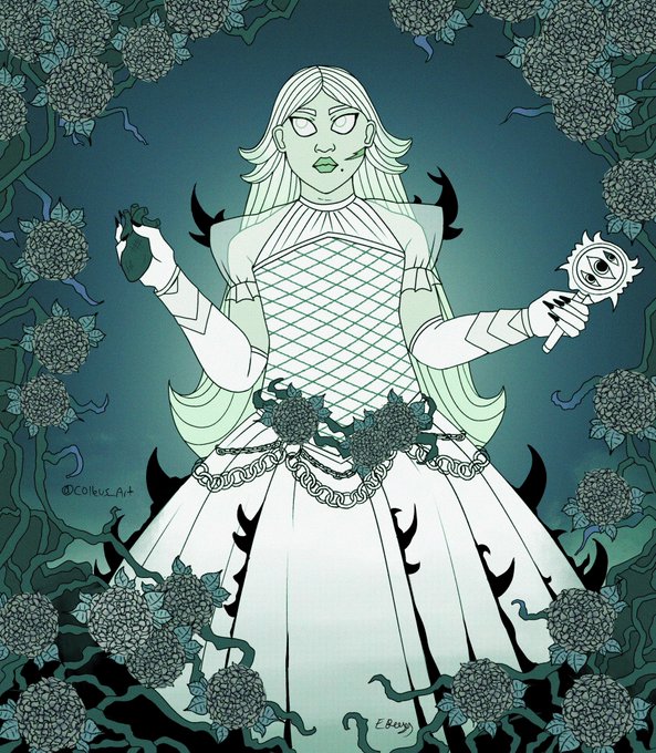
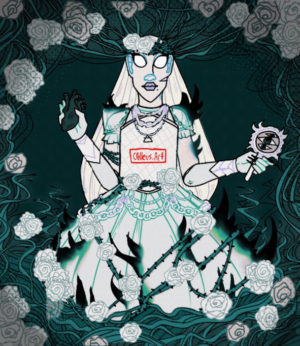
Old be new comparisons, changed her character deisgn a bit to #characterdesign #hydrenga


for comparison with previous years
this one was a bit (a lot) of a struggle since my pen's been acting up for the past few months (there's a considerable amount of distance between where the pen tip is and where the cursor actually shows up on screen)


An updated Colour ref for 2022! Adding a bit of a size comparison to @Mye_Bi 's Ink because she's super short even for him <3 Being a tiny guardian of the multiverse was never gonna be easy! #undertaleAU #undertaleoc


@lavendertowne Original in comparison to the newly tweaked version.
I dulled down the glow of Wilma's necklace and eyes a lil, tweaked the shading, added the cloudy bits (along with fluffing the fans fluff out a lil more)


2020/2021
Finding a good comparison is hard because my art style isn't stable in the least, really. :') https://t.co/MVk9PpEcVH


@GrandYuric These two are a thing now for sure 🤣👌.
Sweet Jesus 😍, lucky Chile guy 😁👍
My bull**it ⬇️ is totally nothing in comparison with this now 😂😅


Worksheet I drew up for Taarna, from Heavy Metal-- and a comparison with the animated feature.

@pipkinpippa Look how upset you made him with that comparison.