comparison.のTwitterイラスト検索結果。 2,018 件中 5ページ目

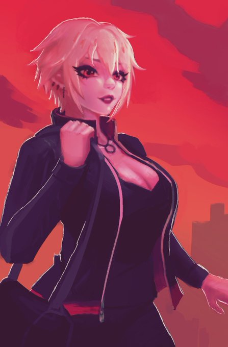


@artelsia I can't compare to the tallent I see in these shares. I kinda suck in comparison.


Rita artwork comparison. She's basically a different character now that I look at them side by side like this... 🤔


Milly artwork comparison. Her design didn't change too much, but I'll have a proper character sheet for her and Rita soon. #oc

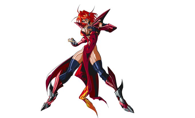
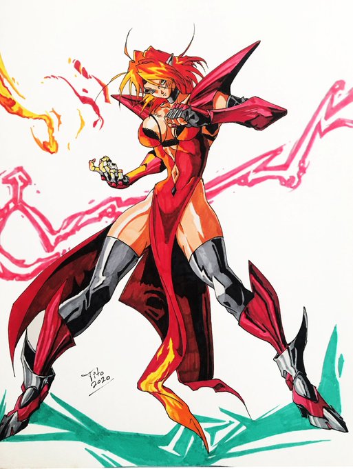

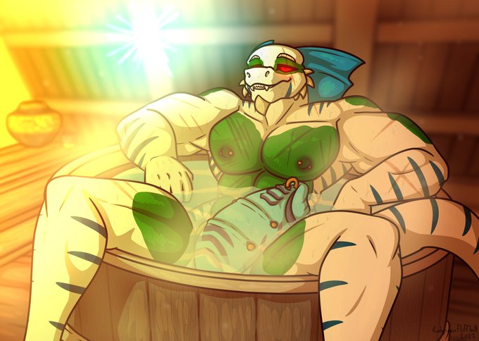

Fun fact! Deathfang was actually my first OC and technically first sona I made before I was even a furry! Zach ended up taking over the role a year or two later and he became his own thing. Here's one of the earliest surviving pieces from 2010 with a 2022 piece for comparison.

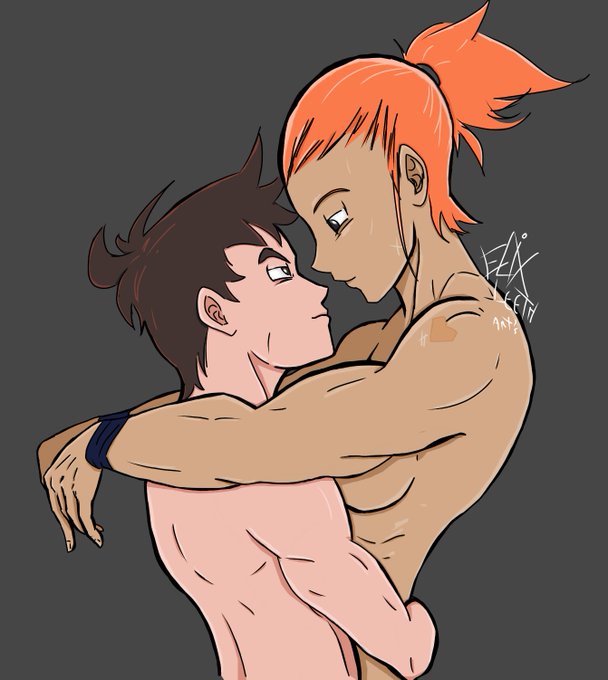

A 2021 Art that I remade in December 2022, I added a few more add-ons today.
Here are both in comparison.
Zinn and Hope, my OC's.✌️
#artwork #originalcharacter #originalcharacters #Redraw

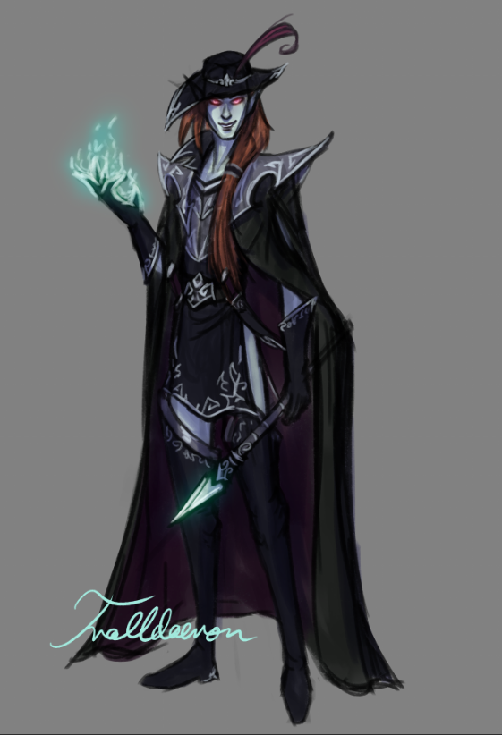


@EntityofJustice @TheDaveKlein There's a lot that goes into conveying character and making movement feel right. I always think of puppet animation vs drawn for a similar comparison. There's nothing wrong with this animation, but it lacks life and feels generic. In a game where you walk, this would be boring.


Okey but, does anyone else agree that the Scarlet King and the Goddess of Flowers from Miota's (@/DarkcatOwO) video look a lot like Cyno and Nilou? Idk if its just me, I didn't see anyone else make this comparison.😭 - 🌊


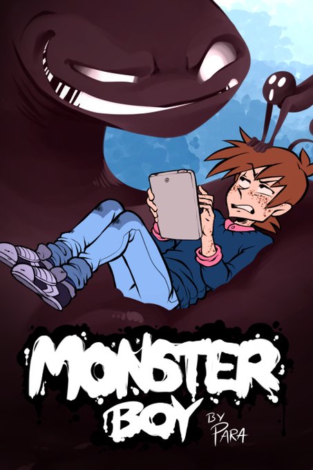
I updated MB's cover image!⭐️
Here's the old one for comparison. Between 2017 and 2023, Vex's eyes grew closer together, and Toby discovered hair conditioner LMAO
#monsterboycomic


You know, back in November, I complimented the Nature Valley protein bar thingies...
Just recently I learned they have "XL" versions, which honestly just look like they put 2 normal bars together...
But my curiosity won and now I have a box.
Here's a size comparison.


I LOVE THIS! 🔥 So simple & yet it has an ominous energy about it.
I like how the simplicity contrasts most other covers. Mirroring how little we know of X in comparison. Also how all soft tones used are contrasted by the sharpness of his eyes. 👌🏽
#ShadzSAKAMOTODAYS #SAKAMOTODAYS


I will say this again Pawaaa is cute :3
some sketch to final comparison.
Honestly I cant seem to get the color to what I want in this one.
But sometimes art is more of a lesson and this one is one just one of those.
#digitalart #illustration #digitalpainting #chainsawman


Jaden's hotness, all in character sheet form.
By @SumiPeach
He wears a very early yet basic version of the regular Fire Force uniforms seen today. It is that of a few differences that Jaden alone only has in comparison. (Look below)


I have returned Twitter, but with a OC repaint. To make it fancy I added the comparison. #characterillustration #OC #artimprovement

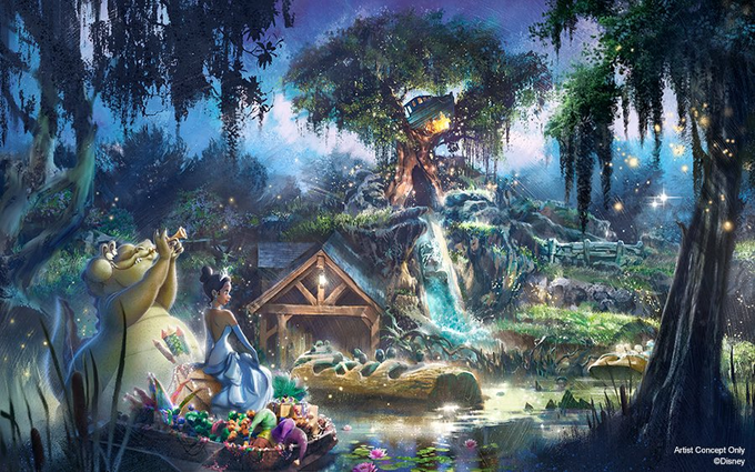

Desperately wish we were getting the version of #TianasBayouAdventure seen in the initial concept art. Was it an early blue sky rendering? Yes. But @Disney should have made the necessary investment to make it a reality. The @DisneyD23 model is just so underwhelming in comparison.


I used the tweet by @IvanDashSmith to make this side-by-side comparison. @evergreenqveen original is on the left, your cover is laid over hers on the right. The ONLY change was the moon.
This is a clear case of stealing & your creative team knows it. Pay her for her work! https://t.co/V0zUX3Stxj

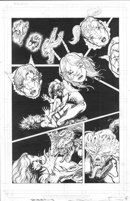

Churning out pages... The new 80+pg horror/scifi graphic novel anthology series - Unconditional Shove Volume 1. Here's another Black&White/Color comparison.
Check out and back it here:
https://t.co/z5CEBdSGbQ...
Thank you everyone who backed or promoted you are PURE AWESOME!


I just had to put them together for obligatory size comparison. See? There is not much of a difference. 😉
Roos are build for sumo! 🦘🥧✨


Here’s the version where the projects are separated and they have a more worthy comparison. Because I think in Books, and so far there’s two of them (soon to be three!).