readableのTwitterイラスト検索結果。 912 件中 5ページ目


Finished badges babeyyy ❤️
I went a little bit experimental with these! Still trying to figure out how to do shading in a way that still makes them clear and readable


For me these ambiguous blobs were super exciting. It presented a ton of interesting possibilities that I wanted to actively solve for. This was already similar to my normal workflow of throwing random shapes and trying to pull a readable image from those shapes.
2/?


This is unbelievably un-readable and I just can't ignore it... let's try again.... I'm a tired boi-o and can't wait to be free of my chains.... for about like a month, week or 2.Anyway bones pic. Fair warning... this shall foreshadow later stuff I'm gonna conceive. Now read alt🙃


Okay, so visually, I still like the second one better. But I really want the text readable in its entirety, which you can't really do on the second. Or maybe you CAN read enough? Uhg. I feel like if Krita's text tool was easier to use, maybe I wouldn't be struggling with this?


@Will_WarfsTash This is my "oh no i have an idea i gotta sketch it before my goldfish memory forgettss!" style and 90% of the time it's unreadable, but these were just. perfect. the emotion. These need no refinement.


BTE UPDATE
Tapas:https://t.co/PC6lxzWMfS
Get ahead on patreon: https://t.co/OIX87zOO1T
[Also readable on Webtoon and WebcomicsApp]


@_akreon_ Oooh never thought of this before, I think mine still readable 😄


obviously it had to have a calligraphic feel. i also wanted it to have a slightly latin / medieval flavor without trying too hard. the other variable was that it had work both as display type (big banner names) + readable blocks of text.
i really like the flavor it has in lines:


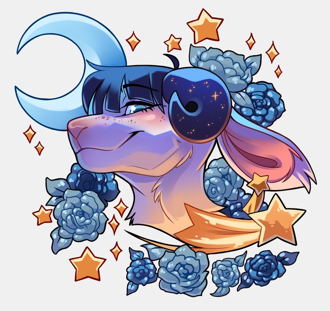
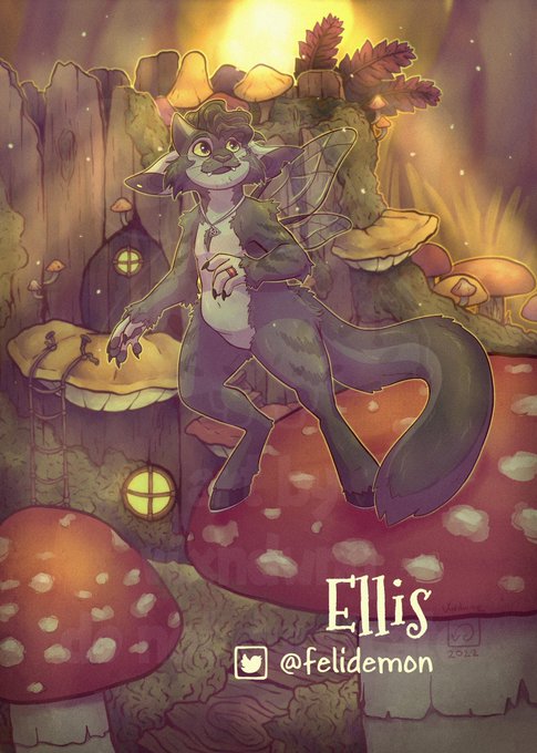
This wind affinity Dirvys is up for adoption for $100 USD. Design is readable enough that I didn't think a back view was necessary. However, if you want a back view, add $45 USD!
Also they are wrapped up in a towel on the right. LOL
DM to claim!


I cannot overstate how much I WISH I could learn to model in this specific model quality/style and also do concept art in this early 2000s animeish art style, where use of bright color is abundant, and where gearset design is focused on making it bulky and readable!


@BigRoundLion Some examples of borderless cards and one with a border
The character needs breathing room
It'll look like too much on the art but when made into a card, a lot of excess will be chopped off
Text needs to be big and readable with a non busy bg behind it


I made a dropship! (Most uncommon for me.)
It's not as fluid and readable as @mike_doscher or @ailantd ones, but it'll do the job.
it's part of a very nice project I hope I'll be able to tell you about very soon.
#scifi #dropship #conceptdesign