saturatedのTwitterイラスト検索結果。 5,454 件中 5ページ目
I did some guides showing how I shade and paint hair before
when it comes to clothes it really depends on the material so I really recommend using refferences for that
for collors I just prefer to pick anything not too saturated and not too bright or dark that's it😭 https://t.co/9RXKuXTbIU
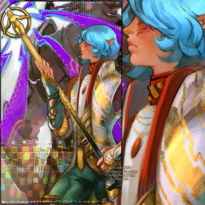
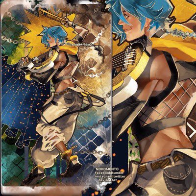
i saw that dragon age inquisition tarot post and remembered i DID draw something like that back in 2014 (it’s on my tumb/r holy cow my art back then blinds me it looks so saturated lol ) #nkmtART
my Lavellan - Bodie (my bae) - OG!Lucius
I joined a #DTIYS on instagram, I wanted to try saturated and more simple stuff...i hope u guys like it LOL posting this in the middle of my essays for school bc im technically doing my midterms rn...hehe
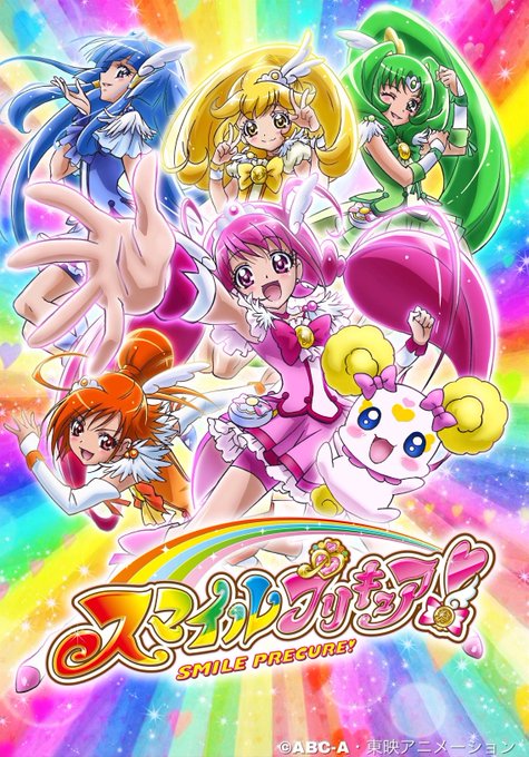
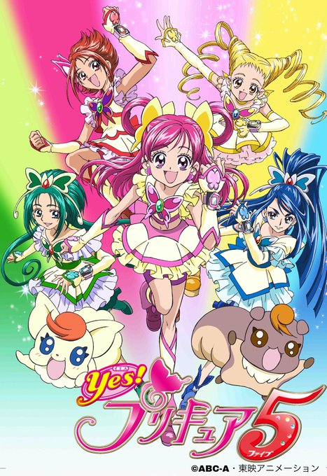
@CrushinBort @cureholly They’re drawn in art styles that are different enough to be recognised as two different shows, and the character designs are very different, for example smile is a lot more saturated! SS and FW are drawn in the same style and the characters look very similar! Hope this made sense
the highlight near the inner corner of the eyes...and the lil saturated line between the brightest highlights and the shadow 🥰💜 (honorable mention, hands hehe) https://t.co/JwGildLrbh
Low saturated color is today's warm up
#pixelart #medievalhouse #screenshotsaturday
up close n personal heres his eyes theyre light slightly desaturated blue
Summary of the past couple of days/week (I'm both of them)
I used less saturated colors this time. My first instinct is to usually go for the more saturated colors 'cuz it's like "that's not quite right" and less saturated colors look kind of dirty, but. Experimenting's nice!
What is this? Why is this? Why is the pop up one more saturated than the one in my gallery when they're just the same pic?
which one is the real color?
(੭ ˃̣̣̥᷄⌓˂̣̣̥᷅ )੭⁾⁾
All I did was save the pic in my gallery and then open the Ibis pop up, but why?
@UFOkiyo Ukii i'd love to be artmoots, and seems like we kinda opppsite lol, i like drawing with muted and warm colours instead saturated colours. I hope we can get along <3
I have 2 modes: very saturated and complete grayscale
#badboyhalofanart
Looking for #artmoots!
I’m Uki and I like designing dresses and using saturated colours!
I also do watermark/logo designs! I’m very supportive and would love to be tagged in any SFW art to boost/bump it! I’m also obsessed with my original characters!
#ArtistOnTwitter
Friend was watching me draw and said she’s infuriated by the way I select colours by using a really saturated and then lowering the opacity until I liked it and go back over with that colour 😞
Anyways have some enstars mama and koha cheebs
je prend le train tiens
art train and present yourself!
so uh I'm Champy, I like to think that my art is saturated and not detail heavy
this time i'm tagging @jussybbyart and @AvalonBlaz3 https://t.co/qAPyltsoXm


