saturationのTwitterイラスト検索結果。 2,124 件中 5ページ目


Finished up another piece! Wanted to do some hyper saturation for this one!
#HatsuneMiku #fanart #illustration


Zoomed in for details bc look at the little ring of saturation around the eye highlight it is my favorite


#EnnDay2023
Happy birthday!! Enna!!I changed my mobile phone, so I didn‘t feel very sad. Suddenly, I found that the high saturation was also very beautiful. Hahahahahahahahaha. Today is Valentine’s Day, so happy Valentine‘s Day!!


#cringetober - Rainbow Neon Saturation Hell ft. Dee (one-off OC i made forever ago)


4/
To combine colors
There are formulas that can help you, based on something called color harmony.
Monochromatic: only one color is used.
Pick a point on the circle and use your knowledge of saturation and brightness to create variations in hue.

@harpbrothers100 Well I usually have to tweak my drawing, mainly saturation


more of curl + fBM, I gave more freedom to the saturation and brightness, I love those tones of red :) #generativeart


I have a secret. This color makes all of this with simple hue, saturation and brightness adjustments.

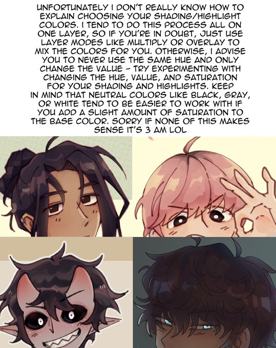

ok so like i swear i know SOME color theory but 1.) idk how to explain it succinctly and 2.) i ignore it a lot, so here is the best advice i can give on choosing colors 😭
the second pic is an example of "not changing hue, only value" vs "changing hue, value, and saturation"


The Last Of Us Part 1 -
Never played this for a long time because of zombie game oversaturation but I was very pleasantly surprised at how, complete of a game it feels if that makes any sense? Lives up to the hype, excited to play part 2 whenever that is since I don't own it.


-poses in console player- if y'all are looking for an alternative to gsh*de aside from another plugin, you can achieve pretty much the same results in a photo editing software, especially if you use simple saturation/brightness shaders! these were all edited from ps4 screenshots:


寒色のときはテクスチャを薄い水色に、暖色のときはテクスチャを黄色にする。
blendMode(MULTIPLY)で大きな色のパーツを重ねているので、重なりすぎると黒くなっちゃう。少し防ぐために、SaturationとBraightnessを操作する。
#p5js #generativeart #creativecoding


I never realised that the Japanese and the English release for some JJK volumes were so different in tones/saturation (?) , I don't know if it's jjk exclusive or viz changes the tone for every other series they are incharge of publishing.


Random drawing. I think my tablet's saturation needs adjusted, because I didn't realize how dull the colors were until after exporting it for twitter.
I kinda like it, but I'm including a 'corrected' version too.


@azraelmint a sloppy method would be to merge your base colors onto new layer, clip to grayscale layer, set layer mode to color and mess with the saturation/luminosity. i have my base colors separated into parts so i can select i.e the sweater and finetune colors


@oliziii Merciiii j'ai utilisé une technique montrée par l'artiste Hozure en live, faire une base de colo dans la même valeur que le fond pour les couleurs les + sombres ( genre la tête ou le bagi ) et un poil + clair pour le ventre et les yeux, en changeant juste la saturation


I can't remember if I tweeted this or not. I found this drawing from 06 the other day and had forgotten all about this one!
#art #colorful #color #saturation #flower #artwork #artontwitter #freehand #drawing #freehanddrawing