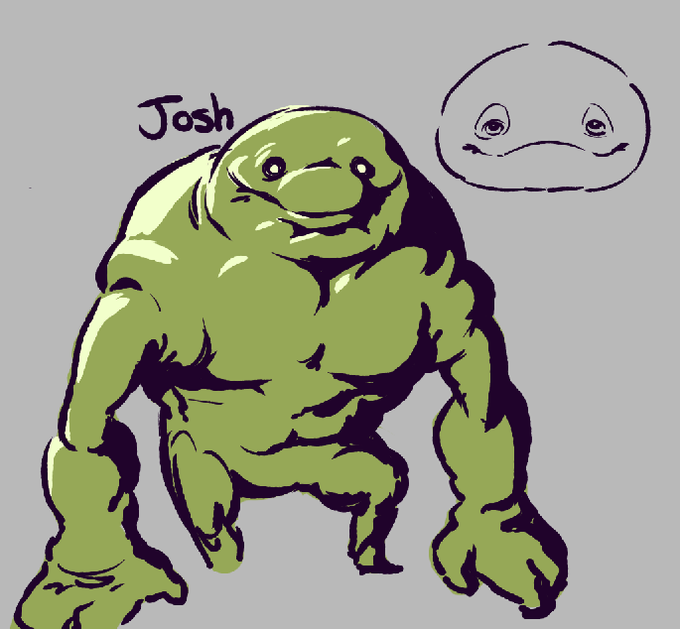
visuallyのTwitterイラスト検索結果。 3,314 件中 5ページ目


We bring a new Curated Gallery, compiling a variety of visually captivating images from our AOI Folios themed on human growth and mental wellbeing 👂️
Curated by Mark Ecob, AD & Designer for the award winning @mecobtweets
Illustration by @merially
https://t.co/Pj55B17rCU


@ChewChewer im very happy to see you draw accurate representations of clouds. i used to make a lot of cloud images. and i love this character design, its so recognizable and so good. seeing the character makes me smile because of how much i like them visually. i like the colors too


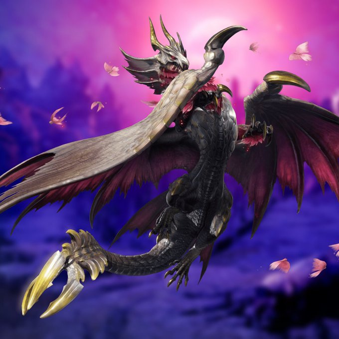


I still don’t think Fata is the strongest monster
But fuck Power scaling
Who is the Hottest monster (Visually)
To me, it’s Malzeno
Bro has Swagger and rizz that is unrivaled


I created a Belly Dancer character that is visually described in the lyrics, "Stop, Stop, Stop" by The Hollies 💠✨
#characterart #oc #digitalart #CLIPSTUDIOPAINT #thehollies #stopstopstop #ArtistOnTwitter


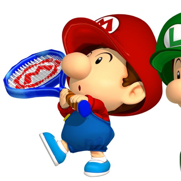
I feel like baby marios og tennis racket just... idk its such a cuter concept. yeah, i agree the newer one is more visually appealing, but the lowercase m!!!!!!!! ugh he baby /literally

oh to be able to simplify complex objects in such a visually interesting way


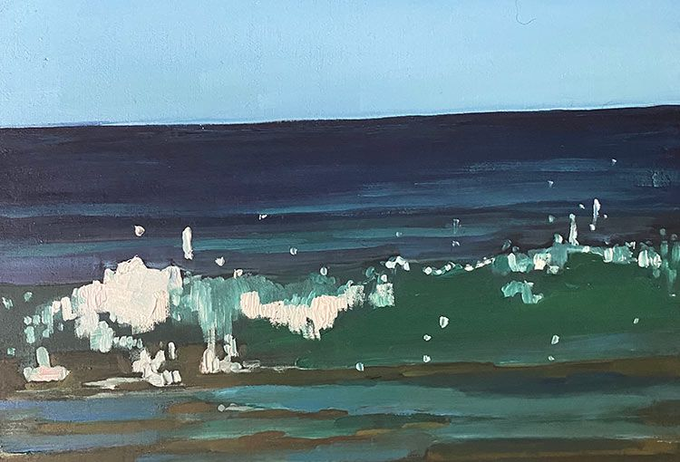
Isles is probably my most visually striking generative series.
Often wholly divorced from the source AI images they were generated from, most Isles images are objectively abstracts, and yet give a tranquil & naturalistic feel, leading many to easily present as landscapes.
/23


Before and after the pandemic.
Visually, nothing’s changed. Back then I was a fresh graduate with no idea what to do in life. Now, I still have no idea, but at least I know I’m not the only one. https://t.co/s8jKJtjVfm


do people like Ossiarchs?
i dunno about anyone else but in my brain, i had a kind of a soft spot for them, conceptually, because they visually read a bit like Wayne Barlowe's Hell stuff

#gartenofbanban redesigns. I imaged them as experimental test tube critters that were meant to be the original drawings irl, but something went wrong and now they're misshapen, evil and more visually appealing 😱🫣

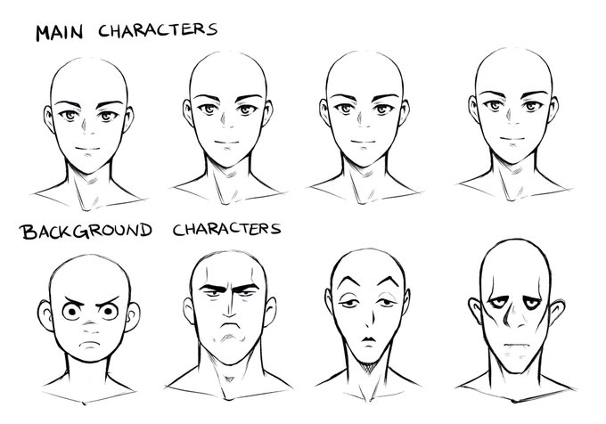
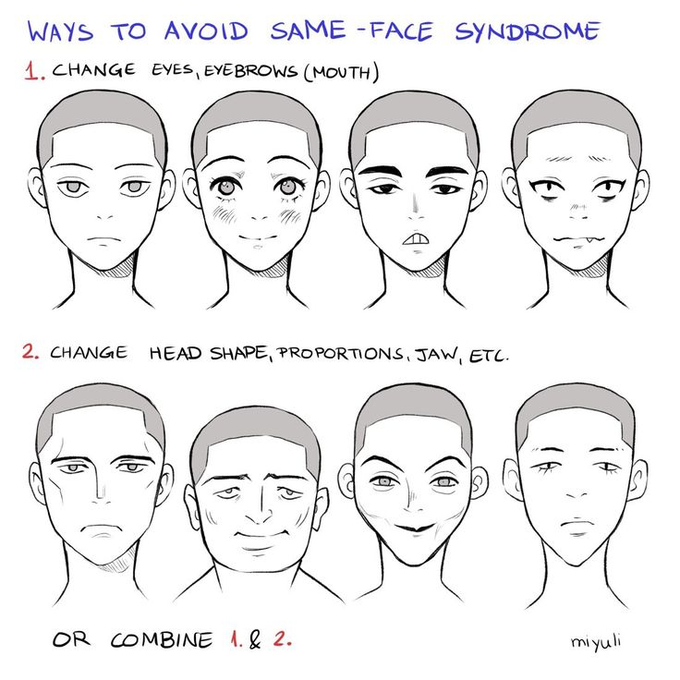

@_BiNGOHiGHWAY_ To me,same face was always what it sounded like, multiple characters having similar facial features with the difference being their hair & clothes, id say its something to worry about if you care bout characters being visually unique, like differently shaped heads, eyes,& bodies.


Dont you wish sometimes that Marik's design were yours?
I cant believe a man managed to create such an atractive and pretty character
just visually he's
gosh
I wish he were mine


I'm considering maybe updating Rubot's design a bit so her robot-ness is more obvious visually. Lemme know if you have any feedback, I'm on the fence!


was waffling on maybe assigning xan toxicroak instead but i think for like a “they are actually pokemon” pokemon AU midday lycanroc fits better - at least visually.


Nothing to see here, just blessing your timeline with 4 of the most visually pleasing grail @DeGodsNFT in the entire collection.
DeadGod art still leaves me speechless almost 1 year after releasing


POV: You won the heart of a certain heroine in a visual novel >/////w/////<
Heehee~ In all seriousness, this is gonna be my new emote to replace one, because one of the emotes I had doesn't seem visually appealing to me. You'll know which I replaced X3


@JeanGen09181213 What they were going for could have been achieved far better. It is very possible to make heavy-set or even masculine-looking women visually appealing (see examples). What they're doing is dragging a well-loved character's design through the mud for popularity points. It's sad.


this crotch armor piece also, because of its top wide bottom narrow trinagule-ish shape, visually reads like the space marine crotch. so his pelvic area reads kinda unclear like it extends all the way to his knees.