ParisのTwitterイラスト検索結果。 402ページ目


Recently been really liking how my artwork looks and how I have improved. In comparison, this is my original Friendly Face drawing . Originally the new piece was meant to be a remake of sorts, but I decided to make some sort of a weird cover instead. https://t.co/7rIXyZwZXJ

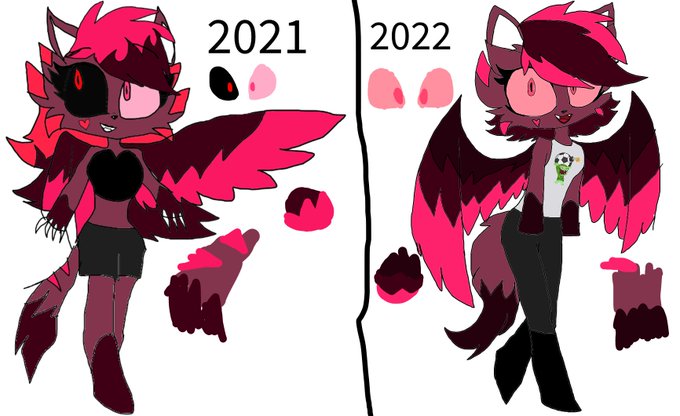
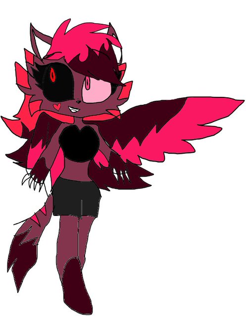
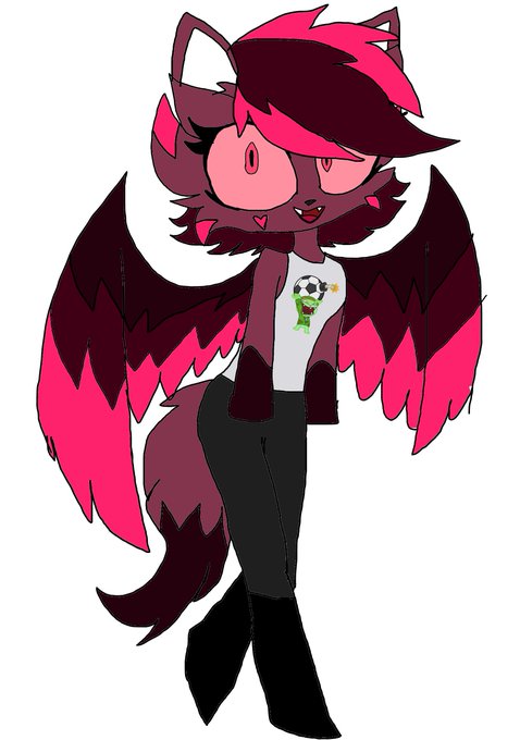
Here's the comparison of Aura's designs #HazbinHotel #HazbinHotelOC

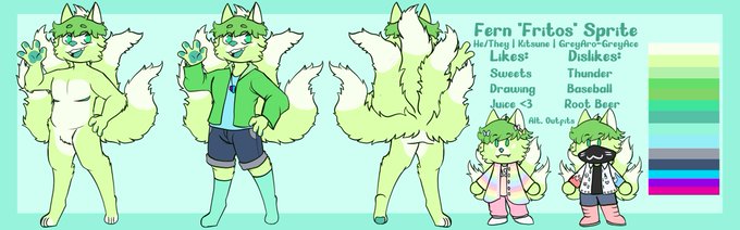

@shareocs here's a comparison between him normally and fnaf fern!

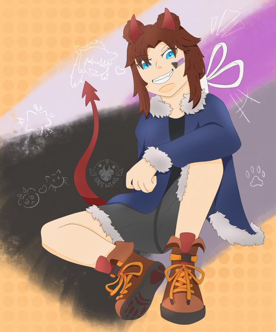
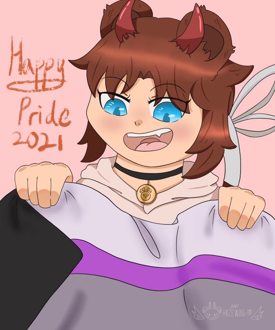


@Mefelis_Hex FES answer bits are absolutely tiresome and just not fun and i think it pales in comparison with what the femc route has to offer LETS GO (please also put Q and Q2 on pc one of these days atlus)


@emilypearsonart Practice away, friend! You know the moment those comms are open I'ma pounce and you'll have to draw Paris anyways~


some recent facepics + comparisons to their old versions (and also chaco's there)
#CaveStory

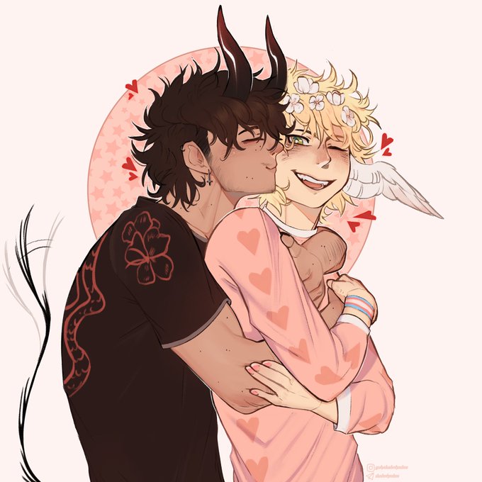
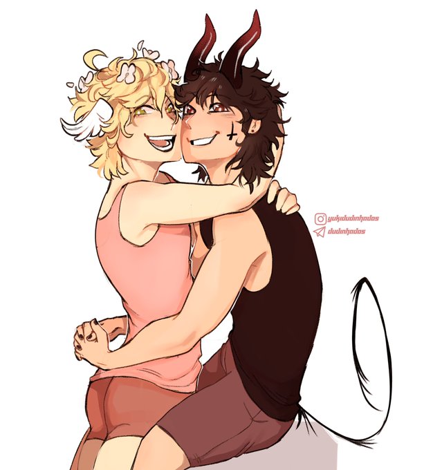
Last year's drawing I made for us as an comparison!
We didn't change much but my art style sure did lol


Rats spelled backwards is star 💫
#hxh #hunterxhunter #pariston


👩🌾 Revue horticole.
Paris: Librairie agricole de la maison rustique, 1829-1974.
https://t.co/NgfmRVH9d2
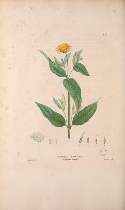
🌍 Flore d'Oware et de Benin, en Afrique
Paris: Imprimerie de Fain jeune et compagnie, 1804-1807.
https://t.co/Tda5jhMBlO


@k9522_ I did the same with mine, but since my hair is pretty curly, it ended up looking very puffy. Best comparison is Haru's hair lol
Its same length as her too, however mine goes past my shoulders. Haru's neck is just long af ig lmao


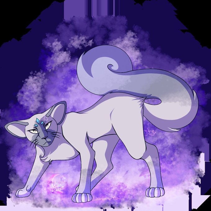
Okay so I know this was a while back but I just need to do this. I don't like the design for Alolan Persian. I understand WHY it looks like that, but I don't personally like it. So I took a crack at redesigning it. For comparison I will have both the Canonical and my design.
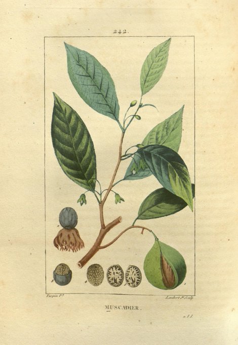
🥕 Flore médicale /
Paris: Imprimerie de C.L.F. Panckoucke, 1828-1832.
https://t.co/D3zjdHO52f

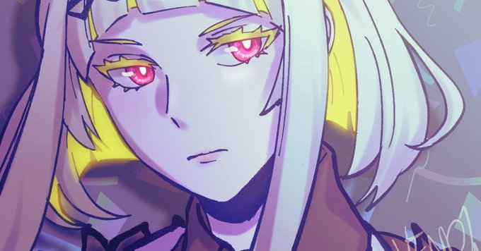

@krocz69 no?? here is a comparison of twitter vs original 😭😭
it may look identical at single glance but *it isnt and i know it*