sonicMovieのTwitterイラスト検索結果。 8,076 件中 402ページ目
I see everyone drawing sonic so here we go I guess haha
#furry #furryfandom #furryart #SonicTheHedgehog #SonicMovie #SonicTheMovie #Sonic #SuperSmashBrosUltimate
Hi @studioteabreak Wednesday #ShapeChallenge definitely new wonky #Sonic #SonicTheHedgehog #SonicMovie
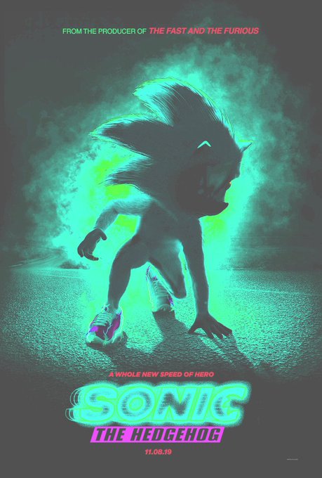
#SonicMovie #TryToKeepUp Lmao why the hell does sonic look so weird in the poster. Anyways i tried tweaking him a little.
It's funny - regardless of these films' quality, character design has almost never been an issue. Yet somehow Paramount decides Sonic would be too problematic.
#SonicMovie
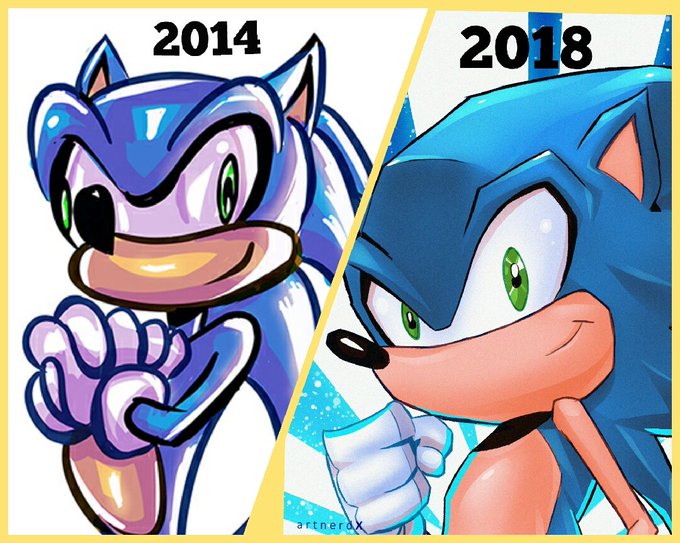
My progress in four years. The sonic from 2014 looks like he's seen some shit. #SonicMovie #SonicTheHedgehog
Guys those posters are really making me doubt the new Sonic movie. Oh nooo, why Hollywood?? WHYY?? #SonicMovie #SonicTheHedgehog #sonic
Real question. Which design would you prefer to be used for the #SonicMovie? The current Sonic Movie design or this design I made?
C H O O S E W I S E L Y .
Poll below.
I don't understand all of the hate. He looks great to me. #SonicMovie
THE NEW SONIC FOR THE SONIC MOVIE LOOKS GREAT
#SonicTheHedgehog #SonicMovie
#SonicMovie The legs were off in the first poster but... this new one just reminded me of this:
uhhhh....@sonic_hedgehog i found a closer image on how his face might look.....looks pretty solid #sonicmovie2019
Some people are up in arms about it... I'm actually excited for the #SonicMovie
With the recent reveal of the #SonicMovie Poster, I think it's only appropriate I post my Redesign of #Sonic which I did a few years ago 😀 #SonicTheHedgehog #sonicmovie2019 #artistsontwitter #redesign #art #digitalart #games


