contrasのTwitterイラスト検索結果。 406ページ目

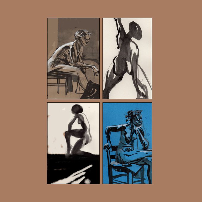
I like the huge jumps from rendered to brush gesture and contrast between the white and blacks and color, wish it had been concious


Bro shut up
they're licherally going on an ice skating date
with their contrasting colored skates


neon lights ❤️🧡💛
something to contrast a piece i made about a week ago as suggested by @luluc0s!! thank you for the suggestion by the way!!! i really had fun playing with the colours for this one because i tried to stay from the purple and the blue for the neon lights ❤️❤️

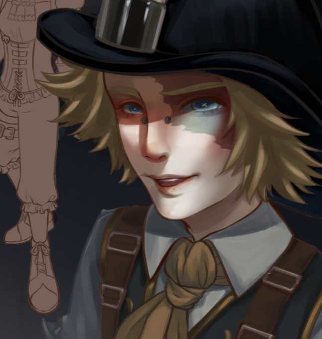
Trying out some lighting tips on Norton! I've always been afraid of high contrast but maybe it's time to change it up a little #prospector #IdentityV #magicitemkeeper


ファゴット、どちらが正面なのか基本はどちらを見せればいいのかいつも悩みどころで、両方採用しています。諸説あるならよかった...両手10本の指ぜんぶ使うというし、正面も背面も見てほしい!て個人的には思います #contrast_design


Hi there, I'm back with my 6th hard cel shade practice. I thought the pose and outfit looked pretty cool, but I felt this one fell a little flat in terms of the colours used. Perhaps I should have pushed the vibrancy/contrast of the piece a little more.


Hey hey #drawingwhileblack
My names James Dawson. I’m a freelance illustrator and storyboard artist. I love high contrast and rim lights


Man, there's something about futuristic night time scenes that are so much fun to paint! There's so much more freedom to play with colors and contrast!
Anyway, this is Akiko Zimmerman from my client's Shadowrun campaign.
#shadowrun #rpg #ttrpg #dystopia #cyberpunk #conceptart


@gears2gnomes I actually had an iteration with rain-booties but decided I didn't like the eye flow. I preferred to keep all the visual focus to the head and neck area, so all the contrasting elements stay in that part.


morning excersice! experimenting a bit with movement lines and pure contrast shadows today


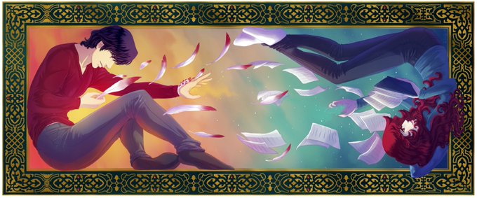
@AislinnTLawson l'image entière du coup, y a un meilleur contraste qu'avant entre les deux perso !


@ArtOfKirin Idk why this is interesting to look at maybe because of the contrast and color choice? Also i did not expect the pizza will look decent hahaha.


Thought I'd post another one of my super rough sketches in contrast to the final piece. The sketch is just pure nightmare fuel XD
#hazbinhotel #alastor #hazbinhotelalastor #theradiodemon


Japanese Manga series #NANA will have its very own TV Drama Adaptation in China!
The drama will have a total of 36 episodes with an expected filming period of 4months.
The manga centres itself featured two females with the same name, "Nana" who share contrasting personalities.

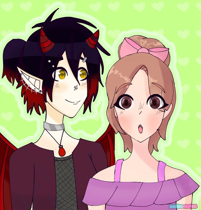
Yoi 😈 y yo 💗 me gusta como queda el contraste de estilos, utilize una base de uso libre hecho por @NYUM_CUP2203 crédito a su parte. Pueden usarla llendo a su twitter.
#originalcharacter #oc


in contrast to Raoul and Gigi, Jangles was easy to figure out. i wanted his palette to be the most subdued of Angel's skeleton crew, because he's not meant to stand out