ContrasのTwitterイラスト検索結果。 10,816 件中 407ページ目


@zuki_bv En Pony Town hay zonas de Danganronpa y a veces encontras a Ibukis y todo tipo de personaje, deberias ir, te puedo ayudar a crear skins🥺💖💞

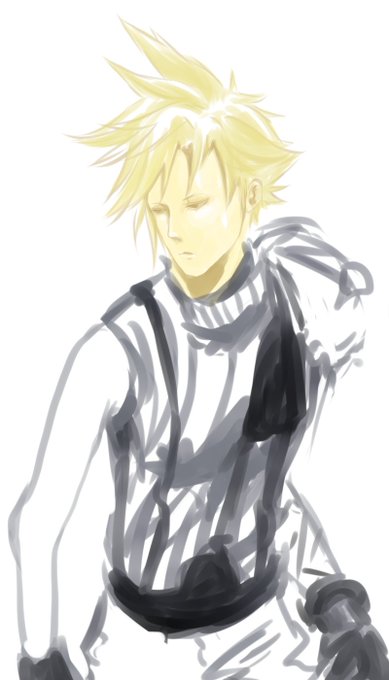
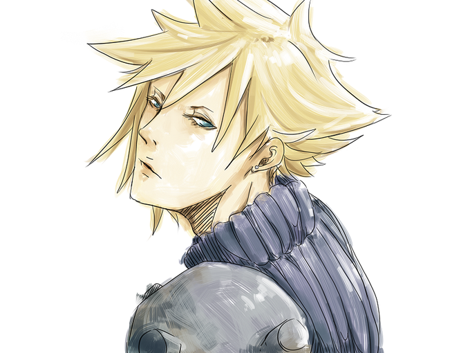
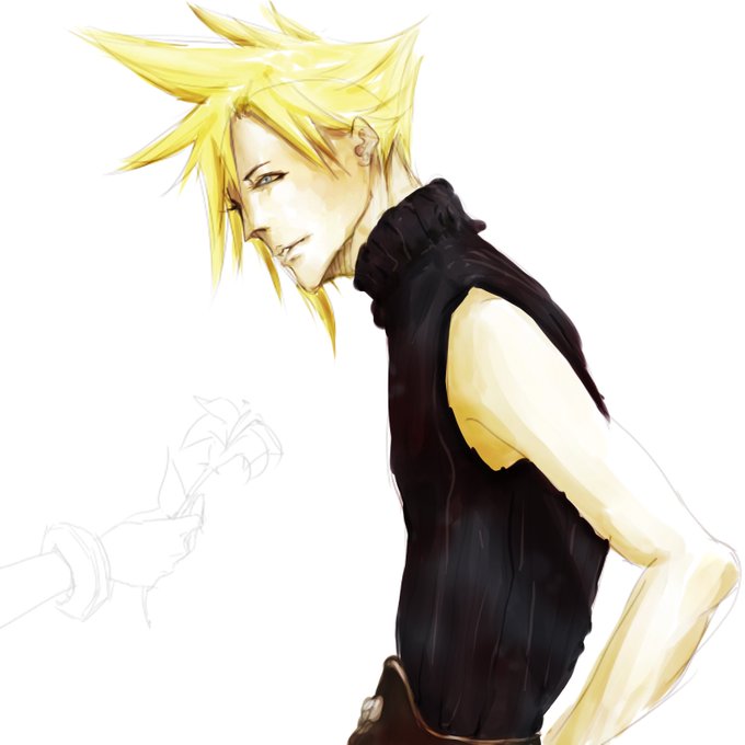
More old drawings of Cloud ☁️ I don't know what's up with the contrast on that last one 😅 #FF7 #FF7R #CloudStrife #クラウド

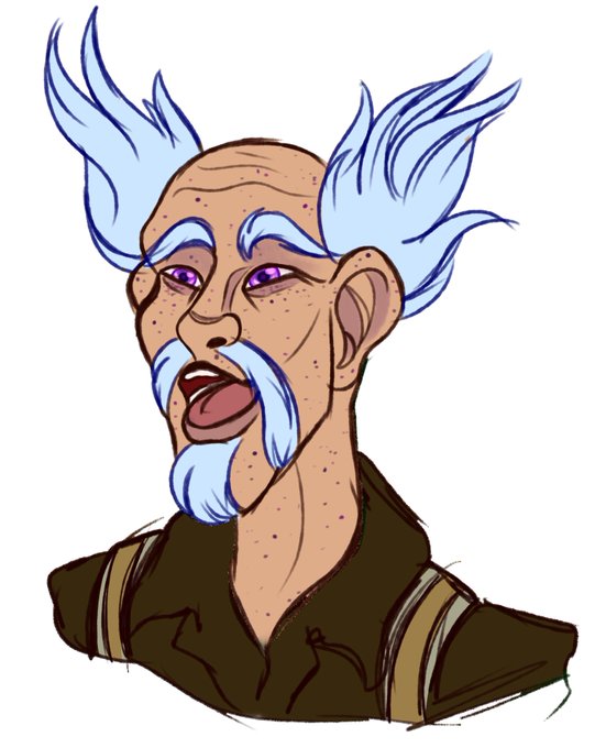
I redesigned him to better match his parents! I designed them after the fact and realized, uh, wow, he looks nothing like them LOL. I like how warm his color palette is. Contrasts with his magic, rings true to his character
Parents attached for posterity. First img by Meocraft


“Empira” (https://t.co/kV6nAvowUO) by Dieter Hofrichter for Hoftype is a crisp, high-contrast typeface—much more Transitional than Didone. Despite showing some calligraphic heritage, these letters are decidedly drawn, not written. Lovely texture & solid features. #366fonts (161)

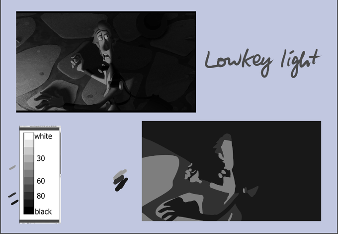

values studies 4
Sorry! Another mislabel but at least we learn hahaha
I got confused with lowkey light and high contrast


2) BanchoLilymon has my favorite punk bad bitch aesthetic!! The black with the bright color contrast, the femeninity balanced with the gangster look. I LOVE HER SO MUCH!
(Side note: Also Yumi’s partner!)


A bold line pops portrait from background, providing contrast to its more subtle shading.
🎨 “MJ - the goat” by Mick-cortes: https://t.co/AmcGKEji9L
#MichaelJordan #Portrait #DigitalPortrait


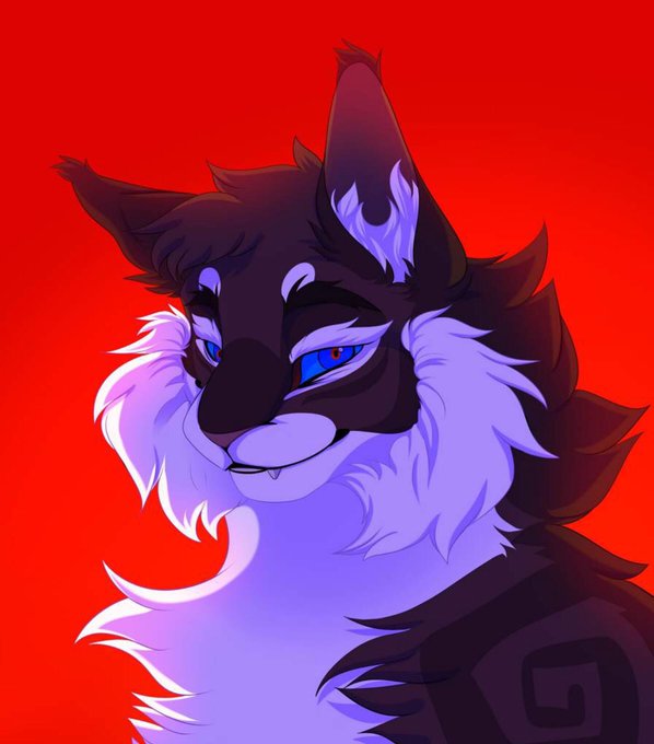
A stunning art piece of Hawkfrost by @Raily_Winner ! The fur, shading, smug expression, and the sharp contrast with the background go together perfectly. Check out more of Raily_Winner’s art on the original post! 👀
Orig. post: https://t.co/H1g6wffIsI
- fern 🌿


+ mas nada adiantava, nada que eu encontrasse era tão ideal pra mim quanto ela.
E hoje, percebo que eu tinha sim a possibilidade de ficar com ela, cuidar, passar todos os dias da vida lá.
Oh como me arrependo de não ter comprado aquela doce casa que o Oli me mostrou a foto.


@ClaudiaSalasAc3 ESO CLAUDIAAAAA
Tener gustos y personalidad que contrastan ES LO MÁXIMO


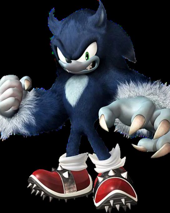
fun fact, in the archie comics Sonic The Hedgehog, the werehog has dark colored claws in contrast to his game counterpart. while i think its because darker claws are easier to draw and be seen against the rest of the design its a fun detail that differentiates the two characters


I realized I haven’t posted the redraw I did of a quickie hell kaiser from a year ago!!
I think I’ve gotten better at putting more color contrast but also I kinda prefer the feel of the old one (on the left)


My settings consist of hard shapes. Bricks, chain-link fences, panels, tiles, etc. They're useful for the sake of a visual contrast between the open space of the subject, and in the case of flats-only coloring, they serve as a way to cleanly separate foreground from background.


Pros y Contras de tener una playera de @YekaRosales:
Pros:
Es una playera de Yeka Rosales
Contras:
Es una playera de Yeka Rosales.
#LaBolaDel6


Interesting online Life Drawing session with a high contrast and heavy shadows going on. Some of my drawings didn't quite come out like I wanted, but was pleased with the final 15 minute pose where I played around with capturing the shadows using a Sharpie and black biro.

@imzeferino eu especialmente gosto quando algumas delas estão em perspectiva pq acho q dá um contraste mto legal no seu estilo de desenho, essas folhas e essas flores em especial chamam muito a atenção de maneira positiva por conta disso <3