compareのTwitterイラスト検索結果。 22,425 件中 407ページ目


The process!! I took my time with this one, allocating a few minutes or an hour every other day. I wanted to imagine I was illustrating my own story, and how I would envision the scene, compared to my reference.


@JagexGrub @Notmywaifu the white trim on the design does a lot to clutter it up compared to other armors, as well as the giant goofy face pauldrons and the storm trooper bucket helm. this redesign by maximax from 2 years ago looks pretty good making the trim darker and simplifying it a lot


Commission for @/bardi98
I loved her vibe, and her design is unique compared to my usual pinks!


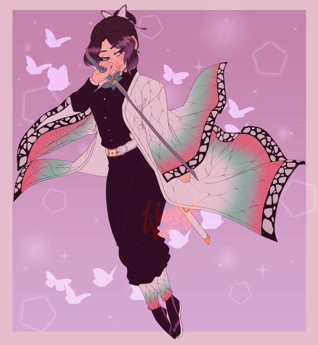
here something to point out what i mean by anatomy and color theory matter: the first image is from when i was a teen- i never studied anatomy bc i figured having an anime based style, it didnt matter. i also used bright neons randomly often. compare that to shinobu lol


[ 1 Year Difference ] The first time I attempted @teranentwii 's character Nami compared to now after one year. Slowly but surely improving I hope!
#3dcg #3dcharacter #vtube #vroid #vrm #vrchat #3D #3dmodeling #3danime #furry #furryartwork


"HAH! You have the Audacity to compare yourself to me?!" ☀️🎵💛 @SMITEGame @HiRezArtShow #smite #smitegame #art #artist #digital #digitalart #bara #gay #muscle #commissionsopen #commissions


@KelliHuggins suspect the overall look here is very much 'ballet girl' costume of the sort you might have seen in music hall/light entertainment at the time; not read this book but compare the costumes here


it's always a LIIITTLE hard to tell; but compared to the Filbert one,, i learned that thicker line art + symmetry + closer attention to the art style's detail is YOUR BEST FRIEND !!
it's also worth pointing out the resolution of Paper Filbert compared to Paper Bill BHDKJDSLKA


LOOK AT HOW MUCH SMALLER IT IS COMPARED TO HIM IN OFFICIAL ART GOOD LIRD https://t.co/wzbvA2kN35

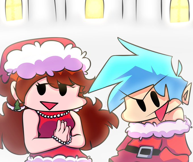


In celebration of #CANVASWeek2022 and #DrawWithCANVAS here are my first OC appearances in the Webtoon compared to their most recent. Some of the old pages have pretty poor resolution. Rahab doesn't look so bad since I recently redrew that panel. 🤣
#webtooncanvas #canvasweek


Redrew Monika to compare to my almost year old drawing of her. I think I got better, I like my newer version! What do you guys think? #Traditionalart #DDLC #Monika


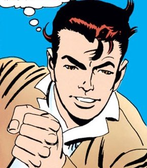

@AbsoluteEngine Tbf, Ditko also made him look way more handsome later in his run. He wasn't precisely Romita-good looking, but when compared to the early issues, this dude looked like a movie star.


Huff Huff...Oh god...Legosi senpai is really HEAVY... -the brown wolf pants and moan, even when she gained a lot of weight to atracct the atention of his alpha, she is nothing compared with the big grey wolf. She feels that in any moment his heavy weight it's gonna break her back


When you spend hours on comparing your art to others you lose a lot of energy that a) you need for that spark in your art and b) could use 100 times better! Don’t compare just create ❤️🔥


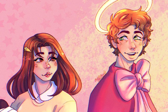

drew tina and karl (and sapnap) as who they were compared to during tina's bee and puppycat stream
really happy with how this came out :]
.
.
[#tinakittenfanart #karljacobsfanart #sapnapfanart]


Big Bang #120
Color Palette: Secret
Background: Caution Stripes
Chaos: Yes
Glitch: Yes
1 of only 3 Bangs w/ both Chaos + Glitch (so far)💥
(compare to our previous post, which is also Secret palette, to see how much variety we still can get within the same color palette)

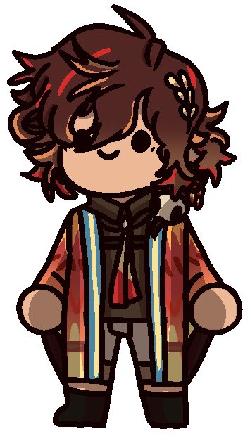
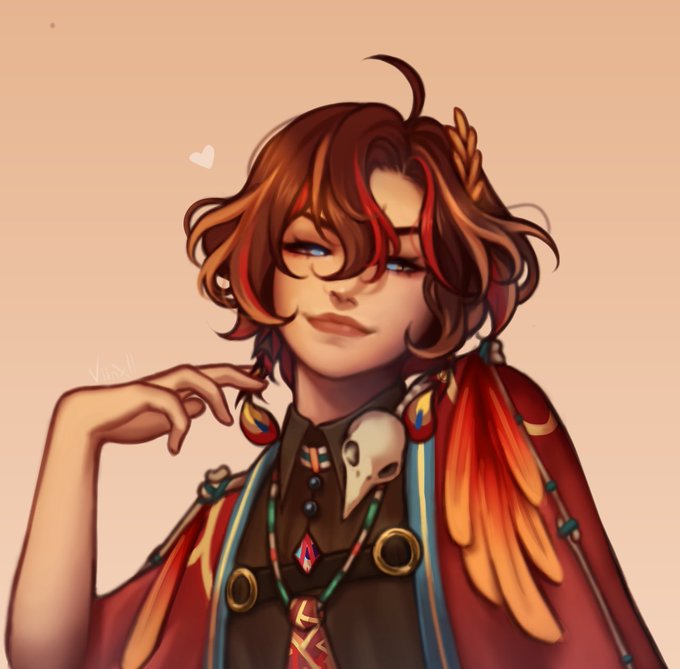
The absolute chaotic energy this pfp gives off compared to the elegant one
[Left by @/DrLessy, Right by @/Doviaf]


Just realised that I didn't post an art summary for 2021, so here ya go😳
Definitely drew a lot more than I'm used to, as compared to previous years (and despite the month gaps) It was my 3rd year into digital art as well wahoo