appealingのTwitterイラスト検索結果。 42ページ目


A few interesting creatures I encountered at @tate Modern yesterday:
- an appealingly minimalist doggy nose (or possibly some sort of sentient lozenge) by Marie Laurencin
- a devilish little dude by Ibrahim El-Salahi
- the world's happiest horsey-bird by Grace Pailthorpe


still trying to make my colours as gross and unappealing as possible. with that said, have some pico in your life.


@SSL_2004 @cake31096953 @benatic_bro Wow 2D art looks more appealing than 3D renders who could have possibly guessed this


@That_Trippy_Guy I agree
Being conventionally unappealing isn’t a bad thing either
Not only does it have its own stylistic appeal
but that means they’re more true to themselves rather than looking like some anatomically correct Barbie doll
*cough* Pocahontas *cough*


Went back to my #parasaurolophus and redid some line work. There’s something about these new guys that is so appealing. Hope we get a completely new para toy for the movie. #JurassicWorldDominion


Seungho is changing for Nakyum and Nakyum alone, the rest of the world doesn't deserve shit from him and i love it. He will always behave somewhat "on-brand" because he's him, what do You expect? That's what makes him Even more appealing, at least for me.


Say what you want about fortnut, but they SUPER understand appealing to my romance needs with some of my favorite pairings lol 😅😊


@ink_cognito To make it more appealing visually speaking? Like, maybe it's too dull? I changed it with the MCYB and it looks a lil better ;-;


So you're telling me that BD retired model that were more appealing to the eye for this?!??🙃😂😂
*Sorry to those who like the new model but TF BD😫


The character designs for Alola pop out really well thanks to the appealing colours used. There's also nice additional sketches for most characters, adding to the overall artwork.


@MrBrownNFT is one of the most visually appealing pfp collections on NEAR. Hence...... I couldn't resist picking these up these bargains earlier


Here's a direct comparison. I wanted to make it a lot more appealing and bright than the last one's muted colors.


@IronDuckjcm Monika has some appealing thighs.
I have yet to see more appetizing ones outside of KFC


Legit any of my anthro OCs have no business being so. They're only evolutions from an abomination of character design. They would most likely be human if anything, because they don't have a narrative reason for being the way they are and I simply can't find one that's appealing. https://t.co/SlJ830VWu0


With all of that being said, it still ended up being an enjoyable arc that really basked in it's higher scale. To add to that, Rama and his little arc of coming back to his roots as a hero and person made this arc so much more charming and appealing for me. He was my fav here.


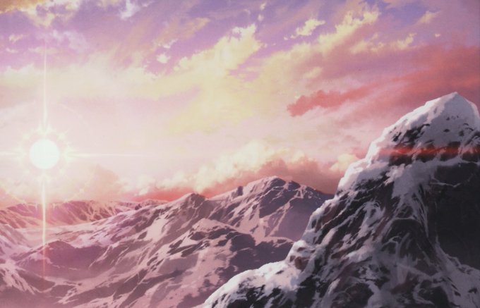


SAO has a bright, beautiful, creative world. And it appears to be carefully designed to appear almost like a painting. The anime made one of the most appealing fantasy worlds ever made. A world that I feel would be damaged by realism.


Gonna start off with Charles Zembillas
definitely one of my bigger inspirations, especially when I first started drawing digitally
Something about his character designs have always felt appealing to me; they've always looked so sharp & chiselled, and yet so goofy and detailed


Bro dont be like this if you are making art and expecting to get respected you obviously need something that is appealing to audiences
This kink is weird