betteのTwitterイラスト検索結果。 308,884 件中 427ページ目


Btw im gonna work on more requested, gift models
These two dont belong to me
One belongs to @/exxxpunged *the one on right
And other belongs to @/Milesthefunny
*one on left*
Theres two more but one is being modeled the other im getting a better ref of
These are the concepts


Additional concept art for the rider, as well as painted material wedges to learn better rendering. I had never really properly done digital painting before this class so i was surprised that i got the basics down fairly quickly


@KottkrigArt Gosh, Fara is actually really hard to Tarotnate.
His whole deal is having made a new beginning wanting to better himself and wanting to live free and unrestrained.
Death???
But we also know he still has hang ups and is a destructive force of hedonism.
He's somebody's Tower.


Better to reign in The Hell, than serve in Heaven
First interactions will be Whitelisted
#NFT #WhitelistGiveaway #Whitelist #Giveaway $ETH #blockchain #NFTdrop


I tried drawing differently, went for a much "loose" (lack of a better term) approach. Plus, I always saw @happychasm as a rockstar. In my eyes, he'll always be one. :D
https://t.co/gVmDtIo9J2


It came out way better than expected👏👏👏👏👏 #gamedev #artwork #mobilegame

Doodles of the clown and his dog (also with glasses because he needs them 🫵) #Bettelful


@ComicGirlAshley Checkout CyborgOverman as well, when Overman leaves his world having doubts, the Nazis get to building a better Overman. Also facist plasticmen can be the flag on your wall. The table, door and they eat you when your looking.


(another version cause i think i like it better) #ronstaedtler #insidejob #insidejobfanart #renewinsidejob #saveinsidejob

Wind Archer (but better than the last one)
I used the official colors this time


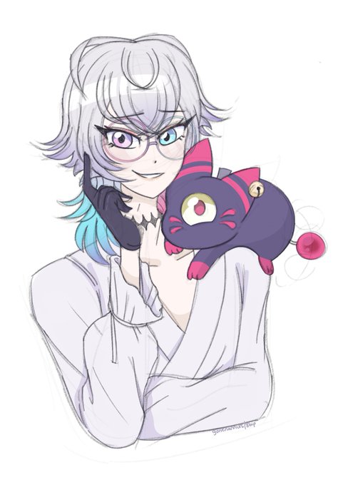
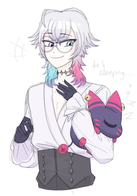
It's #zangooseday!!
It has been so long since I've drawn my lil old Jules aaaa what a better chance than today?


@MelynnRose HI!! ur post helped me feel better about doing commissions so i stalked ur page and i love all of your art so much lets be buddies


"Traditionally, given the same font"
this video: *uses entirely different fonts*
okay????? Just hire someone to draw a logo for you????????? Every single work in this video have a better logo than what was presented


@HikariZ3N I'm doing great art wise but mentally I could be better 🌹
And I'm excited for the new season tomorrow 👀


The idea that text with letters that look vaguely like the Literal Subject of a word is better than a custom-made logo that conveys the TONE and MOOD and ESSENCE of a work is an ACTUAL TRAVESTY https://t.co/6PH2TJs5Bs

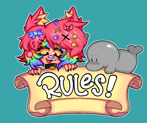

da RULES panel!! flippy is back better than ever!! (he can't read)
(new ---> old!) (。・ω・。)
#vtuber


Best girl right here >:)
(Trust me it looks way better with all these effects)
#corpseparty


man i wish i was better at choosing what shit i wanna show
also i dont think im ready to tag other peeps yet, so imma unfortunatley be the caboose for this train line https://t.co/rk3A05Cx2P