contrastのTwitterイラスト検索結果。 11,163 件中 44ページ目


just discovered that I can change values with CSP, so I fixed this Double's piece contrast


it was rly fun to draw! i referenced the pose, and i think it came out well. the coloring is so nice too, im so happy i started using contrasting colors to shade & highlight https://t.co/XzYLbwCVyS


noticed the contrast and readability of zombie river is kinda washed out, so i'm drafting up a new palette to use for the 2nd ref.. thoughts?


Joder, qué contraste xd
Pasa de 😠 a ☺ en mis manos XD https://t.co/RS3oou0QFh


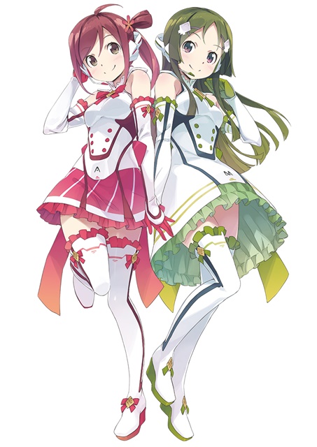
【VOCALOID4】The vocal synth of the hour is Masaoka Azuki.
Azuki is a cheerful girl who tends to act first and think later, in contrast to her best friend Kobayashi Matcha.
Originally released for VOCALOID2, her voicebank wasn’t public until her V4 release.


@Flowerdino Fr i love every single one of your pieces, i cant fit every fave so ill summarize with these bc they are etched into my brain so deep, ive stared at them all so much bc the contrast, anatomy, textures and use of whitespace in all your pieces are an absolute feast


I tend to dislike most Gudao ships as most potray him as this Ultra cool Harem lord that makes any girl into a blushing mess which is just boring
... But I quite like Gudao ships where he is the sweet Malewife/Trophy Husband he is in order to Contrast with a meaner character


Now that the holiday(s that I know)season is over, back to garbage posts!
[I am working on the requests]
Geo scared me and I wanted to draw a reaction and just,,
The contrast between these 2 images makes me laugh to much


@Darpellet the 1st two are from last year. i think ive gotten a bit better with contrast and shading and i now love eyelashes


Physic of Purity design made based on Nahida 🍃
Here I wanted to show a contrast on the dream world and reality.
The design is available on my etsy store: https://t.co/7jkXECC3Do


#たまに組むならこんなプロンプト
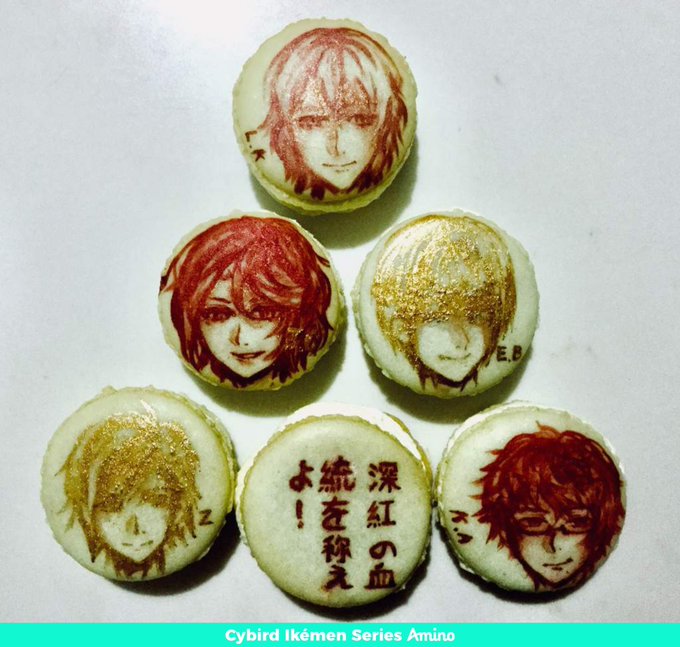
* (high contrast winered drooping eyes:1.2)
瞳のハイライトが弱いのを解消しようと「high contrast」を入れた所、時々「基本モノクロだけど一部だけ色が付く」画像が出てきました。
狙って出せるか、までは検証していません。
#AIart #AIイラスト #anything_v3
The garment's wrinkles have fine, detailed shadows. The folds are intricate and the fabric smooth and lustrous, with the wrinkles adding a subtle contrast and graceful elegance.
なるほどこれはいいものだ

Not me knowing to use mint green for bg for contrast. I will never be this good at traditional art again.


@Jimb0Games @Fire_Mario_Fan this is how I came up with the colors for PowerStation
Hue Slider, Contrast, and saturation fuckery


【好評発売中】
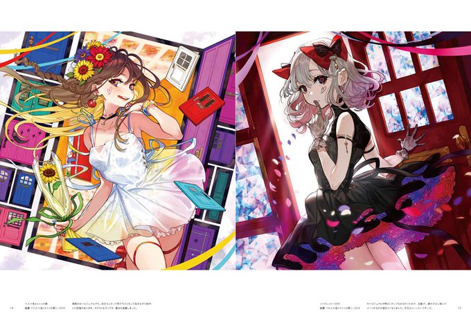
イラストレーター・裕さん(@youcapriccio)の初画集『CONTRAST 裕キャラクターアートワークス』多数の描き下ろしから、創作、版権も大ボリュームで収録! デザインはあの@BALCOLONYさん。たくさんの「かわいい」が詰まった充実の一冊です! ご購入は👉https://t.co/cKesaPVphV

@agonizedowl i think it still works just due to their design alone, they just seem softer so i think youre good
i tried to tinker with the colors a bit to sorta keep the warmer colors but also adding a bit of contrast