imoのTwitterイラスト検索結果。 44ページ目


@MichaelG_3D This was a fan poster for far from home ( done for a competition ) and its so much better IMO, although a lot of ppl didn't know who Mysterio was before the movie. I was really fun to watch my friends surprise when the reveal happened


Also, comparing these two, the one of the right has a bit more...."expressive-ness? (Is that a word?) What I mean is that the character poses on the left are more basic and more streamline Mario, if that makes sense. The one of the right adds so much more character imo https://t.co/HtU8zdGLxL


@ItziMitzi07 well said; while we still have yet to have seen it, IMO V9 looks promising; that aside, we can all still appreciate the relentless creativity of our community as Monty endowed us with


Again, I love her, but missed opportunity for not having her ace be a Dachsbun imo https://t.co/RU1BZNZNql


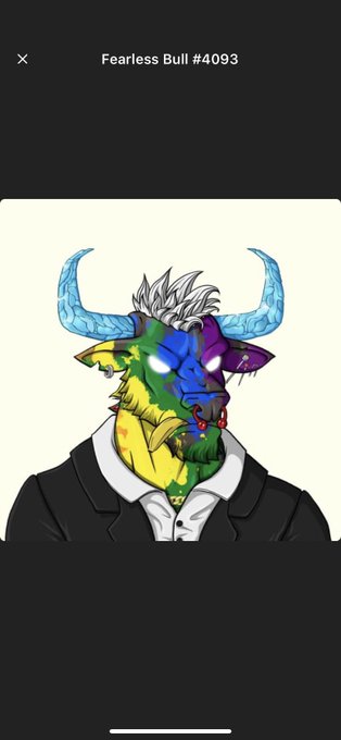
I Just used the @DandiesNFT transfer tool for sending my @Fearless_Bulls Og collection to the burn🔥wallet and it was seamless keep up the awesome work both teams are the goats 🐐 of solana imo 🐐👑


My OC Rhue if she was part of #avatar2 's world... how well does she fit in?? (very imo)
#AvatarTheWayOfTheWater #oc


@BamBanDibuja It never stops, it helps that all the designs feel distinct and try to go for different aesthetics. Two more really good ones imo


decided to give orthworm an evolution because it’s the only gen9 mon that felt incomplete imo
#fakemon


@herbancowboy_ I really love the squiggly stripes on their tail. They're just silly and fun imo :D also I love how blue they are


Shintanis character sheets are genuinely a marvel to look at imo. Really love his designs.
And oddly enough the golden form is my favourite form of all time in db, homie frieza pulled up WITH THE HANDS only to get killed but still


Here's mine, coloring styles are very different imo https://t.co/BNuHATdQnk


I did something and imo it looks better
These colors goes hard https://t.co/NwXgprv68j