ContrasのTwitterイラスト検索結果。 10,816 件中 431ページ目


@cavagugo Podria ser esto posible? (le subi mucho el brillo y contraste porque se veia oscuro xd)


you'll often also see that they develop a better sense of contrast – the difference between dark and light, hard and soft often becomes more pronounced


Loose vs. Tight? Casual vs. Office? Monochrome Color vs. Color Contrast? Whatever you prefer, don’t be afraid to flaunt your style! The beauty about fashion is you’ll have to change your clothes eventually, and every day gives you the chance to try out something new!


I forgot I entertained the idea of a Commander White cosplay. The contrast with my skin would be fun.
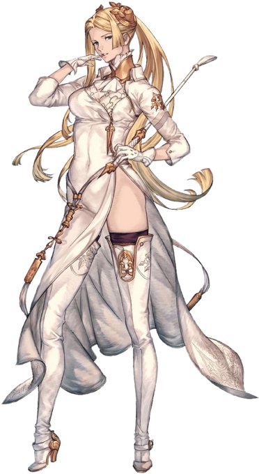
This was before they showed the 2P color variant. Still though, Commander White is 🔥
#NieRAutomata


Meninas!
I think silver makes for a nice contrast to her hair ☺️
One of my favorite ones I've drawn lately!


Contrast is the key to making fun and fashionable outfits! Weather you combine different clothing sizes, or work with complimentary colors, find a way to make some visual contrast in your outfits to make them feel more dynamic!


Hi I’m Myles! 🇷🇺🇺🇿🇴🇲🇮🇪🏳️🌈
I’m trying to be more active during this time or quarantine — I like character design and drawing in high contrast! #VisibleWomen #portfolio
insta: https://t.co/deGHTEh48O
tumblr: https://t.co/wGUzWinJ8b
website: https://t.co/dO7nztsPS8


What is this thing called?? A siphon??? I just remember seeing it on a competition on Food Network and only one chef knew how to prepare and use it
I wanted to contrast it w/ Brie, who’s making quenelles with simple spoons! #GHliveblog


En contraste están Marte (Aries) y Venus (Tauro + Libra).
Respectivamente muestran una parte de nosotros que está asociada a los deseos. Ambos planetas muestran polaridades muy distintas. Mientras que marte es un planeta que se mueve por lo que desea, Venus es experta en atraer.


i bumped up contrast and saturation to match the colours on the demo disk image found on nintendo dream's site, as well as removed noise that comes with scanning. as happy as i am with this, there's a lot of info that's lost from all this processing... ;_;


Alex Niñov - The Minions of Kane (Christopher Enterprises, 1976). I bumped the contrast on this. Original is below.


The amount of detail and contrast you put into different parts of your painting is a great way to direct the viewer‘s eye.
Check out this painting by @LeeshaHannigan and pay attention to the trees in the background and the hand / shoulder.


#TeenTitans #raven #starfire a new poster I did since my Raven print is pretty old. I also just love the contrast between the two characters so I wanted to draw them together!


Nice to know local art by local artists continues to please our customers. These contrasting prints were among those going to new homes last week. Daniel Bokenham’s buccaneering ship - a derivative from his epic 3D graduation project, and Kirsty Steadman’s ‘Autumn’.


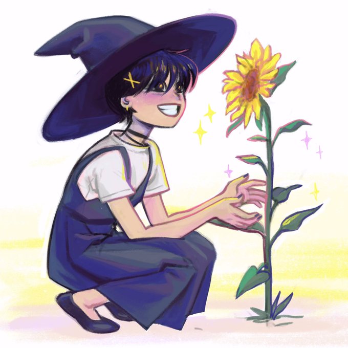
Apparently I only make very dark or very light drawings. Contrast? Don't know what that means.. . Character by @VoiceOfOBrien of @CriticalRole
#criticalrolefanart #Criticalrole


[HILO] Los dibujos de la cuarentena:
#Mermay2019
#Stretch
Me lo estoy pasando pipa con este dibujo, jugando con los colores y los contrastes. Tenía clara la luz en mi cabeza pero al meterle color WOW no me reconozco. Espero terminarlo pronto 🧜🏻♀️