compaのTwitterイラスト検索結果。 164,130 件中 432ページ目


you can BARELY see it but definitely a different color (rosho's on the right for comparison)


GEMS COMPANYのユキノくんこと赤羽ユキノさんを描きました。
#GEMSCOMPANY
#ユキノくんアート
#mitchiの二次創作


*clones myself and stands in a line to stare at you*
(for easier comparison, mostly for me if I'm being honest LMAO)


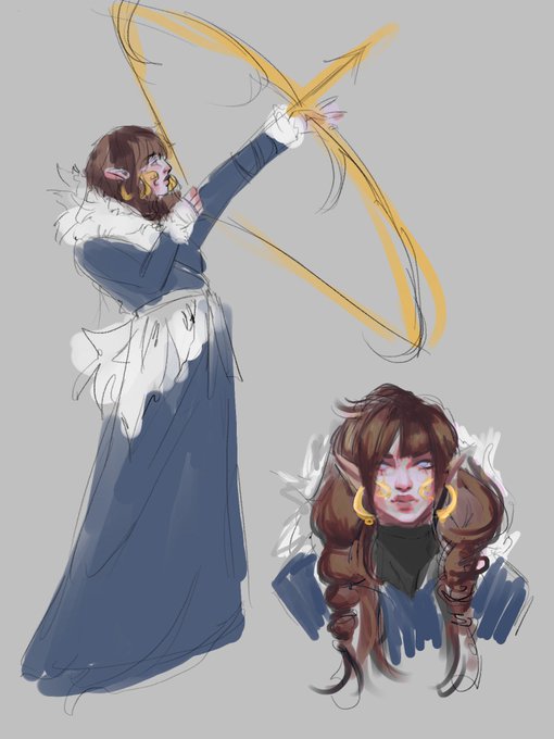
@dinkndots Sayu the aspect of compassion and Vara a blind archer from freljord 👀


Je préfère Farfurex shiny et Pierroteknik shiny à Amphinobi shiny car les couleurs sont plus originales >:)
(Ptite image des deux shiny pour que vous comparez) https://t.co/1qJ9vvQNs1


@dreamtothesoul She just got a pear shape
The eggman you’re showing is more cartoonish in comparison


Which path would you choose?
Emissions continue to rise and action from companies remains far too slow.
On our current trajectory we are set for a 7% rise in emissions by 2030, instead of the 43% cut needed for a 1.5 degree future. (Reuters) 👇🏻
https://t.co/2tNgmlpPcf


Lilia was the first TWST character I've drawn digitally! My current artwork of Lilia is different compared to my first artwork of him...😳
✨🦇✨
#RayArt2022 VS #RayArt2023 https://t.co/1Stw5R8KaX


I don't get why his art looks wrinkly but ig they were trying to make him horror-esque, but he's one of my favorite designs. I like that he has a less cyber aesthetic compared to other vocasynths and more of whatever you call this aesthetic.


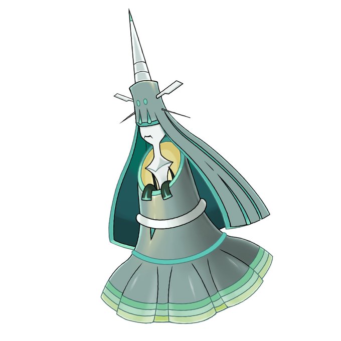

I used to do the design fix~only to UB though. That's how the impact was done to me but nowadays it's just compared with other tasks this isn't really something major. I'm learning to appreciate more but on the other hand it's also like...I'm never gonna fix them all lol