ContrasのTwitterイラスト検索結果。 10,816 件中 433ページ目


and of course, magtav isn’t just foon: I’m a sucker for a good framing device, and the moment the show went from “I love this” to “oh this is EXACTLY my jam” was when the space bunker turned into a world unto itself! and what a cool contrast of characters to explore!


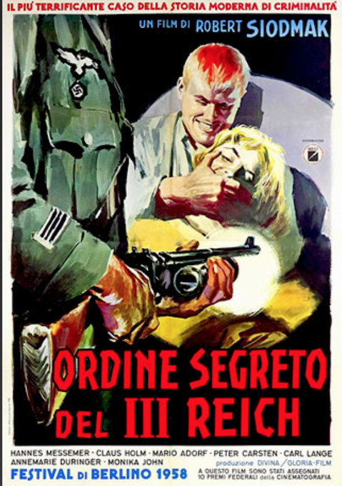

THE DEVIL STRIKES AT NIGHT (1957) - I highly recommend this Robert Siodmak thriller set in Nazi Germany. Paints the Nazis so chillingly that a mass murderer of women in the film almost seems harmless by contrast. @noirfoundation


tenho um testezinho de contraste tbm, eu sou uma negação pra fazer processo de desenho pq eu sempre esqueço de tirar print das coisas e quando lembro de tirar eu já to com o desenho quase pronto haseuhaseh


3 year process. 2017 I was still struggling with the more basic fundamentals, and afterwards I learned I had alot more to do in terms of contrast and readability. Last revision on the painting was early this year.
#digitalart #illustration #painting #fantasyart #wacom #historic


This might be really petty of me, but… Am I the only one who isn’t a fan of the colors on Ash’s Gengar? It’s just, I dunno, too “soft” for my liking. The darker contrasts for other Gengar just really sell it as a shadowy figure. Like, what point do the alternate colors serve?


@eggz_with_legz 🤔 i lightened it up much more, it looks different on my phone though.. oh well i think that helped reduce the contrast?


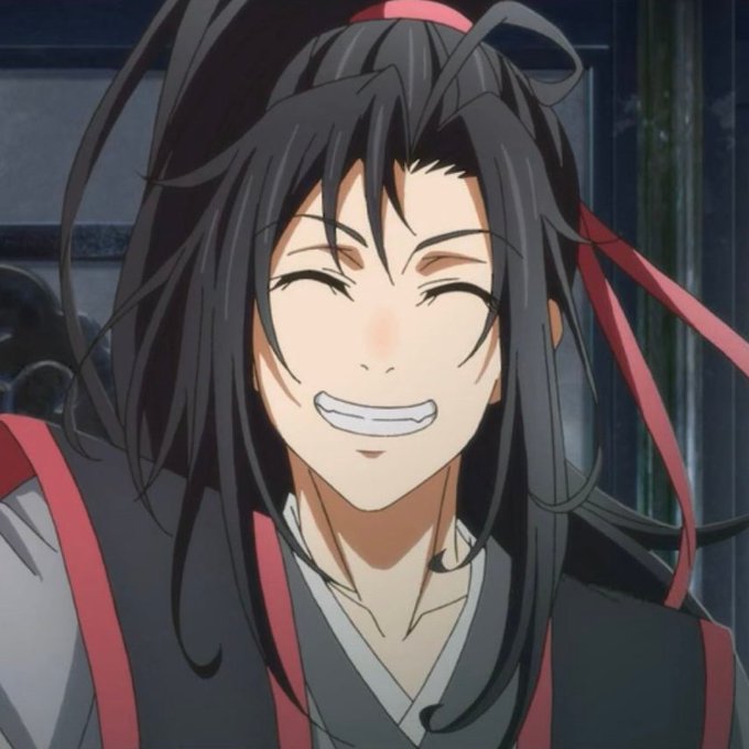

teen wwx is bright, open and smilng wide but the contrast with yiling laozu who is literally the reverse..........


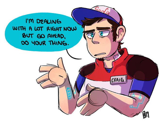
BIG DICK BACK IN TOWN...with mayo! Here is a blushy Crim! I wanted to go with a pastel "aesthetic" background to contrast the banner text. Enjoy!
😇🍆😇🍆😇
Like my art? Support my Patreon!
https://t.co/Lws4MXhQmT


Li and Abigail commissions for @KyrielleArt drawn by Lila.
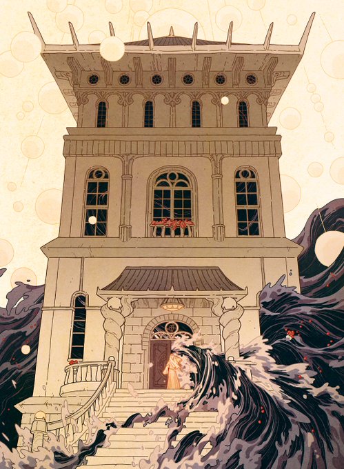
I love this contrast!
🌸 😈


@sousakuTL #宥柊
⭐️待ちに待った1stシングル⭐️
.
新生アイドル -contrast- 🔥
.
「Dye ~アナタ色に染まる~」
.
今回はなんと!初回限定版のジャケットAとBを初公開!
.
是非2枚ともゲットしてくださいね!✨
.
.
.
ゆかりくんの妄想二次創作です


Some times i have to delete my sketch layer to make room and other times my sketches will be on separate layers bc of overlap/complexity. Also instead of erasing lines i usually just go over them in a highly contrasting color


So I spent most of my free time today messing with texture projection from scans and in the end all i thought was "damn there really needs to be some contrast here, it's flat as hell"
going back to it with a fresh mind tomorrow or monday i guess


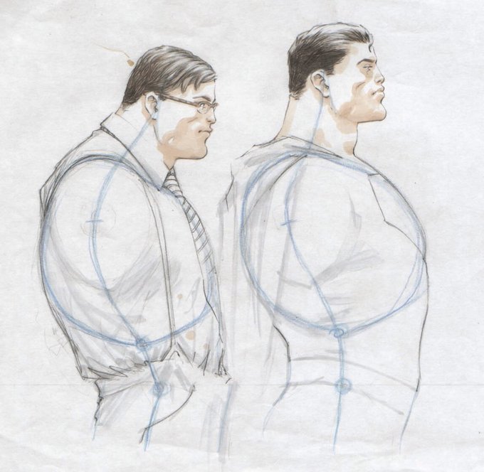
Done re-reading All Star Superman... and now re-appreciating Frank Quitely’s and Jamie Grant’s work with the Clark Kent/Superman contrast.