ContrasのTwitterイラスト検索結果。 10,762 件中 435ページ目


Here’s me drawing Bukayo Saka, leaving out the exterior lines and building up the interior with deep pink purples and blues. Leaving the kit as a vector like piece with the organic style of the head blooming from the neck is to enhance the contrast and direct the eye.


crop of a BIG illo I just finished *___*
i really love coloring these in Illustrator. enjoying contrast between the very wonky, hand-drawn ink lines to the solid shapes. and it takes soooo much less time vs raster graphics, especially the doc size of 28,000px

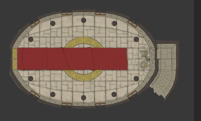

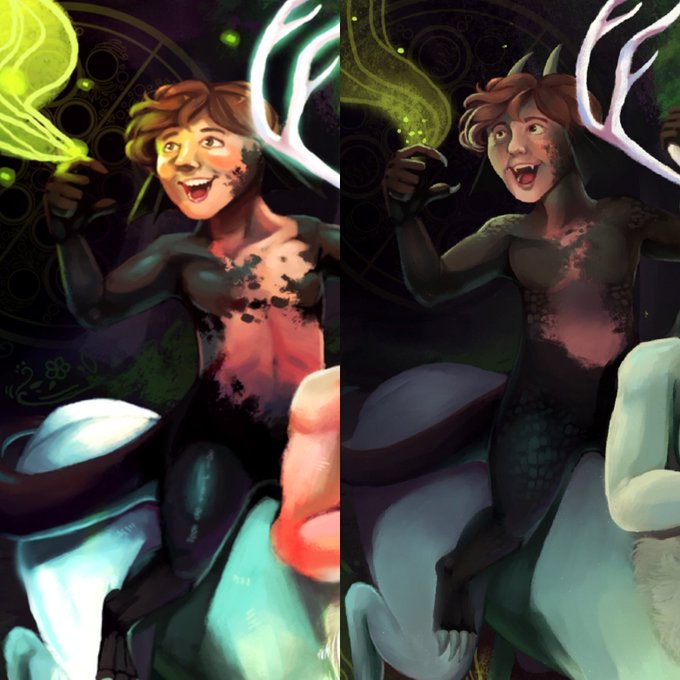
Working on contrast and value control in one of my old pieces and wow focusing on subtler value transitions definitely saves my eyes a world of hurt


2019 - FAN ART ALERTE ! Alors lui je dis oui ! J'ai bossé sur le fond, lui je l'adore pour son fond !! Attend, Stranger Things, meilleur série !! Oh puis le "monstre" (pour pas spoil) il est cool !
Ouais je complimente que le fond. Elya..Mouais bon contraste, Ombres pas mal.


another example, reducing full color to warm and cool to help control contrast and composition

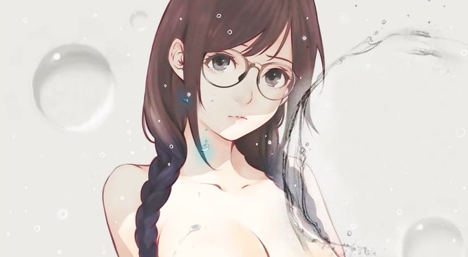


I mentioned this on @LoveItOrWeebIt, but I find the setting of Eizouken—in particular, how fantastic and out-of-this-world the school and town are—really bizarre, especially when it’s supposed to contrast with the fantasy of the girls’ imagination.


Comparing and contrasting... Excited to have a new project in the pipeline. A series of fractal responses to paintings within the collection of @strangershallmuseum will soon be installed in situ alongside their doppelgängers...
@ace_national, @NCCArtsService & @NorwichArtCentr


@DrLavaYT Another sublte but shiny lost to time that’s always struck me as odd is Flygon’s. It’s original had a nice turquoise stripes, and it’s current has sky blue stripes. I miss the contrast of the turquoise ones alot.


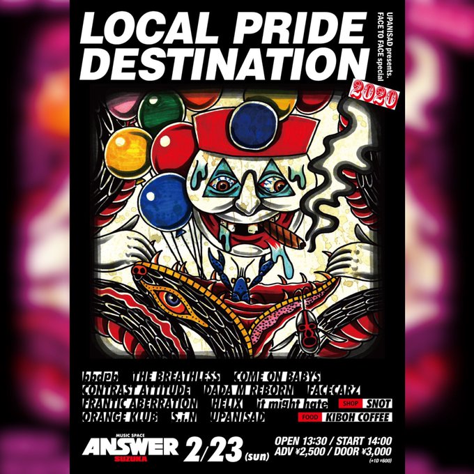
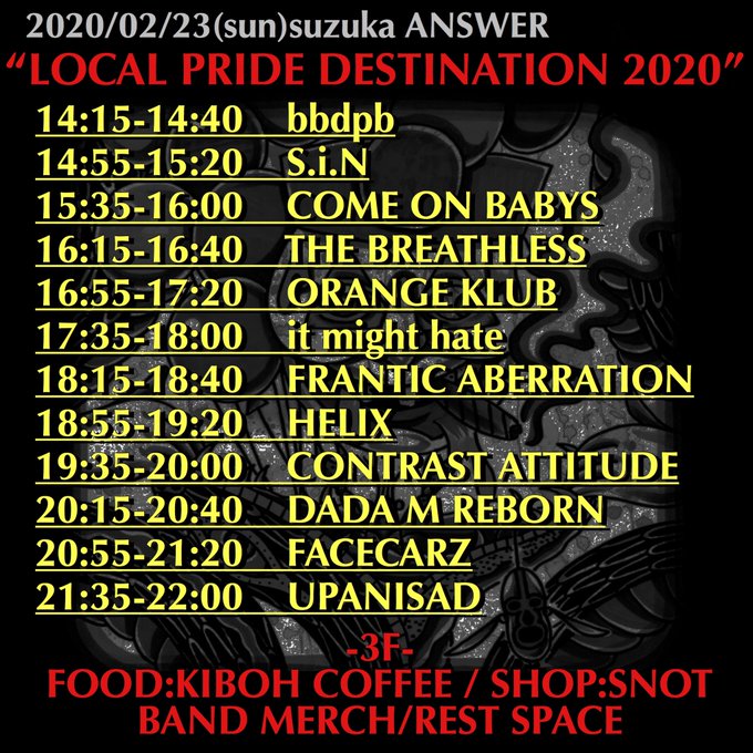
2/23(日)三重鈴鹿ANSWER
"LOCAL PRIDE DESTINATION 2020"
■BAND
bbdpb
THE BREATHLESS
COME ON BABYS
CONTRAST ATTITUDE
DADA M REBORN
FACECARZ
FRANTIC ABERRATION
HELIX
it might hate
ORANGE KLUB
S.i.N
UPANISAD
■SHOP
SNOT
■FOOD
KIBOH COFFEE
取置きOKですか?


my skin, my logo.
postei outro speedpaint no YouTube falando sobre os contras de se criticar demais e criar muitas expectativas. corre pra assistir e me dizer o que vc achou ❤️
https://t.co/g3Ndkz0DYJ

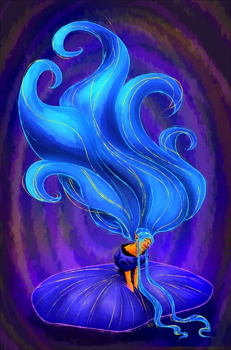
Experimenting with a new brush that I used both for the lines and all of the color work. Blue/orange contrast has always been one of my favorite combinations and this was an interesting challenge to complete 😊


Made a cloudstar design for fun. He's black and white rather than grey and white because its more contrast. #warriorcats

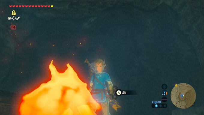


Abec uses cel shading in his illustrations and so does the anime while the scenery is still very pretty. this is necessary for our SAO game. Granted the shading in BoTW may be a bit... INTENSE... So I think it should be toned down and use less contrast.

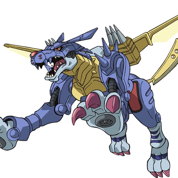

The colour scheme is dark blue, like MetalGarurumon and ZeedGarurumon rather than the original Garurumon which is an interesting choice. Red neon contrasts pretty well with the Greymon’s neon blue, the neon energy lines are also Merciful-esque.


A character concept I wanted to try out. This is still very sketchy and I don't have any plans to go deeper than that right now. Colors and contrast are quite messy but it's fun to do something faster once in a while.
#art #illustration #scifi