ComparisonのTwitterイラスト検索結果。 22,231 件中 442ページ目


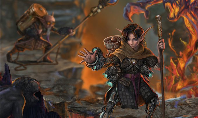
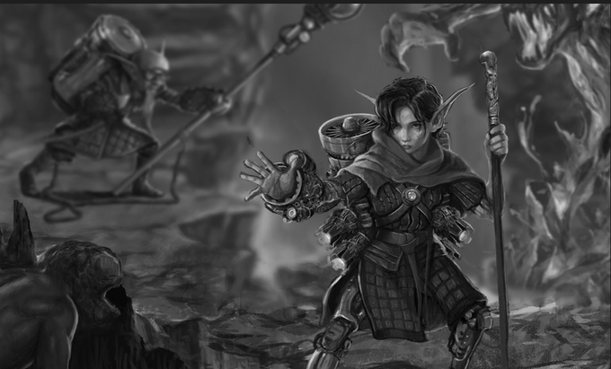
This is a comparison and not meant to be overly critical of this art. You can see the contrast in the foreground character, which works well. However, several background/foreground elements could work better by different color choices.

@JubileeGeode Thank you so much 🐶✨!! Drawing so much for the graphic novel has really helped me improve! I *just* made these comparisons


@Pd_wins said i should illustrate how big Squeaky is now so i made this quick comparison between Squeaky and Polly (since she's a character i draw a lot) to illustrate how much llama are we talking about now.


I'm getting sick of the $60 price comparisons between games. If you don't think it's worth it, that's OK. That's your prerogative.
But different genres make for different challenges. So unless you're a programmer who understands the idiosyncrasies between game genres, stuff it!


sketch to finish comparison, adding some minor tweak here and there.
https://t.co/VZVVu5A1os
available on secondary

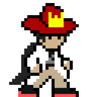

ngl it's only hitting me recently how much progress I've made on these sprites.
For comparison here's that first sprite I made way back in May and the most recent one earlier today


I made this by practicing under painting with green and I thought it brought out a cool quality in the skin. Here’s the skin fully saturated for comparison 🤪


A little Diana comparison, her first drawing and her latest. About 2 years apart, it's crazy how much my style changed

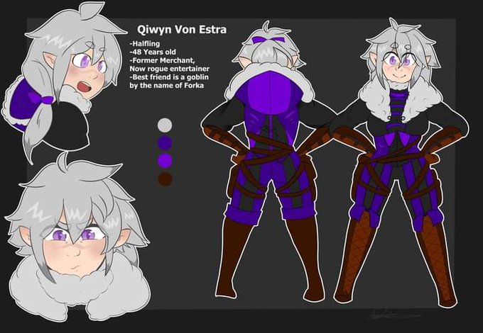

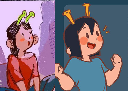
Another comparison !
Left (2020)
Right (2021)
I encourage artists to look at their old art and new to see their improvement, it helps remind me I'm indeed getting somewhere <3
#improvementcheck


Sometimes I just look at my first с!Tommy art and cry
(second is my new design for comparison)


hi. oh my god. sorry. this comparison made me completely bonkers and i fucking FLOORED IT. thank you for this #deltarune https://t.co/vbBkRjCGTS


bruh i am crying over this. twitter really gave me a nice abs comparison and i am in tears