compareのTwitterイラスト検索結果。 444ページ目

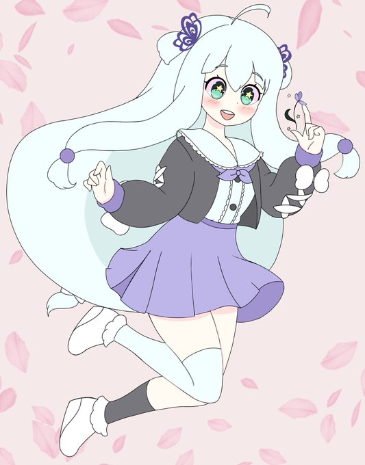
We all grow at different speeds and in different ways. So be kind to yourself and celebrate your accomplishments. Even if they may seem small compared to others 💕


Her popularity reached stratospheric levels compared to my other productions on twitter, still the surprise of the year!
QRT with your most popular art! https://t.co/RDgFXL2cMc


I on the otherhand was too lazy, so instead of doing that I moved the hands and deleted/flattened the ass
This model is horrible to use to compare, because;
1. The hair is straight out because nahobino physics
2. Arms/legs deformed to fit nahobino
3. Pls no look at head rig


Reference sheet of Whitie as an adult, with a more defined personality and physical expression.
His desire not to be compared to his parents, not to be in the shadow of either of them, leads him to a totally different style.
Commission made by @Teka_Tk1 🥰❤️
#HHOC #FluffyDeer


@EmanueleVerlez2 The hair becomes more fuller compared to Super Saiyan 3, and the hair it's more spiky like super saiyan 2, plus it loses all of its bangs. Buratsu's face is very "simpatic'' in the form of Super Saiyan 3, but in the form of Super Saiyan 4 his face is much more aggressive.


Big One
If anyone says that thats not a big one compared to the hypermess one i will put you back into underwear


QRT your sonas first design compared to now.
The memories of the first design will never be forgotten https://t.co/yXxgU9sF8L


drawing beidou gives me an excuse to look at (and draw) her boobas :3c
I drew her twice just to compare how different my style look between traditional and digital art, never thought it would be this different tho...
#原神 #GenshinImpact #BeiDou


"sasha how the fuck does Tamaki, a character that only has two entire attacks and is a relative grunt suit compared to Red 5 and Blue 1, have such a high ace score"


My art has grown so much... compared to Arc 1's illustration (dated: 2/23/2020).


これはペルソナのアニメEDのパロディで、メットレス、擬獣化ではありません。
This is a parody of an anime『PERSONA -trinity soul-』, not a character being compared to an animal. #shovelknight


I did a neural-style-tf video of a similar video with similar style input to compare results. Something nice about both and maybe I’ve just done too much with ns by now that I crave the new of pytti


Metal Build Eva-00 is not what I expected, but I kinda love it. A bit unique compared to the past models. Not sure I love the abundance of white on the head though. What do you think? https://t.co/h5pvmVz2JV


and yomi, she's a bear because she's generally laidback compared to the more energetic tomo. her glasses are opaque like several animal crossing characters, my specific inspiration being velma! the back of her jacket has a speech bubble, which is a common symbol is azumanga


Going all the way back to 2016, Gizmo Guy had quite a darker, more imposing design compared to now.
Must be the cat smile he currently has. https://t.co/EZSnQuYnwJ


I dont have a crazy number of emote slots compared to others but definitely more so now my tier 1s get 7 out of 8 emotes I have! Yey!!


i think i made a good choice keeping him in the same pose for every ref because its easy to compare and contrast. saar bimbofication 2020-2021 ...... ITS ONLY BEEN A YEAR???