parisのTwitterイラスト検索結果。 38,110 件中 447ページ目


did someone say ethersea ocs? 👀 this is Rev! she's a ex-parish ship mechanic up at Mona's at first glance, but Rev has a passion for tinkering and supplies all sorts of folks with arcane weapons she enchants and crafts herself 🔫🌊


Had a go at rendering a Quadstar and putting it in a random hangar I found on art station by seankernerman. Artie by @ZKabbit is not authorised Tribunal flight deck personnel and should definitely not be there for a scale comparison.
Security has been called.

@ParisHilton @unsilenced_now @itscarolinecole @SenSaraGelser @mikemckellutah @SenJeffMerkley @RoKhanna CryptoPrincesseParis


Doing a height comparison for The Three! Love them
#characterdesign #conceptart #Procreate #digitalart #art


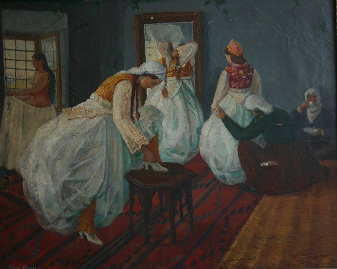
Ky kompozim, '' Pregatitja per Dasem '' eshte realizuar ne Paris gjate periudhes se studimeve te piktorit Sadik Kaceli dhe ekspozuar atje ne ekspoziten e ''Vjeshtes''.

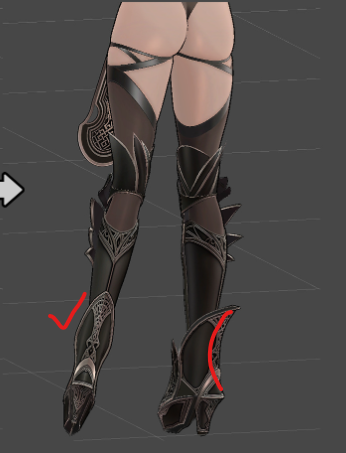
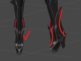
@Oitan_04158 I think you perfectly captured the shape really well~! But i think the shoes are a little thick in design in comparison to the curvy legs.
完璧に形を捉えていて、本当によくできていると思います。でも、カーヴィーな脚に比べて、靴が少し太いデザインな気がします。

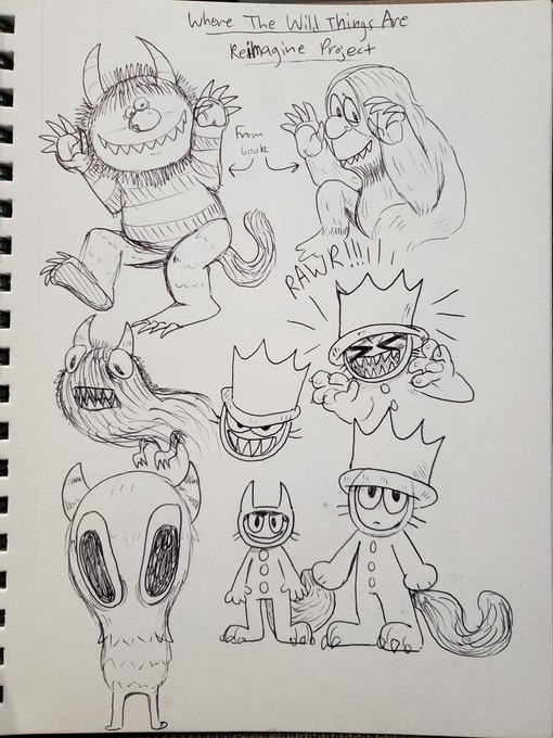
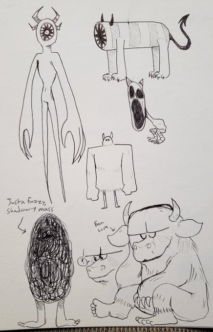
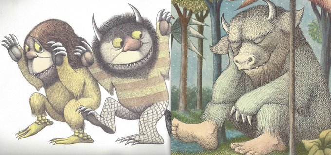
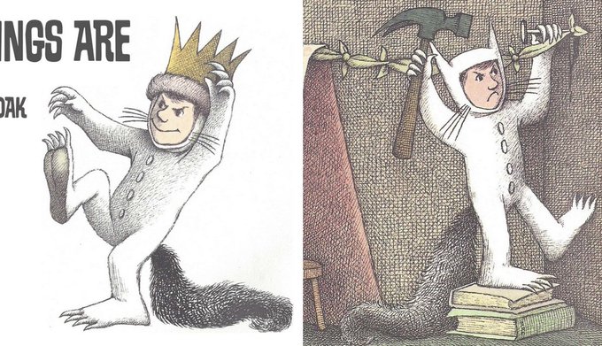
Finished my final assignment from my concept and storytelling class this semester! Had to do a take/redesign of Where the Wild Things Are and I ended up going in a more creepy/goofy direction I suppose ha (last 2 images for comparison from book by Maurice Sendak)
Thread🧵(1/5)


We are extra inspired by @ParisHilton these last few days. She is helping to give a voice, and empower those who have felt powerless!! Thanks for all you do Paris, sending so much love your way💜💜💜
https://t.co/hre1ONhbsY
#womenwhoinspire #totalboss


@b1odeuwedd so based blods
this is from July and looks wonky in comparison to new art & doesn't include like the newest design i have for him but i agree with your tweet
(is this shameless self-promo? maybe i mean i don't think it is but it bould be)

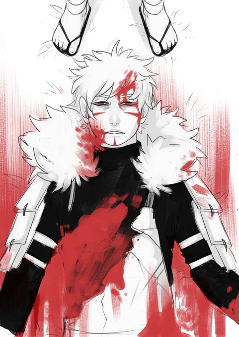
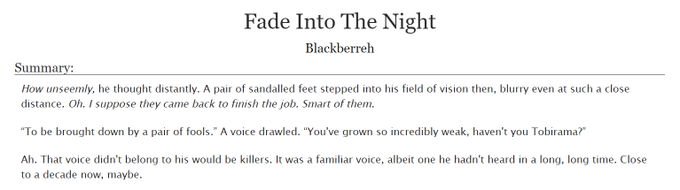
The fic is here!! https://t.co/kbKBqPLcBP
And the old picture for comparison eheh


if you guys were wondering which one i was talking about , here is a comparison from august to now ! what do u guys think ? :) https://t.co/eB0wa9QE8v

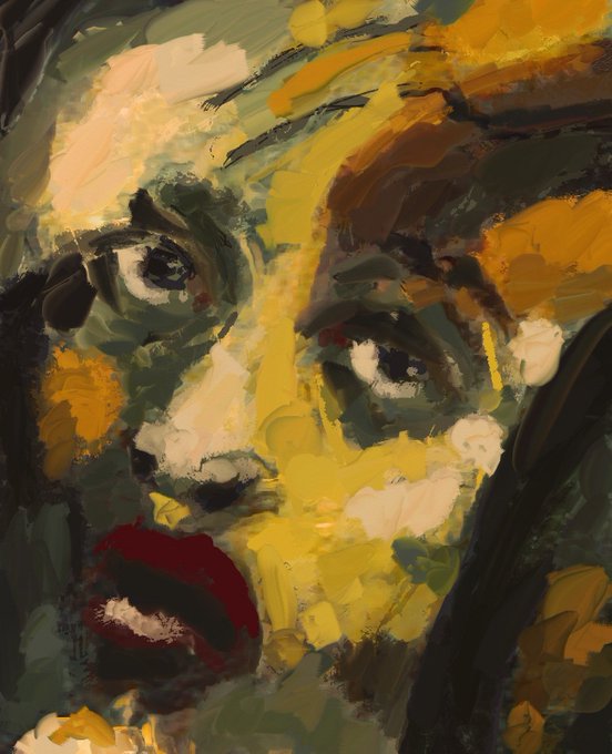

The difference between ArtRage (left) and Procreate (right) when it comes to oil brushes
Is there even a comparison?
I personally love and use them both but when it comes to texture ArtRage wins every time
What apps do you love?

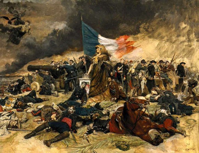
For #WIPWednesday I'm posting some of the nineteenth century art that's inspiring me as I work on Inferno, the game of swashbuckling #steampunk adventure.
Meissonier's 1870 'Siege of Paris.' Note the Valkyrie? top left.
Learn more at https://t.co/3Dkj66lJyn


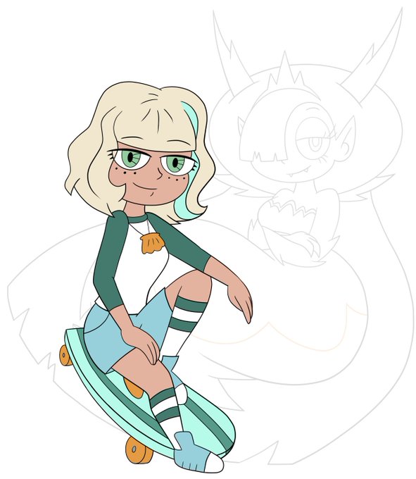
Talking with a company about a possible #JackieLynnThomas pin. The two designs I’m considering are below, along with a comparison to the Hekapoo pin I already made. Vote below to let me know your thoughts

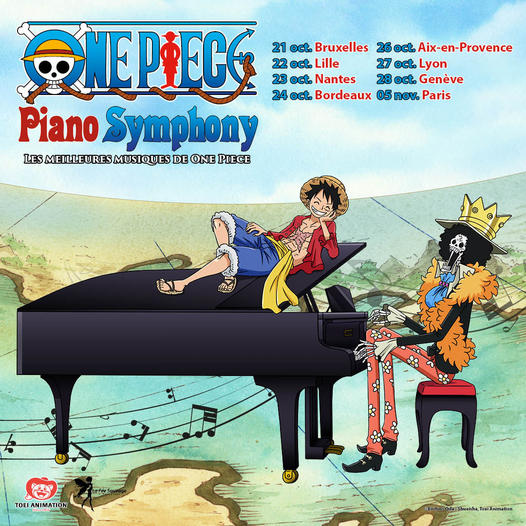
🎶ONE PIECE Piano Symphony sera en tournée en Europe : Paris, Lille, Bordeaux, Aix, Lyon, Bruxelles et Genève.
Revivez les moments les plus intenses de la série avec les plus célèbres musiques de la série interprétées au piano.
🎟️Billetterie ➡️ https://t.co/SANkIKQV7s

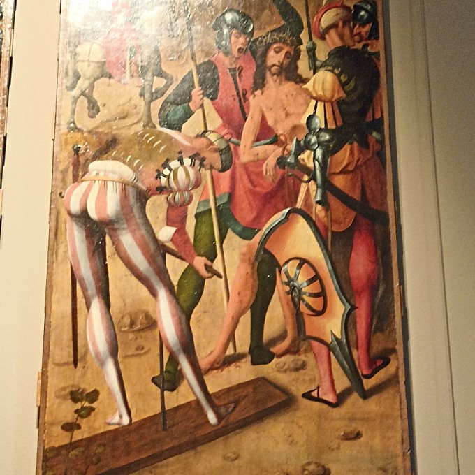

History's juiciest ass is in the museum of decorative arts in Paris


Zelfde veiling: Maria Sibylla Merian and Daniel Rabel, Histoire générale des insectes de Surinam et de toute l'Europe, contenant leurs descriptions, leurs figures, leurs differents metamorphoses... (Paris: L. C. Desnos, 1771) https://t.co/P0jpdxZTo5


@brndnsng here’s a comparison between the flat coloring and the one with the overlay so you can see it clearer!


@ElRhymesWithHel It makes a big difference imo. Here's it without (left) and with (right) for comparison. All I did was draw a bunch of messy hatched lines on a clipping overlay layer and dropped the opacity to 30% so it was pretty simple! Curious to see if the same thing will work on the shirt.