ContrasのTwitterイラスト検索結果。 10,820 件中 448ページ目


@LogicFairy Yeah, wow, I feel that, but with your art, all those vivid colors and contrast, the CMYK conversion must be cruel. Still always looks incredible.


i like to compare and contrast my old and new work :3
Old [Left] - April 2019
New [Right] - January 2020 https://t.co/5tyluileum


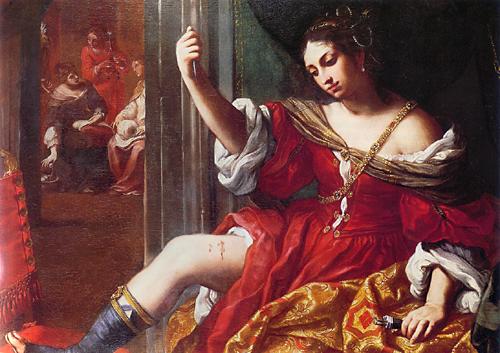
Born #onthisday1638 Elisabetta Sirani prolific Italian #painter specializing in historical themes Master of #Baroque style at just 19 produced 200+ paintings 15 etchings hundreds of drawings & 13 public altarpieces Employed dramatic contrasts of light & shade virtuoso brushwork…


Y en contraste, una prueba realizada a mediados del 2019 (yo toda inocente queriendo probar marcadores xD)


ピアノ、いくつかデザインのパターンがあります🎹はずせないのは、フェルトの赤と、塗装面の反射です✨
1:今年のカレンダー。リアル重視
2:1になるまでの過程。ちょっと押せる感が弱い
3:マスキングテープ。小さな面積でどれだけ表現できるか勝負
4:孔版印刷で版ズレを楽しむ
#contrast_design


All sketch portraits sent out!!💖The contrast between personalities here is my favorite thing ever.


AND HERE ARE THE SUPPOSED KIDS OF BYLETH, JAMIE
the personality i was going for was a much more outgoing and extroverted kid, to help contrast with byleth for MAXIMUM SHENANIGANS


Soundwave sketches... he's metal to contrast my Blaster design being 80s rock


@kfov_851 Cause of all the cute OCs here, for contrast I submit one angry pirate skeleton man. (Baines.)


I've been wanting to draw Campagne (oc) more, so I ended up hacing her hang out with this other oc I have named Polka. I kinda like the stripe/dot contrast with these two 😊
#ArtistOnTwitter


Here is my redesign of Slurpuff.
Didn’t like the hair/ears so I made them more floppy. This design is also based on Japanese shaved ice as you can see below~ Also added blue to create some contrast.
#pokemon #redesignpkmn #fakemon #slurpuff #sophiesuffocate #hardkandystudio


#PokemonSwordShield #digitalart #NintendoSwitch pues pude arreglar poquito el error del contraste pero ai esta mi primer dibujo del año y mi primer dibujo sin line art creo que are a mi equipo principal de esmeralda


I usually prefer flat colors since the painterly shading looks very contrasty with this style? idk


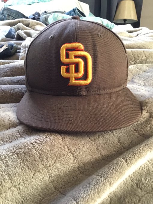

Take the new logo and just add orange it gives it more warmth and is still Padres unique .Use this hat that I bought over a decade ago. It’s not too busy or jarring in contrasts like the camo SD or road alt hat since ‘04. The orange seems to blend in and not fight with the gold .


compare/contrast of the kid heroes of Daydreams, with hd vroid versions of them for a spinoff idea... I really enjoyed making the original low-poly ones by hand, but I THINK I kinda got their personalities into the fancy ones? 🤔 #gamedev


#screenshotsaturday Calling this done. New "Rocket Launcher" for Bears In Space @Broadside_Games
I always try and design them up to be toy like, it gives a good contrast to the grungy enemy robots and surroundings.
Always keen on feedback
#gamedev #SubstancePainter


@NintendoES "¿Dónde encontraste esa baya meloc?"
#FanartPokemonEspadaEscudo @NintendoES @Escolajoso


“At the Tip of Two Galaxies” 15in x 30in gallery canvas.
I love the colors and the texture contrast in this piece. I may add a reflection in the helmet 🤔
Available for purchase 🖤
.
#artistsontwitter #painting #space #bluewhale #astronaut


Just removed a “halo” layer I had placed just behind the foreground, and I like it much better now... also the original (on the right) had a “Lux filter applied to it in Instagram, making Lionel less noticeable next to that newly high-contrast environment.