CONTRASTのTwitterイラスト検索結果。 452ページ目


@HiruArt And here's that Flareon, Made her hair(?) closer to the shiny color for contrast, thanks for the practice, hope you like😊


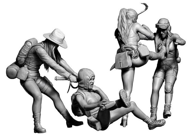
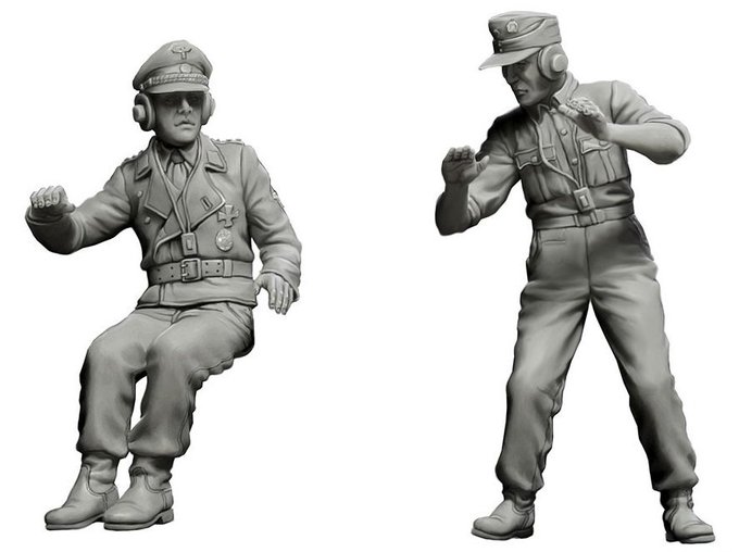

Masterbox two new kits for October in 35th scale - A German WWII tank crew & the other an almost out of this world scenario of a bunch of amazonian post-apocalyptic warriors fighting over some booty! What a contrast in today's new item preview...
https://t.co/o9OZPvkPK5


☀️ Hi #VisableWomen! I'm Jess, a freelance illustrator who loves to paint characters and backgrounds using bright colours with lots of contrast! ☀️
🌻 Instagram: @jessbernadetteart
🌻 Portfolio: https://t.co/mCck0zgCvy


This week I unexpectedly found two friends going shopping. I loved the contrast of the two cones, it had so much character.

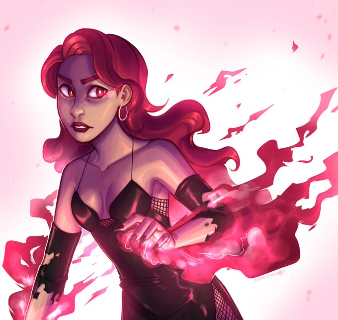

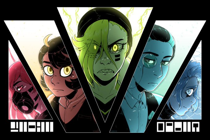

Hey #VisibleWomen I'm Serpyra and I draw angsty comics and high-contrast illustrations.
Comic: https://t.co/vm9HIKREha
Portfolio: https://t.co/mAejIhEtJI
IG: https://t.co/VjsnBUHAhx


Step 5: paint de fins
Step 6: mess with lighting and do final contrast and paint tweaks
She dun


✨ Hi #VisibleWomen !
I love drawing portraits and using contrasting colors !
✨ https://t.co/GcBkqbTYkI



The design of Vivace's hair incorporates the treble and bass clefs, to show her strong connection to music! Her outfit is meant to evoke lively forest fey, as she thematically represents life, to contrast how Duhrge represents death.


An earlier one and a more recent one. I feel like I accidentally achieved pretty good contrast on the first one and I’d really like to be able to replicate that again in the future. I like the second one because I think I did okay with the inks and I like the colour palette! https://t.co/VvpgCR9vfw

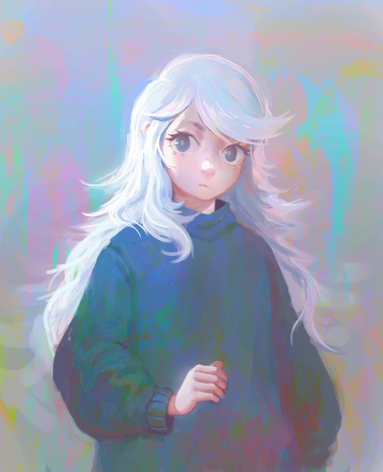
@HugoH2P Even more gorgeous #Eastward artwork 😍 This time by @fabianrensch. We love the wet oil palette background in contrast with Sam, great work!
🎨 OP: https://t.co/jocS8QlTaP


Here we have route 7, the one right in front of Celadon City. Wanted some contrast with nature and huge buildings in the back to foreshadow the city. #kantoinreallife
99/150 #thegrindto150
#digitalart #pokemonfanart


Elec Month Day 22 - Wanted to try something with a higher level of contrast... #megaman #ロックマン #digitalart #fanart

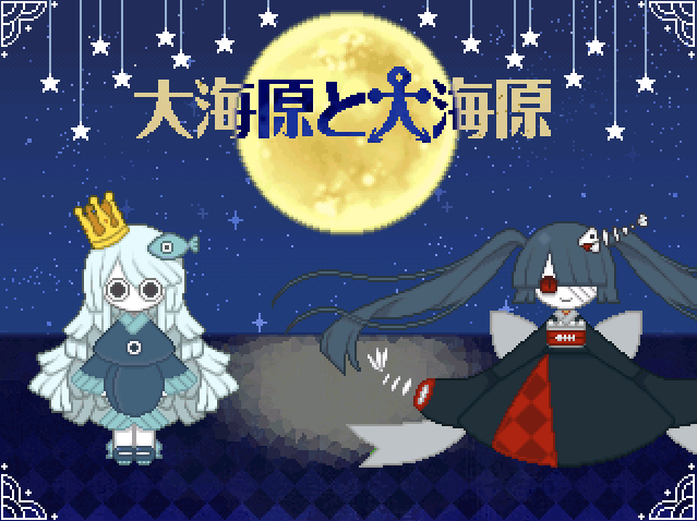
oohhh.... look at those contrasting silhouettes..
the blood sea princess (dont remember her name) has a much grander ominous silhouette to uomi's


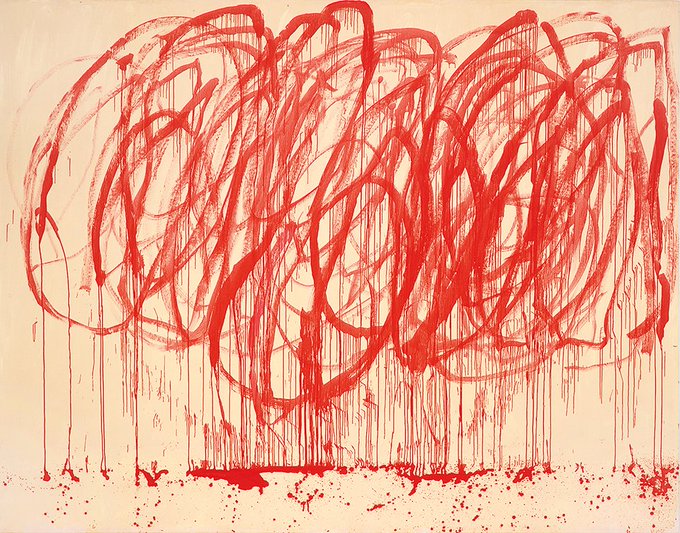
The asking price for a 1/3 re-paint of Universal Invitation is $50.000. The project changed the world, reached hundreds of millions of people and is about universal truth available to all. To contrast, this ketchup accident by Cy Twombly fetched in 36MM.
https://t.co/OfuhjSv6N6


These two again - workin out facial feature stuff n contrast

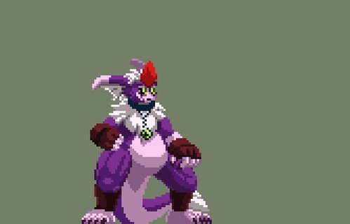
Startin to pick at Jeibu's moveset.
Here's a WIP of his stand atk 1+2. In contrast to Gejhi, Jeibu only throws a jab for atk1 & can't throw them as rabidly. His knee attack is also slower. Stun time & damage on Jeibu's attacks are greater than Gejhi's though.
#pixelart