compareのTwitterイラスト検索結果。 22,430 件中 453ページ目


you know god has his favorites when both the us and uk covers of a book are gorgeous beyond compare 😭💖
✨ us cover: art by kuri huang; design by rich deas
✨ uk cover: art by karl james mountford; design by lydia blagden


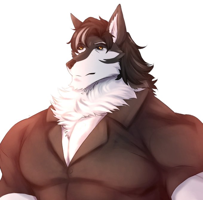
Yeah not that much has changed compared from 2020 and now, except now he has a hair style
(I gave him a little white part on his hair cause why not) https://t.co/9bAv9I16Es

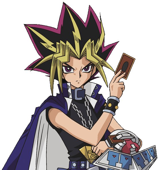
@addaestheday Atem on the left is the deurotagonist of the original show, he's a pharaoh. He's usually portrayed as sharing a body with Yugi and is called Yami Yugi. The guy on the right is very ehhh. The anime really stereotypes him compared to the others and his design to me seems offensive.

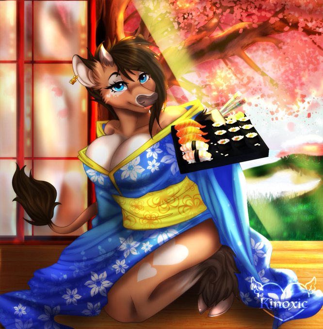

First Fursona compared to my current fursona https://t.co/5InmZhYc8D


@zurielight Must have been a small oversight.
What I find interesting is that they made that portrait in the first place. If you compare them, this is actually not the original P5 smiling portrait but a completely new one.

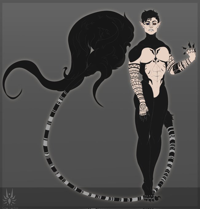
I've made so much art in the past few months and I really haven't been active on here lol. LUCIFER! Updated humanoid reference, in this form he's 6'0 but he walks on his toes to be taller. Compared to Caine six foot is small-
#art #lucifer #oc #digitalart


I swear if y'all compare my forehead to Haru or Takagi ONE MORE TIME-

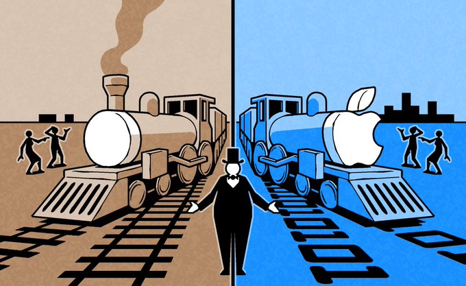
Financial Times - Brooke Masters Compares Apple to 19th Century Railroad Monopolies.

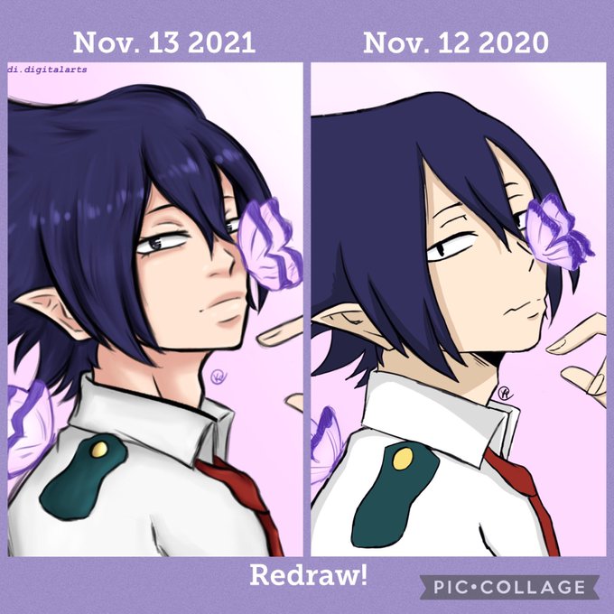


Tamaki Redraw from a year ago!
I did this to compare my style and see growth 🥰❤️
~
#tamakiamajiki #mhafanart #BNHAfanart #animefanart #animeart


Wait I also wanna join the wagon lmao, I'm so overly happy with his new design as he also reflects my current interests and how much I've matured when you compare him to that Tails recolor over there haha. The first design is like 6 years old by now btw wtf https://t.co/18TjXsEQNe


On my current playthrough of DQV I’m going with Nera. I wonder how she compares to Bianca gameplay wise.


Another model sheet comparison! This time, it's the original show's final model sheet for Season 1 Rotor, compared to his model sheet for @TeamSea3on by @timcampbe !


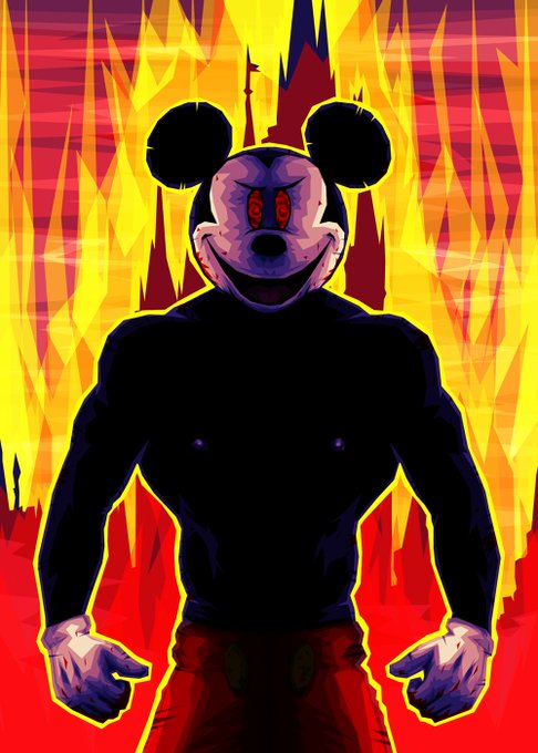
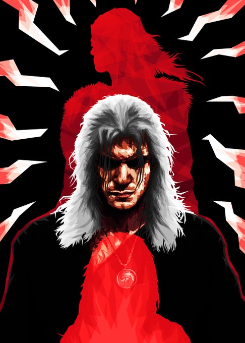
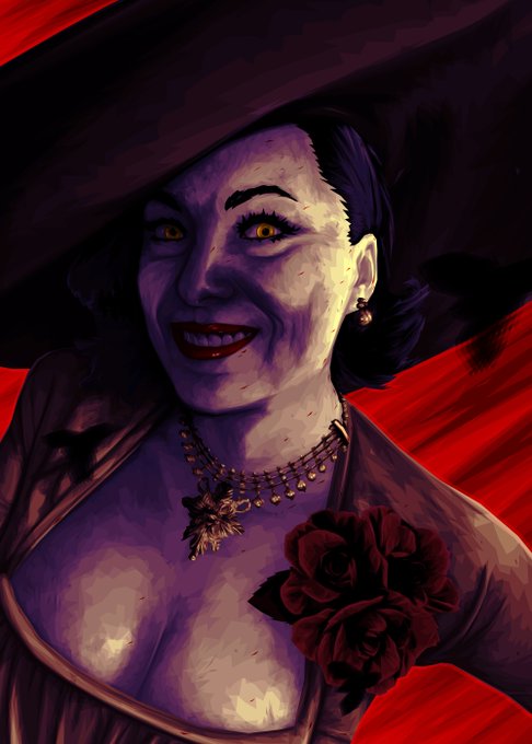
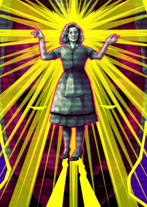
@GeekyTheArtist Compared to some really big artists, I'm still small. Here's my art...
Warning! Possible eye strain.
You can buy my prints on:
https://t.co/iZTx9MDGEK


FINALLY MY FROGGY SONG FANART IS DONE!!!
ik its not good compared to all those art gods out there but i tried my best so i hope u like it😊
@derivakat @BoomerNA #FroggySong #derivakat #BoomerNAfanart #dsmp #dsmpfanart #mcyt #mcytfanart #BoomerNA


@SNick_WT I think 11 is a case of Capcom overcompensating for what they did in X8 where the models are accurate, but as a result they come off as lanky. I say this cuz in like literally every other MM11 artwork, Rock looks proportionally very fine compared to the stubby in-game models.


Way back in 2009 I made ash and I've felt like he's grown up with me 😭😭😭 look at him now compared to then back when he was just a spyro oc. It gets me emotional 😢


Felt like addressing. NEVER compare artists' work in a shallow/rude light. It's okay to like whatever art you like, and I appreciate the compliments, but could do without the added insult, either toward myself, or other artists. It's legit bothersome when I see this happen.

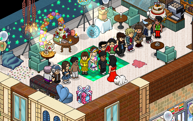
muito obrigado a todos que compareçeram na festa de aniversário do sorian! ele amou muito!