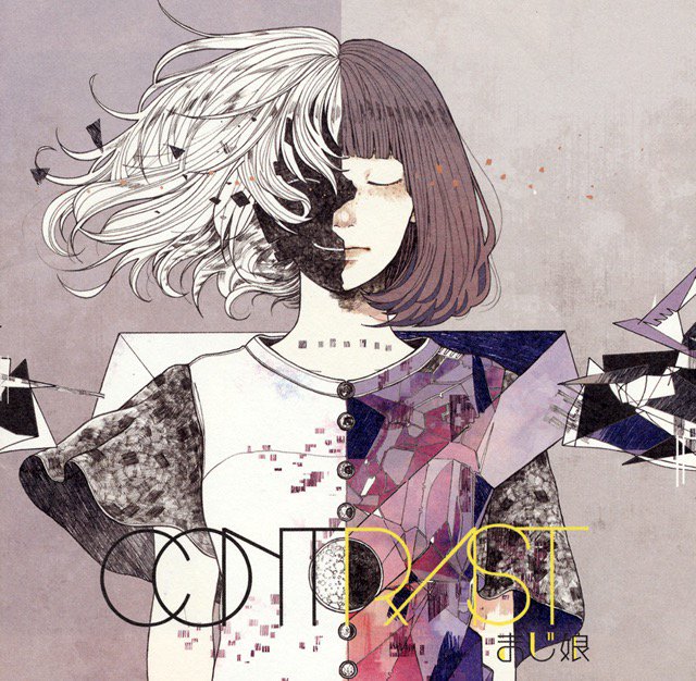
contrasのTwitterイラスト検索結果。 10,746 件中 453ページ目


@CollardsArtwork contrasts against the muted texture in this concept


@fernacen @CircuitTheFox Thank you! I think I might like the green with the orange hair. Nice contrast.


Nadia's colors looked too washed-out, so I contrasted the fuque out of them

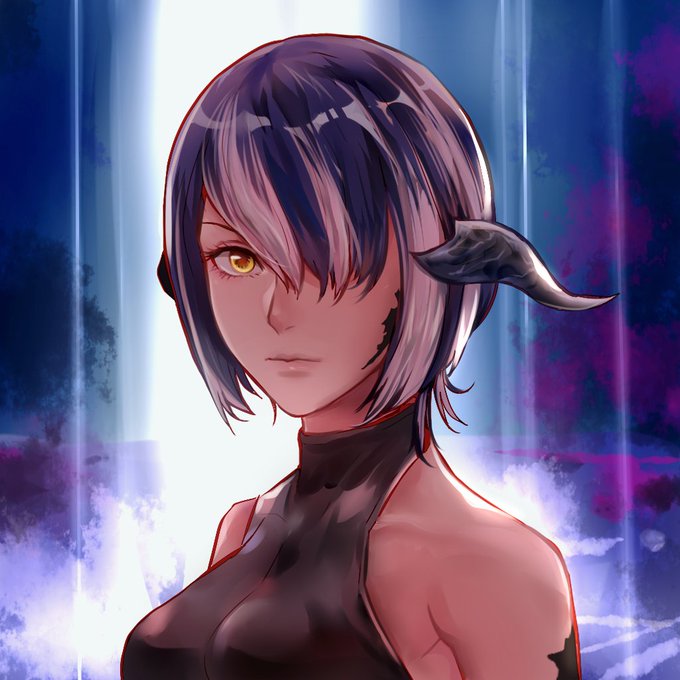

Bust commission from @ahan1112 of my character in a serious and less serious moment. Big fan of the work and the contrast, thank you!
#FFXIV_CC @FF_XIV_EN
#FFXIV #au_ra


This is the moment when the resurrected Jesus reveals his identity to astonished followers ~ contrast Rembrandt’s atmospheric, almost cinematic Supper at Emmaus (1628) ■ Caravaggio’s more theatrical version (1601) ■ & forger van Meegeren’s fake Vermeer (1937)

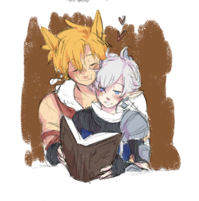
havent drawn in a hot minute due to selling my soul to ishgard but i rly lowkey love how their color palettes contrast..... warm vs cool


A little present for my artist friend @MuffinNeko1! She chose Aggretsuko as her favourite... but her sweet & calm personality is such a contrast - if I were drawing digital art with mouse only and no tablet, I would be raging 24/7 unlike her😂


🇳🇴 artist Ørnulf Opdahl’s atmospheric watercolour paintings draw on the dramatic & contrasting light of the rising fjords, islands, and wild seas of the Northern European coastlines. Come by @GandTFramers in Newcastle 29 Nov-17 Jan – or @PurdyHicks in London btwn 22 Nov-21 Dec


Hi #VisibleWomen!
I'm Jess, a UK based freelance illustrator who loves bright colours, nature and texture (I'm a sucker for lots of contrast too 👀).
🌿 IG: https://t.co/L8rvs1dZEb
🌲 Website: https://t.co/mCck0zgCvy


@cateyearts Hey 🙂 I'm a wildlife artist from the UK specialising in fineliner illustration. I like to explore contrasts in my work like light and dark / life and death


More black! I like the lacing and the contrast.
#art #artist #abstract #abstractart #fluidacrylic #painting #contemporaryart #artwork #artforsale #fluidpainting #originalart #originalpainting #paintingsforsale #fluidabstract #uniquepainting #canvaspainting #abstractpainting


An approximately true color/contrast image and versions with different levels of enhancement (one with a lat/lon grid) processed from @NASAJuno raw image PJ23_18 from Nov 3, 2019. A long band of haze extending from top center to the lower left is visible in the enhanced versions.


@michebluedragon @TomatoLacoon Hi guys! I'm Jess, a freelance illustrator (I'm also open for commissions for Christmas! 👀) who loves warm tones and contrast 😌✨


🌌 • I promise myself , from then on I’ll live honest to myself• 🌌
~ The sad contrast and comparison to Ymir and Ymir Fritz , who both we’re used, but Ymir got a sense of freedom that Ymir Fritz didn’t ~ yet in the end both deserved better .
#AttackonTitan #ShingekinoKyojin