LooksのTwitterイラスト検索結果。 305,871 件中 454ページ目


@soggystyrofoam OH YEAH THE POP ART GOES REALLY WELL WITH THE CHARACTER DESIGNS i think its bc the art style feels so "sharp" in a way where it looks kind of unnatural to me on top of the faces so the more they lean into the pop art the less jarring it looks to me.
Like this one, i like.


dunno if this is a hot take or not but I think this is definitely my favorite adult gohan design. Its a shame people didnt like it cuz it made his transformations stand out SO much better and is very fitting for him overall
also gohan looks great in green


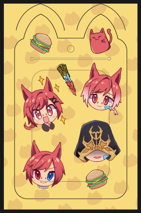
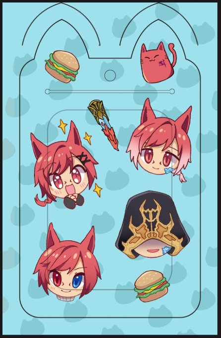
may i haz sum onions if yellow or blue looks nicer? poll in thread


*Looks at the time*
*11:59 PM*
I still got time, Happy Miku Day! Thank ya for all the years of awesome songs <3
#mikuday #HatsuneMiku #ミクの日2023


365 Day Drawing Challenge day 30🔥
ik he's psychotic here
but in this one moment he looks free and happy
ffs it hurts like hell but still i rlly like his smile here


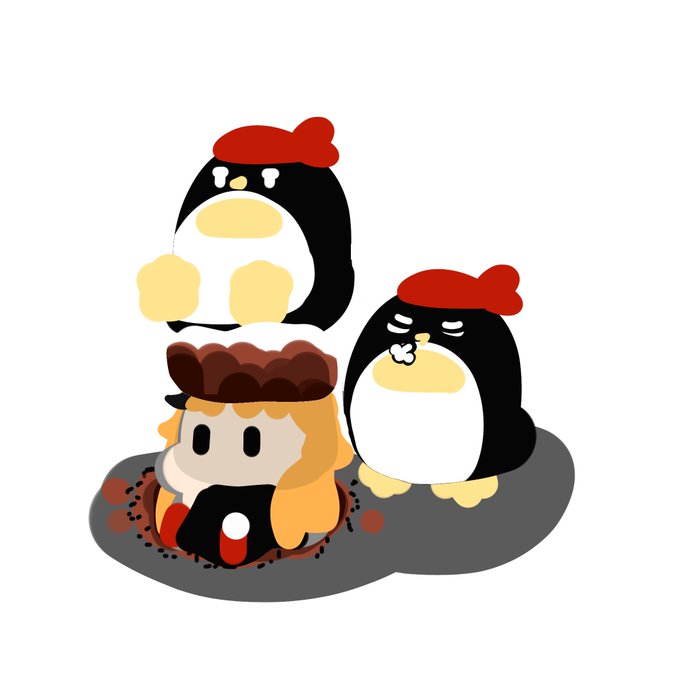


I've been watching #Playthrough videos for the #ResidentEvil4Remake demo that dropped today. It looks so good. And that #ChainsawMan 😱
"It Comes For You"
• https://t.co/GaUylPlvI3
•
#PescEffects #ResidentEvil #Nemesis #Zombies #UmbrellaCorporation #TVirus #GameArt #GamerLife


Sea fairy cookies costume looks cool 🌌
=========================
#SeaFairyCookie #cookierun @CRKingdomEN #cookierunfanart #cookierunkingdomfanart #art #cookierunkingdom #ibispaint #CookieRunKingdomTH #artistontwittter #ibisPaintX #digitalart


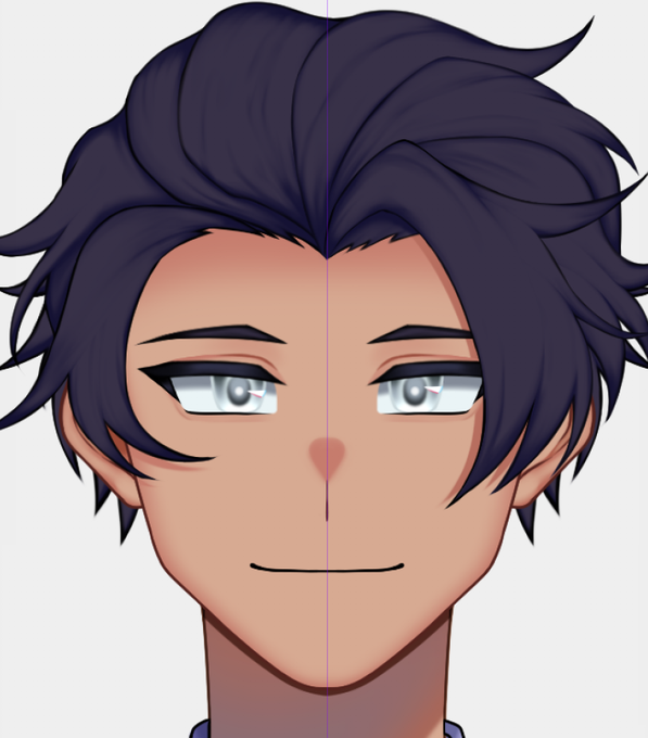


It's my big boy he's back! And he looks way more better!
#impulsesvfanart #hermitcraftfanart #fanart


AGGGHHHHHH HE LOOKS SO GOOOOOOOOOOOOOOOODODDDDDDD AAAAHAHAHHAA (btw this is another red flags screenshot redraw-) #ocart #ocartist #ocartwork

Hello fellow degen. Ever wonder what to do when teh market tanks and you are down bad? Here are some tips for when the market looks like it's going to 0 because some stupid bank in SV aped to hard for 1.6% yield and crypto FUD is at a max. 1/9


@alleycatguy I’m never saying this ever again.
it looks like something osomatsu would type out.


@SquishyBloom Want to re-submit because my PNG looks a little weird.