V2のTwitterイラスト検索結果。 455ページ目


Legion v2.20, Support for Apex S7: https://t.co/Toq1K2Oblo
-- Thanks to all the supporters.


You are all invited to the second iteration of the 2v2 Doubles Premier League! Signups are open until November 20th, so don't wait any longer! Come and join!
More information here:
https://t.co/ysymT0N4ya
Art by momo!
https://t.co/QuEc2OYdwH


Haven’t been able to do a whole lot lately due to school work, but here’s a bit of sneak peek at Protea Chronos V2.0. Really trying to expand on the Greek theme with the helmet. Her “ponytail” will have energy bits around it. #warframe #tennogen #sentient #thenewwar


v e e p o r w a v e
for the most aethetic veevee @/UtopianVee
[thread, v2/3]
#pokemon #vaporwave


BORGA v2, esta si me gustó , tons @stardustjarr


Comparing miku designs!!
V2 is obviously iconic, kinda sad the artstyle isn't so bold anymore
V3 stayed mostly the same, but with a white shirt (personally prefer the gray...)
V4 made the awful choice of toning down gee hair?? Why?? And made her even more moe-fied than V3...-

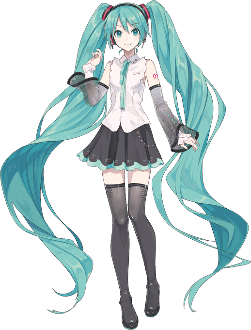
미쿠NT 일러를 맡으신 ixima님의 코멘트 번역
트윈테일의 볼륨이 화제? 인 것 같아서 제 개인적인 인식을 적어 보겠습니다.
원형인 V2미쿠의 머리카락은 (머리카락의) 양이 맣지만 근본은 (극단적이라고 할 수 있을 정도로) 타이트하고, 이 균형감에 비해 비교적 독특한 디자인이라는 인식이 있어서


btw to understand a bit better i don't dislike the design itself, Rella is talent i just think for default Mik it's a poor choice compared to how neutral and blank V2 was. Ive illustrated Miku metal with her V2 unchanged before, i could not manage w/this princess design

and its going to make more difficult my sentiments of her being able to be put into any situation with such a girly more infantilized design... V2 you could paint in any mood from cool to cute, edgy, soft, young, mature, casual or cyber and looked good everywhere