PortionのTwitterイラスト検索結果。 13,240 件中 456ページ目


Colored ver. I corrected proportions and played a bit with coloring 🥺🖤
@bts_bighit
#TAEHYUNG #bts #taehyungfanart #digitalart #digitaldrawing

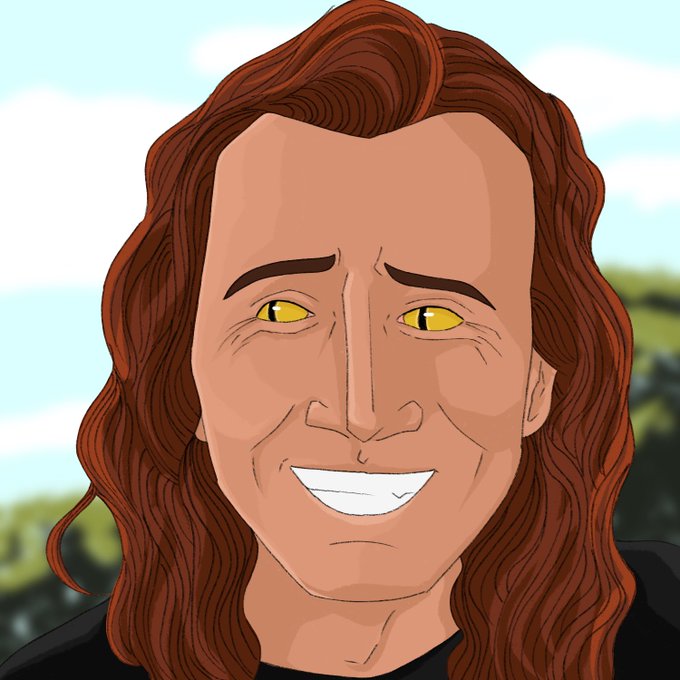
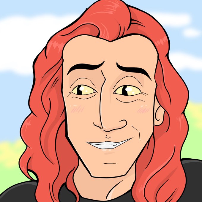
#artstylebend #goodomens
At least I tried lmao 😅
❌ Thin line art
❌ Lots of lines in Hair
❌ Dark Colors
❌ Realistic face proportions
❌ Semi- Realistic overall


Today’s drawing practice : proportions
I realized this Iori is too tall! According to official information, he is only 1 cm taller than Riku.
I think I’d better practice character’s face next time.


@ZeeFixesArt The head is disproportionate and the chin should stick out more. Also, the nose should not be aligned beside the mouth. The mouth should be more under the nose like in the original art. And the fingers are all the same size and they shouldn't be.This art is not good.Look at mine.


Unrealistic proportions
•
•
#uzakichan #anime #animeart #fanart #digitalart #yesnt


today I bring you some Shinkai Shoujo Nejire
tomorrow? who knows!
anyways enjoy~💞💞💞
//plz pardon these horrible proportions (I suck at art yk that 😔👉👈)
#ねじれ波動 #波動ねじれ #僕のヒーローアカデミア #深海少女 #BnHA


@80constant_ @REALMadMax1960 Chibi Naoto's proportions are too different from Morgana's, and even then the only thing that really looks off is the stretched out head. Which is pretty easy to fix, There's no easy way to make these two fit together and not looking weird.


next is Tyler. as much as I love the first painting, it took me a week of working for 6 hours everyday to finish. I think the recent one took 6 hours in total. I don't use grids now and then I used a grid for it, so it's not as proportional as I would like it to be.


Hehe throw back to my art 2017. The proportions were a bit crazy but I like were I was going with some of these!


Another comparison between even more recent works is Dora's older design and the new one. It's not just an outfit and color change, but her new proportions on the right are much more exaggerated


had an idea, so had to draw it. with the new Battletoads out, I got to thinking "what if they were a little more proportionally correct?" this is what I came up with #Battletoads #digitalart #Procreate #characterdesign

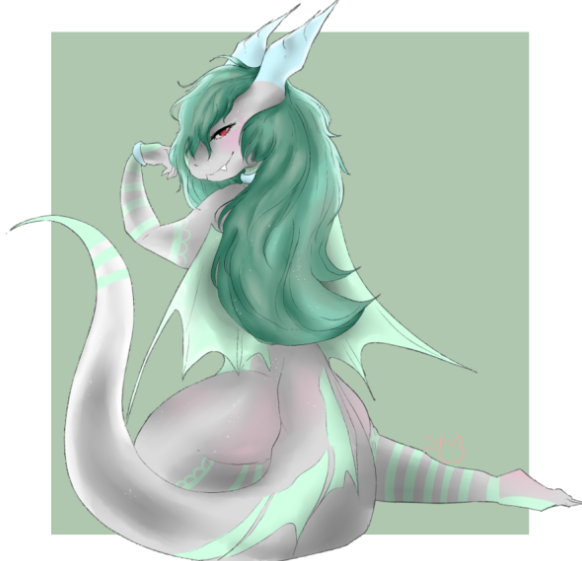
drawing of @TRIXWanderlust !!!
i was a bit confused on the proportions at first but omg i made her HELLA THICC on accident
#thicc


So yesterday, I GM'd for the first time in over a month and my players set off on the next leg of their journey towards a small mining town ("R") on the map. They're still a solid day and a half away, but they've encountered a snag.
And now I get to share this portion of the map!


Eeeek I got my #Covatar today from @TheCovatar ! ❤️
As hoped, my earrings take up a sensible proportion of the frame.

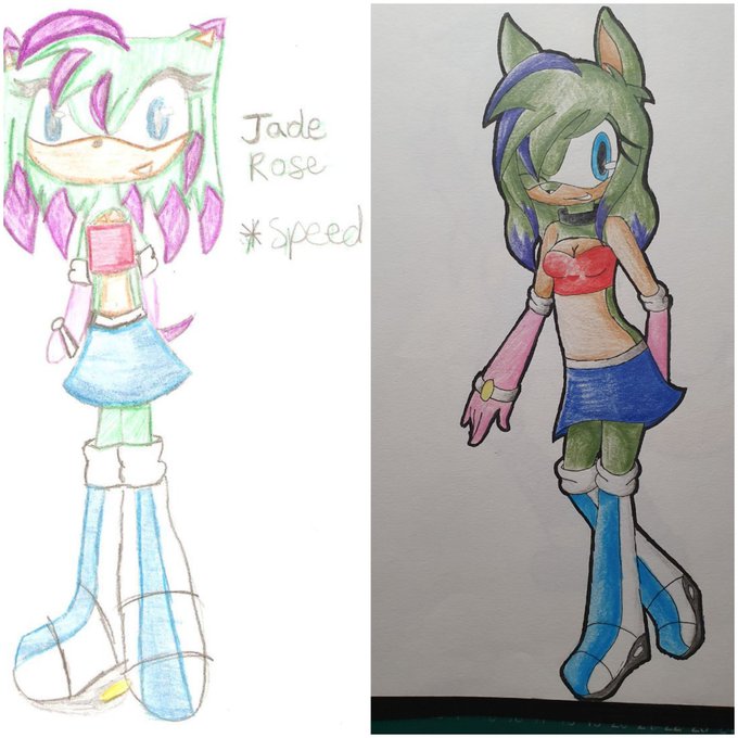


So, this is an old thing. I remade the og version of my then mains.
The bodies are alot better proportioned.


Not a tier list, but a rough count of my combo videos for each character (counted if featured for an important/major portion, since I have some videos featuring multiple characters):


Karate Man has his priorities set!
Check out Rhythm Heaven Reanimated, a collab of rhythmic proportions! Featuring me and many, many other talented creators!
@RhythmReanimate
https://t.co/gka1YL5tJb


My attempt at #artstylebend! Saturated colors, unrealistic/chibi proportions, thick colored lineart, simple fur feathers and scale details, eyes with more than one color, all the things I dont draw

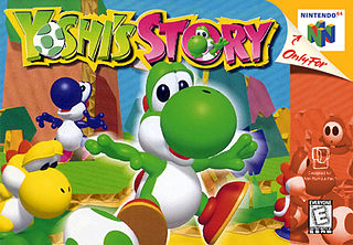
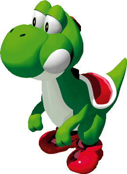
The n64 yoshi design seems based on yoshi's story and in that game all the yoshis were meant to be babies i think, so theyre a lot smaller in proportion compared to the yoshi most had come to know up until that point


@maskyarts OH THANK GOODNESS I AM NOT ALONE. the portions with the sky cast were the most enjoyable bits of it for me. Not that i didn't like the crossbell gang or anything but the moments that really kept me awake were with everyone from sky