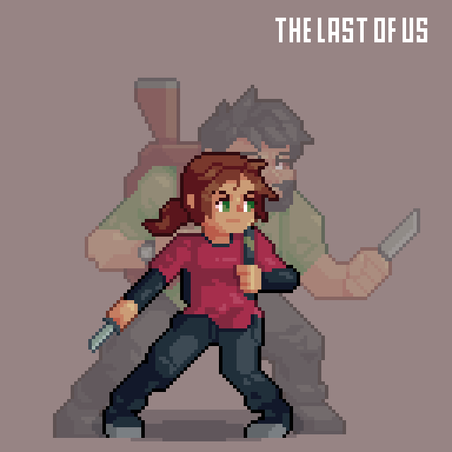
ComparisonのTwitterイラスト検索結果。 22,248 件中 47ページ目


Before i go to bed, i wanna gush again. It's been around 7-8 years since i picked up a stylus for the first time and started digital art, so here's some character creation work from then to some now. Hell, even the WIP is insane in comparison.
#ArtistOnTwitter #characterdesign


This is the character I used as reference in a comparison I did for different clothes.
#AIart #AIイラスト #AIイラスト好きさんと繋がりたい #stablediffusion #AI術師さんと繋がりたい


For comparison, it was the best I could do w/ no in-game mesh tops or garters 😔


Days ago i was thinking how Yuko had different colors from the first drawings that I made of her.
So I decided to create a side by side comparison, (on left) i used the same pose and colors (as well her old eye style) while the other (on right) is her current design.


and to finish the first round of comparisons, here we have gallimimus!!!, soon I will be following with some new species of jurassic park tlw

I have finally finished it, here is a comparison of the dilophosaurus from the jurassic park franchise compared to the dilophosaurus from #mesozoicbiologyaddon


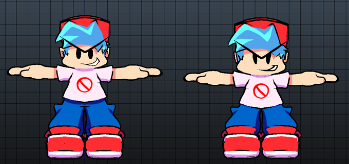
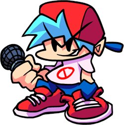
Wanted to do a comparison of Sunny's icon I made in August vs his new one! The improvement is making me really happy


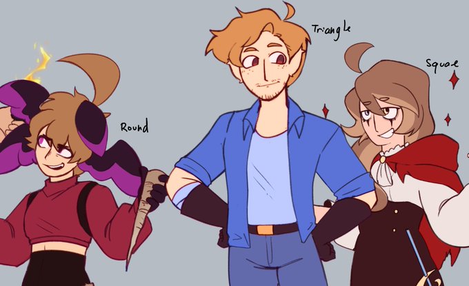
-Blondes
-Psychopathic
-Relatively unassuming compared to other characters in their series
-Similar ages
-Can kill people with an explosive coin
All we need is for Russel to start severing hands and the comparison will be complete.

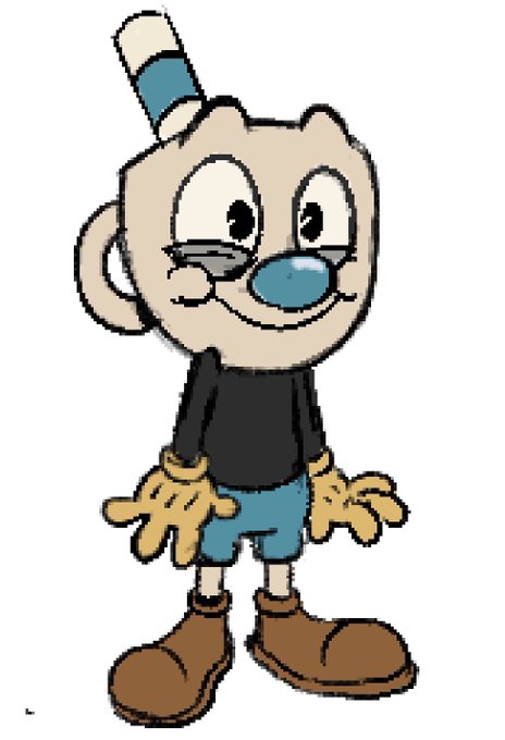
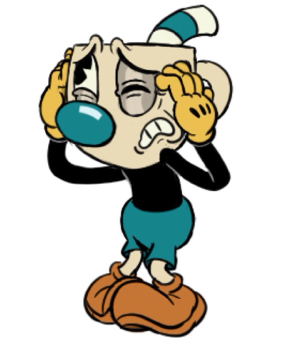
can’t believe the first time I drew mugman was so dang stiff, the 5 month comparison between both of my mugman sketches is killing me now /pos
old - > new

@Alex_theDemon i actually updated him to be more accurate to his sprite in the game! (v2 is on the right in the comparison image)


In case you're wondering, yeah that's actually a Void Gear variant.
Storm Wave is there because for size and proportion comparison, besides it is on a tier of its own among the Keyblades so the rest will have to surpass that.


Can't believe we forgot to mention that Atelier Marie also had a "demake" for Japanese phones in 2003.
Here's a comparison between that demake and the original.


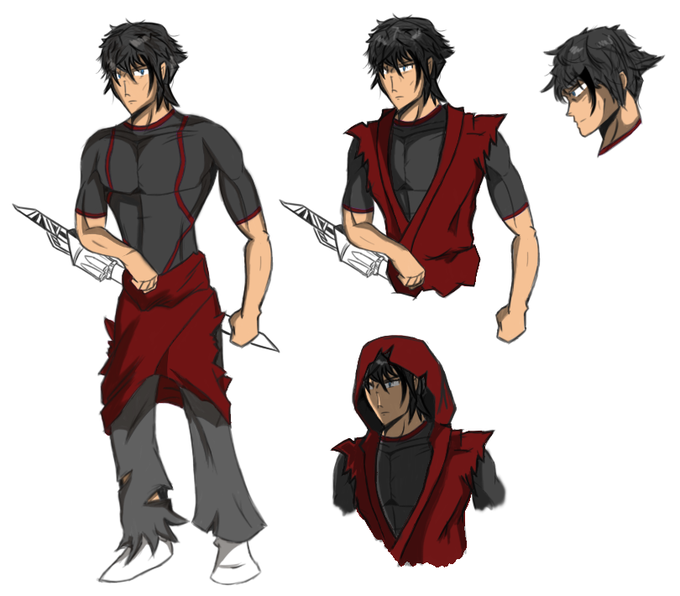
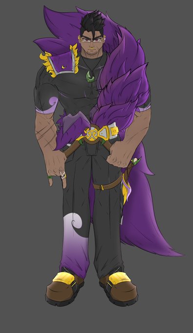
Here's a comparison of how he looked before
Wanted to make him look deadlier and to test out some new tools I got


Some comic designs for some comparisons.
And omfg the Flash design is an even WORSE downgrade than the Wonder Woman one.
Batman is roughly fine IMO since the movie is basically just a more simplified version+actual batwings. Superman's design is a small improvement tho.

