comparisonsのTwitterイラスト検索結果。 47ページ目


Nice little bonus instead of sleeping as I should be doing as I just found on his site, comparisons to the final shot are always neat! As the relevant boards go up I'll probably add this instead of an Instagram preview since it does the same job - https://t.co/Fc4PqL0Hil


Challenge by @Zhane_Star 's to recolor Willow with Dr. Starline's color palette so here's the quick result lol
(and the pics for comparisons)


I can already see all the damian and oliver comparisons when invincible s2 drops


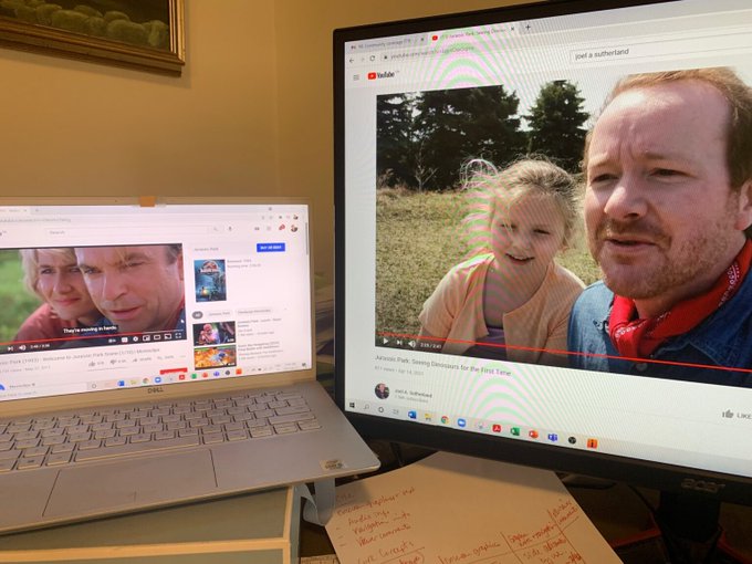


I was interviewed by @JGCanada for @TeachKidsNews's One Good Thing series about my family's recent Jurassic Park video & was delighted to see it includes an illustration of my son by @peggysbooks! I also loved the comparisons of the original scene & ours: https://t.co/aq8MRyyiPq


Btw, brother comparisons
Left:
Ken (Left) - 5'1
Taichi (Right) - 5'8
Right:
Naoki (Right) - 5'2
Naoto (Left) - 5'5


Webtoon Server is asking about character doppelgangers and it's fun so - I used to be bothered by the Seed comparisons. I don't care anymore, I find them hilarious and embrace it.


guys I found out that my pvzh and humanized mr men references are surprisingly size compatible despite me not referencing from the other while creating each of them. resulting in these (real) height comparisons:
(found out that Mr. Rude is 5'4 and Mr. Stubborn is 5'10. cool!)


My digital art from 10 months ago, to now (I really love doing comparisons)


Thought it would be fun to post some side by side comparisons between the #Webtoons & live-action promos! Since these were ads & not short films we felt like we could be a little more visually stylized while making sure still capturing the essence of the comics. How’d we do?


seeing a lot of vtuber remodel comparisons... but Wish has been my OC for almost a decade!! we been Through Some Shit


just thought these comparisons were neat lmao. I do a lot of grey sketches with a few colored details and then use a 50% opacity gradient map to figure out the rest for me
w/ fran I used colors beneath to maintain cool/warm temperatures and make gold tones where I wanted them


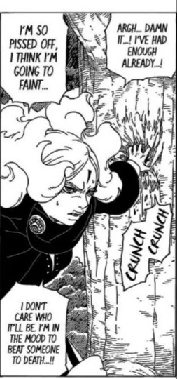


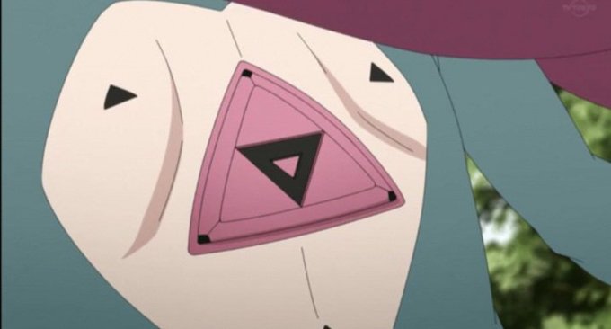


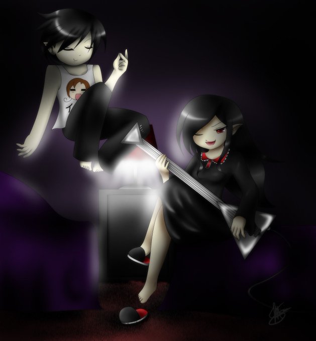


Here are a few more comparisons. Left is from 2013/2011 and Right is from 2015/2018.
While I had a few good bursts of art, these were the norm for my art from mid to late 2010's. Lacking programs affected my art, but also the passion. Never let your passion burn out.


2/2: Mina, size comparisons, wing shapes and patterns, bodies with wings stitched onto them


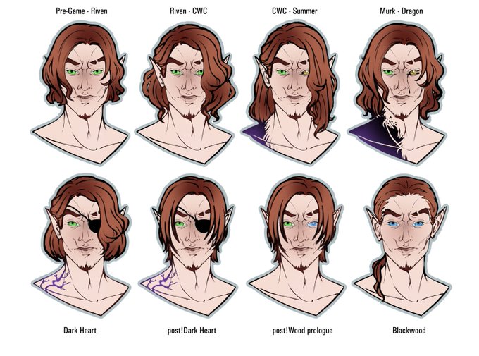
So I was lurking around @TlMElSPREClOUS timeline and saw time-skip character comparisons AND U KNOW I DID MINE. Now including #Blackwood! It's been 3 PTS cycles with me using ponytail till EU copy and I think its time has come. And new eye...s. Straight from Harbour.

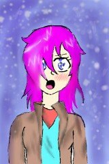


all 4 comparisons
at first i did 2 years between each but i thought i progressed enough and i was bored :)