ContrasのTwitterイラスト検索結果。 10,822 件中 464ページ目


✨Finally done! This was hard to paint!
My commissioner wanted white skin, blonde hair and yellow armor. This left me no room for contrast!😨
https://t.co/vMi3j8l6HD

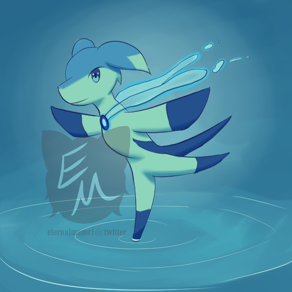
A water spirit named Danseau-- The water dancer.
A graceful spirit who skips on top of the water, and are capable of using their veil for whipping and water reserves for protection. Had a lot of fun making contrasts on the color. #art #originalcharacter #artwork


I reduced the contrast a bit. Do you think this is better? https://t.co/XA5pprEUbg


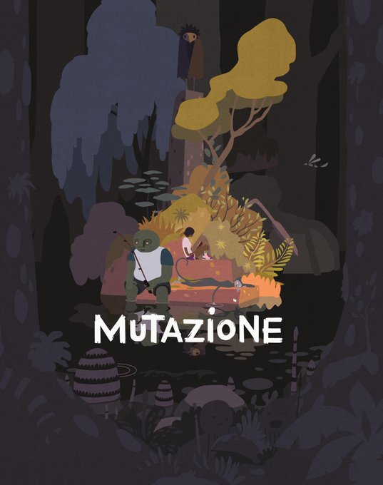
My friends @helvetica and @doougle both released games today (with their collaborators)! <3
Card of Darkness is on Apple Arcade: https://t.co/RR1pYEzMTt
Mutazione is on Apple Arcade, PS4, and PC: https://t.co/PxERtuEnS8
The contrast between these two title images says it all:


Here we go. Shallot and his keyblade colored. Shaded it a bit different for the keyblade, but I think it's a nice contrast to the DBS Style for Shallot. Once again, I referenced an image of @KaggyFilms with his own.


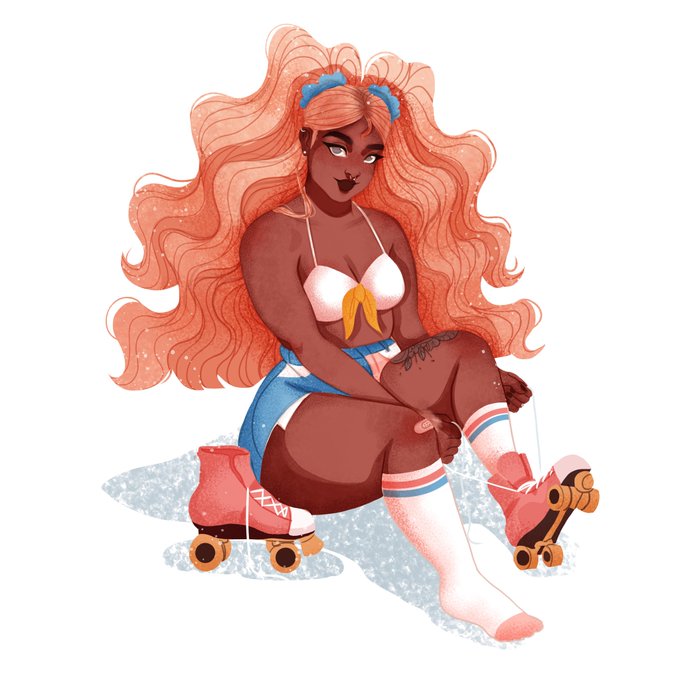
The rotten fruit continues. I hate mold - but mold looks really pretty on oranges/lemons, the contrast is A+, so I couldn't help myself. Promise I'll draw something yummy again soon! #foodillustration #oranges #nasty #digitalillustration


‘Green and Red’ by Sue Hammond-Lovatt.
(https://t.co/5KhGFoN1pB)
#oils #somerset #colours #contrast #southwest #artists #thoughtprovoking


I loved how this episode contrasted Grimmer and Johan and all but dude to have seen a proper confrontation between them, as individuals who experienced Kinderheim and grew to adopt such opposing ideas, would've been. Wow.


So uhh... I lost the yellow shirt I use for Compare and Contrast. Think I'm gonna have to use a different color. I've edited the sprite with different colors in mind, What's your favorite?


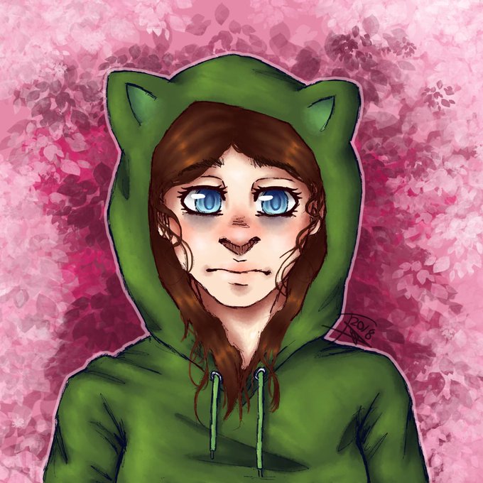
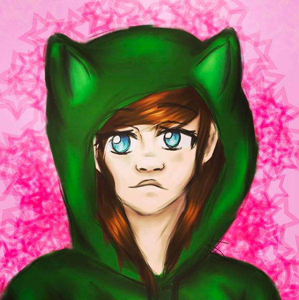


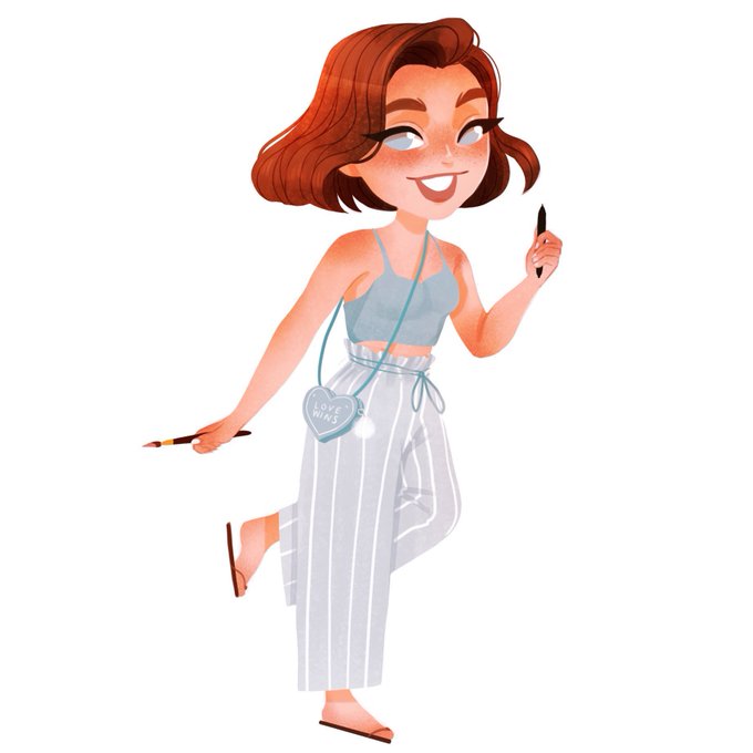


@starijam @Kayas_Kosmos Hi everyone! I’m a freelance illustrator (with open commissions!) who loves warm colours, contrast and texture! ✨


Samuel Bas contrasts creepy with cute in his vibrant illustrations > https://t.co/DQpCdiDfK7


So I drew @_gabrielpicolo's OCs Sun and Moon! I've been wanting to do this for long time and I finally did. I love these characters and their design contrast. I was also a little nervous on putting this here but I hope you guys like it. 🧡💙

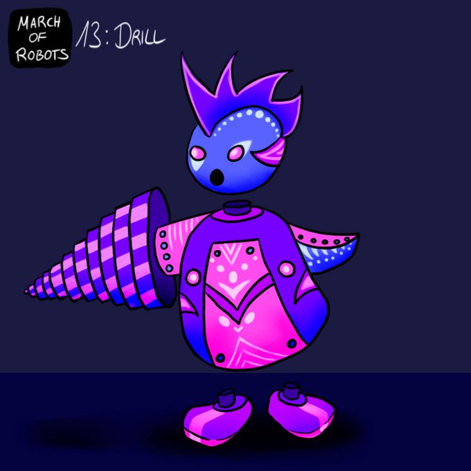

I also quite like the contrast between these ones~ #art #ArtistOnTwitter #robot

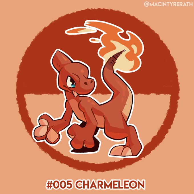


No. 005: Charmeleon
Evolution has made this Pokémon much more aggressive in contrast to the calmer Charmander. It will scarcely listen to an inexperienced trainer and will often act on its own accord. Bring bandages!


@DeePeeArts Hi! I’m Jess, a freelance illustrator (with open commissions 👀) who loves warm colours, contrast and texture. I’d love to get to 850 or 900! ✨


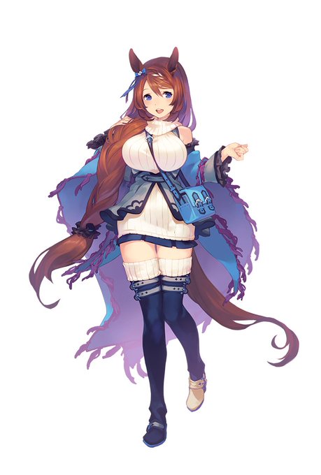
🔸Super Creek
A gentle, carefree, and motherly sister figure. She dotes on others, and is full of patience. But in contrast to her healing power, in a race she can overwhelm all adversaries with her endless stamina. Her hobby is helping promising new trainers.


At first, I imagined the teapot decorations in plain white with some lineart details, but I came up with this as a solution to reconcile that with the gradient flowers from the borders uwu (contrast is softer now~ and it looks prettier xd)


i feel as though there is a subtle warmth and friendliness to the way peter griffin was drawn early on in family guy, in contrast to his more modern look which comes off as sinister and untrustworthy to me. i.. don't know why, though. it could be in the eyebrows