ContrasのTwitterイラスト検索結果。 10,822 件中 468ページ目


Here we have route 7, the one right in front of Celadon City. Wanted some contrast with nature and huge buildings in the back to foreshadow the city. #kantoinreallife
99/150 #thegrindto150
#digitalart #pokemonfanart


Elec Month Day 22 - Wanted to try something with a higher level of contrast... #megaman #ロックマン #digitalart #fanart

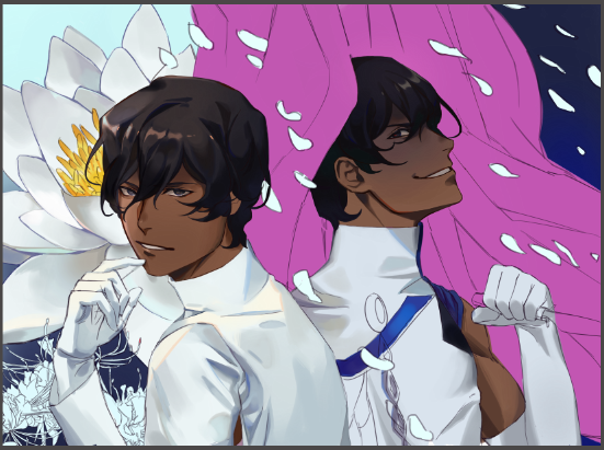
oohhh.... look at those contrasting silhouettes..
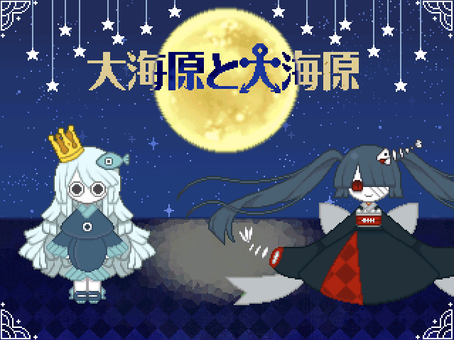
the blood sea princess (dont remember her name) has a much grander ominous silhouette to uomi's


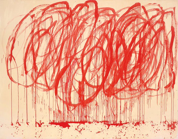
The asking price for a 1/3 re-paint of Universal Invitation is $50.000. The project changed the world, reached hundreds of millions of people and is about universal truth available to all. To contrast, this ketchup accident by Cy Twombly fetched in 36MM.
https://t.co/OfuhjSv6N6


These two again - workin out facial feature stuff n contrast

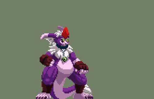
Startin to pick at Jeibu's moveset.
Here's a WIP of his stand atk 1+2. In contrast to Gejhi, Jeibu only throws a jab for atk1 & can't throw them as rabidly. His knee attack is also slower. Stun time & damage on Jeibu's attacks are greater than Gejhi's though.
#pixelart


@WirleyContaifer @SonyPicturesBr @TomHolland1996 @tomhollandbr @ProjetoTomBR @BRVingadores Actually you Uploaded too much contrast. This one is original guys

quick question, does this look better with red or white spider lilies? i can't decide.. leaning on red more though bc of the contrast but hmm

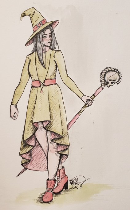
And here she is! I decided to do it traditionally this week and play with the line art more.
I like how the colors contrast the staff. Like, who is this sweet pastel goth witch? Where did she get that skull? We may never know.
#drawing #witch #pollgame https://t.co/6fkW1vpMOX

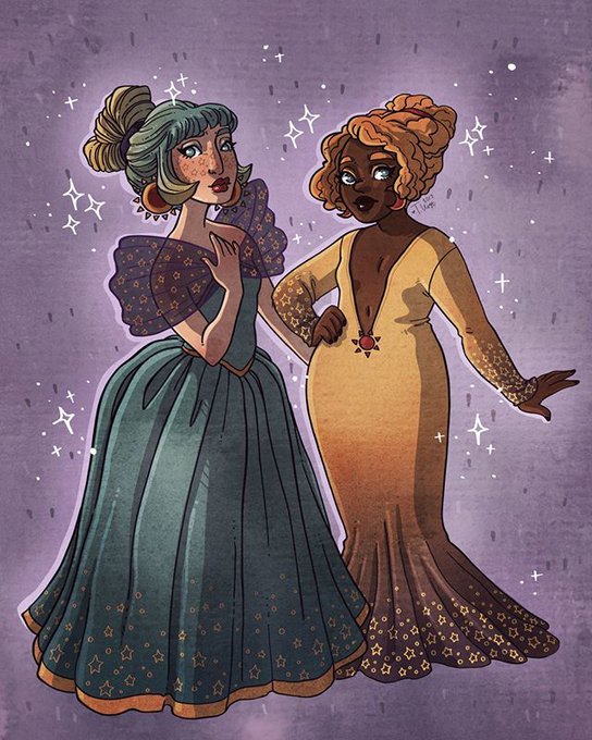
228/365 Soooooooo. Today’s 365 might be a cheat since it’s the last two days combined and re-colored. BUT... I brain birthed a comic story for these ladies and I wasn’t happy with their original colors (not enough contrast) so I took the time to re-color… https://t.co/No7tZGpXkt


This is either finished now, or very, very close to it...I may do a little toning yet, in color and contrast. And then comes the title. For now here's my latest.

This is a stark contrast to 6MYs LASER EYES which I absolutely love, but I am currently all out of laser eyes energy so I'm trying to go back to positive vibes

227/365 Okay, here is a design idea for the sun goddess. I really like the way she looks but like the moon goddess I feel like there isn’t enough contrast in her color design so I did work on a color variation which I will share with you guys tomorrow. T… https://t.co/Yrx4PAkDpa


Did some self-assessment. Tried to re-work how I choose my color palette especially when it comes to the eyes and skin; Substituting dark colors for contrasting ones instead.
I personally think it looks better now 👌

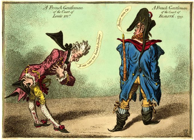
Gillray reflects on the decade since the French Revolution, contrasting a deferential courtier of the 'ancien régime' (left) with the brash bludgeon-carrying confidence of new republicanism. Published in #London August 15th 1799


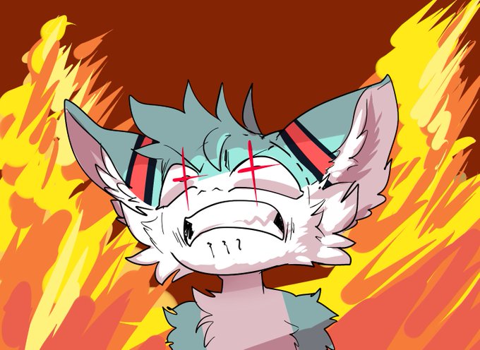
GNGNF WINGS OF FIRE OCS,,, GOOD,,, egress amd contrast good friends very good make happy


@Soltairus looking pretty good, it does look a little barren though, even if you added enemy's. maybe you could try adding more contrast in colours in the cave. your cave has a lot of grey. and although it is common in normal caves, grey is not the only colour in caves ie moss and dirt:


Aaand finished! I chose white at the end because it contrasts more with her dark skin