compareのTwitterイラスト検索結果。 48ページ目

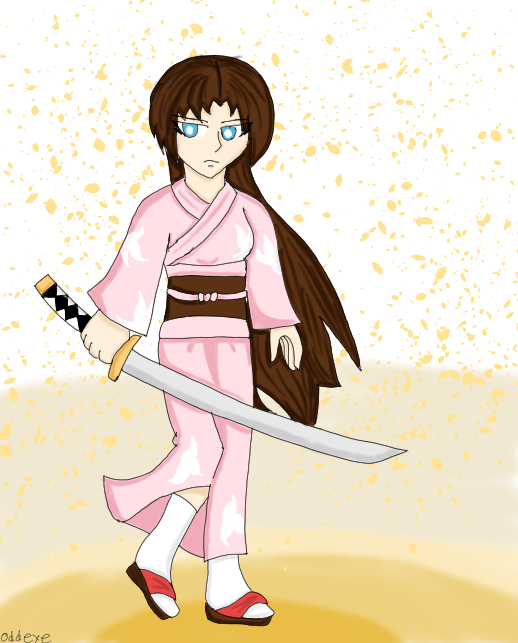


'Nother artpost of the Fate/Odd Order Series of Redesigns. Void Shiki, Saito Hajime, Siegfried, and Sigurd. Something entertaining to me that Sigurd's changes are so much more drastic compared to everyone else's.





My favorite OC I've done. I pretty much compare everything else I do to this.
#DigitalArtist #opencommissions




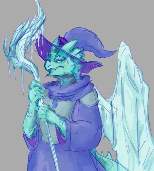
i honestly think drawing these guys, even if theyre not supposed to look the greatest, really did help me get more into the colouring groove, as well as making the rise icons.
super cool to compare my maidos to my last coloured drawing of glacius. i should redraw her...




i def think it means something that it’s a noose around his neck that he cut off himself compared to sakura being still tied at the arms and legs

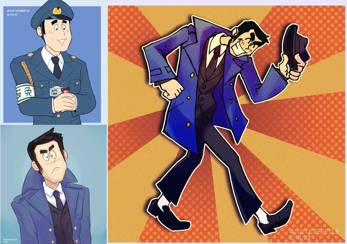
do you guys like art comparisons as much as me? well, on the left is some very early meekins art compared to my latest one, truly a lot can change in a year


compare to these earlier ones and they're not Bad they just like. feel like comic covers instead? idk if that makes sense. idk what a Podcast cover looks like vs a comic one but. idk these just feel too detailed. this is a tell-dont-show show lol don't show me everything

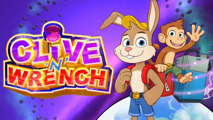
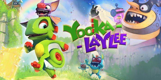
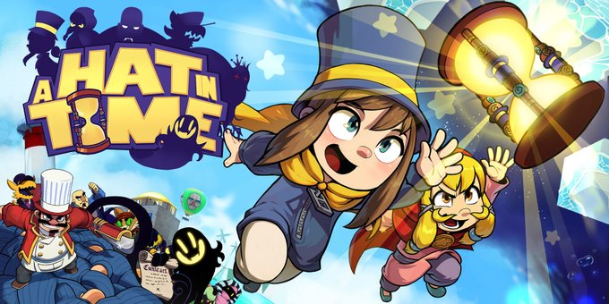

Now that it’s been out for a few days how do you guys think Clive N Wrench stacks up compared to some of the other recent 3D platformers?


this is revolutionary im graduating myself this year but this is NOTHING compared to hina hikawa holding a piece sign smiling with tears in her eyes

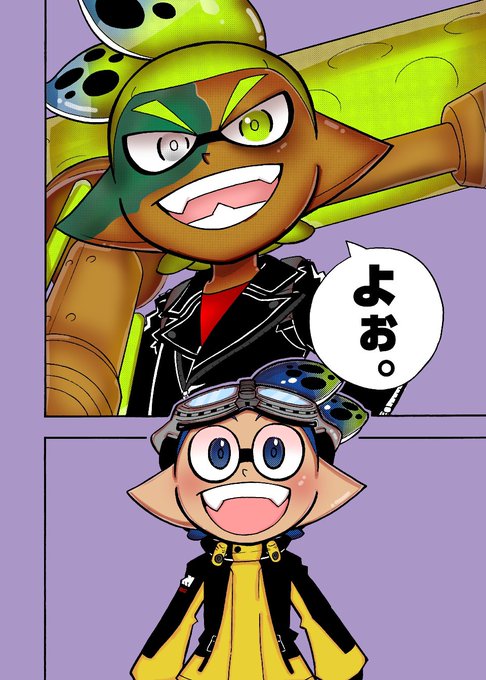

Welcome to I show off panels compared one month apart! #coroika #splatoonmanga



6. Fire Emblem: Three Houses - Ashe Ubert & Yuri Leclerc
I am THIS CLOSE to writing a compare/contrast essay on their backstories and personalities and philosophies. The sheer potential makes me insane.


Ready to dive into the world of Pokemon? Here is one of my oldest pokedrawings compared to my relatively newer ones :)
Follow me for a non-stop supply of amazing fan art and original illustrations. #pokemon #art #fanart #PokemonDay #PokemonTogether #litten #charizard


Also, funny thing (unnecessary but I'm saying it anyway) Nyx would kick Ram's ass lore wise
Ram can MAYBE compare to Doom, who can level a skyscraper. Nyx, meanwhile, threw hands & WON against Azaan, who stopped Yago, a WORLD ENDING THREAT lol
#Paladin #Overwatch


i wanted to compare the first lineup I did of Jon compared to now and I'm really happy with how much I've come since 2020

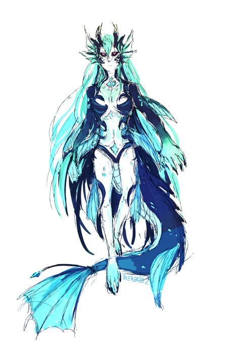


I swear to you guys, this legit the first design. I didn't think ppl gonna like it LOL. I just want to make her design related to her dragon-god descendent lore. ( that's why she is so huge. but still tiny compare to other leviathan. )
Im just glad that I get her taste correct😭

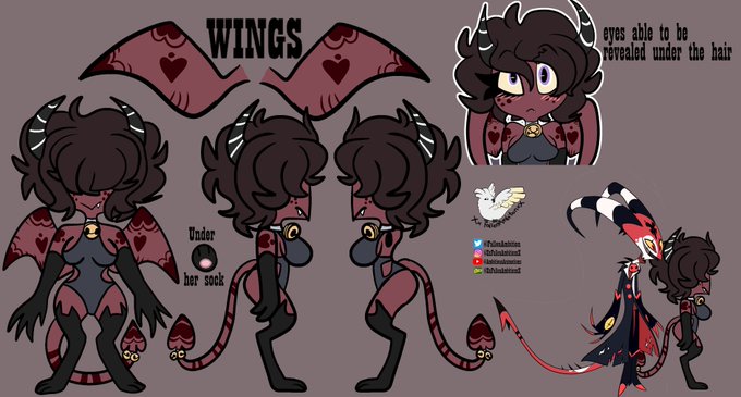

a ref of remi, and now her sister Emi! with height compared to Blitz!